What is storytelling?

‘“Storytelling” – the term makes me curious. But I am not sure what it means, exactly…’ ‘I want to use storytelling in my communication. How can I do that?‘Storytelling? Could I do that too? But I am not creative at all.’

These are just a few examples of the responses I get when I talk about storytelling at birthday parties. And about the storytelling training courses I teach.

Do you have similar questions?

In this article, I will discuss the three basic ingredients of a story.

So you’ll better understand what storytelling means, and how you can use it yourself.

Storytelling makes your topic interesting and urgent

But first, let’s zoom out a bit.

Why would you use storytelling in the first place?

You use storytelling because people have a soft spot for stories. Including managers, finance experts and policy advisors.

A story makes your message interesting, coherent and urgent.

A story helps people with creating a mental picture. They better understand your message, become curious, emotionally engaged and inspired. As a result, they are more likely to take action.

Storytelling: you already do it

Want to use storytelling in communication about your work?

This may feel like something radically new.

But it isn’t: you already do it.

Everybody tells stories. Also at and about work.

About how an idea for a new product emerged during a daily run, for instance. About that time the electricity went down at the lab. About the inside joke that colleagues hid in a memo.

For storytelling, you don’t have to start from zero.

You start with your own natural ability.

Then, you build on this ability with storytelling techniques. To make better use of it, and do so more consciously.

To do this, you tap into techniques that have been used for ages, in various forms. From myths and fairy tales to Hollywood movies and games.

Stories have 3 main ingredients

A story contains roughly 3 main ingredients: a main character, a narrative arc, and scenes.

Main character

Stories are (mostly) about people.

About their motives, goals, emotions and problems.

Therefore, telling a story is easiest when you use characters. They can be real or imagined.

A classical story has one main character. Next to this protagonist there are other characters, who help or oppose the main character.

With a main character, you add perspective, direction and cohesion to the story. And it enables your audience to sympathize.

In a story about your topic you can, for instance, choose one particular citizen, customer or patient as a main character.  

Your protagonist could be Ingmar, a 32-year old freelance graphic designer.

He has a few small and one big client: a pet supplies store.

Ingmar likes to spend his free time road cycling and mountain biking. He spends a lot of money on it.

Narrative arc

The second main ingredient of storytelling is a structure in which tension first rises towards a peak and is then resolved. Or, in storytelling jargon: a narrative arc.

A narrative arc has a more or less fixed order.

In the beginning, the audience gets to know the protagonist (or the topic), and starts to get involved.

In a movie, this is often a kind of ‘24 hours in the life of…

But merely getting to know the main character or topic, and getting involved, is not enough.

To keep the audience interested, something has to happen. Something has to be at stake.

Only then it becomes a story.

For this reason, the main character is usually given a goal. Or a problem to solve. In The Lord of the Rings, the goal is to destroy the Ring in Mount Doom.

The goal sets the story in motion and creates tension. It creates a gap between where we are now and where we want to go. And there are multiple obstacles on the road.

At the end of the narrative arc, the tension is resolved.

A classical ending is a ‘resolution’, a solution: the Ring is destroyed, the lovers find each other, the murderer is arrested.
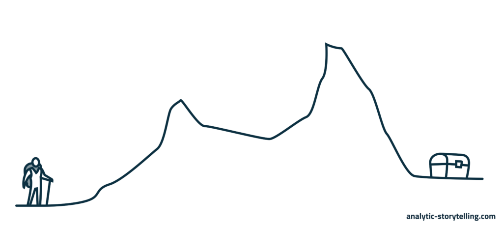
So what could a narrative arc in your professional communication look like?

As a financial advisor, you may say that controlling your own money is important. It ensures that you can do what is important to you, like living in a nice house or taking a cycling trip.

But many people do not have a realistic idea of their finances. Graphic designer Ingmar is an example. He has a large student loan debt, is optimistic about his business prospects, and is always buying new cycling gadgets.

This is risky. For instance, with a few setbacks he may fall into debt, stress out, pile debt upon debt and, eventually, for instance, lose his house.

The solution is a website where people can test how healthy their financial situation is. Someone like Ingmar answers questions about revenues, spending, savings and loans. He then receives a score and advice. For instance, to create a buffer.

Scenes

The third and last main ingredient of storytelling is the scene.

A scene takes place at a particular place, on a particular time. A scene usually contains people, sensory details and action.

A scene helps the audience create a mental image and immerses them in the story.

The opposite of a scene is a summary.

A summary is, for instance: in the years that followed, the couple had three children.

In a scene, you zoom in on the two oldest children who come to see their newborn sister. You describe how their eyes twinkle and how they carefully stroke her cheek. And how, a little later, they suddenly jolt the hospital crib in a higher position, because they were curious what would happen when they push a button.
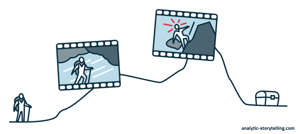
In a scene in your professional communication, you describe, for instance, how Ingmar opens an email from his biggest client.

The pet supplies store has gone bankrupt. They can’t pay the bills he sent them.

Ingmar just bought a new gravel bike – an offroad racing bicycle. He takes it for a ride to process the news.

He cycles down a hill at high speed. At the bottom of the hill there is a cattle grid. He lightly turns his handlebar to take the turn. Then he feels his wheel slipping.

He falls. He screams. In his right arm – he is righthanded – he feels a sharp, burning pain. Probably broken.

Two seconds later he thinks: shit – my insurance deductible. And how can I work now?

More storytelling, or less?

Characters, a narrative arc, scenes…

You can use all of these together to improve your communication. If you do, you have a complete story.

But even if you use only one of the three ingredients, it makes a huge difference.

For instance, if you structure your policy plan with a recognizable introduction, a complication and a resolution. Or if you start your blog post with a short anecdote: a scene. 

How you use storytelling depends on your audience, your goal and what medium you use. And on what you feel comfortable with.

My advice: experiment. Life is too short for boring presentations and texts.

Want to know more?

Want to know more about storytelling? Or want to use it in your own work?


Priscilla is director, advisor and trainer at Analytic Storytelling. We help people make content-driven stories.

To inform is not a goal

Summer holiday.

You are swimming in a river that runs between steep cliffs.

Past a small sandy beach, the current suddenly grows stronger. A cold force pulls you down. With frantic swimming strokes, you try to escape.

After a few seconds your muscles respond. Your right calf turns as hard as a coconut. Cramp.

You are losing your strength. You trash around, your head goes under, you swallow water.

Then, you struggle to the surface and scream.

‘I am drowning! I am drowning!’

You probably don’t scream ‘I am drowning’ to inform people.

You want your audience to do something. Someone has to jump into the water and save you.

In the workplace, we think it’s perfectly normal to inform

In the river, the idea that you communicate just to share information is absurd.

But at work we think of informing as a perfectly normal communication goal.

Maybe you yourself sometimes say that you want to inform someone. Or perhaps you use a similar term – ‘explain’, ‘tell’, or ‘update’.

Yet in professional communication, informing is never really your goal.

Usually, you also want your audience to do something with your information. Luckily, in these cases, it is not your life that’s on the line.

If informing is your goal, your communication becomes uncompelling

If you decide that the goal of your communication is to inform, chances are that your story will be long and not very compelling.

An example.

Shania develops an app for elderly people to train their memory.

The board of a seniors’ association asks Shania to give a presentation at a members’ conference.

Shania is flattered, and she likes to talk about her app. She already has a nice couple of slides she can use.

But she has no more than 15 minutes. And she can think of 1000 things she could tell them about her app.

What to include in her presentation? And how much time should she dedicate to each topic?

At the conference, Shania first talks about memory problems in elderly people. Especially in those who have dementia.

Then, she discusses scientific insights in memory training. She makes a case for highly intensive workouts. New research reveals that these are the most effective.

Then Shania talks about how her team developed the app.

The moderator raises 2 fingers: she has 2 minutes left.

She clicks to the slide with the app. She starts to talk faster. About the game with the animals, how it works, why it is fun for elderly people. Fun, but also highly intensive.

Then her presentation is done. She receives a polite applause.

Ask for the underlying goal

Shania isn’t sure how she feels about the conference.

Did it go well? How has this helped her?

The problem is that Shania was asked to tell the members ‘something’ about her app. She received a request to inform.

That’s also how she defined her goal herself: to inform her audience.

Since ‘to inform’ sounds like a goal, she didn’t think any further about what she wanted to achieve with her information.

In retrospect, Shania would have preferred to formulate a more specific goal.

Luckily, such an underlying goal is generally easy to find.

There are 4 questions that can help Shania – and you – do that:

Question 1: Why do I want to inform my audience?

You should first think about what you want to achieve by telling your story.

You can do that by asking yourself ‘why?’. It’s often good to do this several times.

For Shania, that goes like this:

Why do I want to inform the members of the seniors’ association? Because the members are elderly people, and elderly people are my target group.

Why do I want to inform elderly people? I want to raise their interest in my app.

Why do I want them to be interested in my app? In this phase, I am looking for elderly people to test the beta version. Later on, I want elderly people to use my app.

By asking ‘why?’ three times in a row, Shania makes her goals explicit.

Question 2: Why does my audience want information from me?

You’ll often choose informing as a goal when you, like Shania, are asked to speak or write about your work. Or when you receive a task or assignment from your organization.

That’s why it’s good to also ask ‘why?’ from the perspective of your audience. Because, in fact, getting informed is not an end in itself either.

Why did the seniors’ association ask Shania to give a presentation? What is the question behind the question?

Don’t know exactly why your audience would want information? Oftentimes, you can just ask them.

When Shania asks the association about this, she learns that they want to show their members which opportunities apps can offer to elderly people. And secondly, they want to help Shania because her work is important for their target group.

Question 3: What do I want my audience to do?

After the why questions, you sometimes need to ask yourself one additional question: the question what your audience should do afterwards.

Shania may decide that she is looking for elderly people who are willing to test the beta version. She would like them to share their e-mail addresses with her. It would be even better if they would ask other seniors to test the app too.

Sometimes you don’t have a direct action as your goal. For instance, when you want to convince others that apps offer opportunities to elderly people.

Usually, in such cases, there are more long-term actions that you can think of.

For instance, to make sure that people choose an app when they have to solve a problem six months later. Or to motivate them to tell other people about apps.

Question 4: What would go wrong if I don’t communicate at all?

Are you still not satisfied with your goal? Then put the whole thing on the line, with a final question: what would go wrong if I don’t communicate at all?

For Shania, the conference is a bonus. But if she doesn’t go, she will have to find another way to recruit elderly people who want to test her app. Which will probably cost her time and money.

Can’t think of anything that would go wrong if you refrain from communicating at all?

Then it may be better to spend your time on other things – if that’s possible.

Life is short.

Use the underlying goal to focus your story

The underlying goal makes it easier to focus your story.

Often, you can explicitly mention your goal, and what you want your audience to do.

Suppose Shania can make a presentation based on the goals that she found by asking the 4 questions. In that case, it could look like this:

Shania starts with a short impression of apps for elderly people. And she discusses 3 examples to inspire her audience.

Next, she explains how her app works, and how valuable it is to have an easy, accessible tool to train your memory with.

Then she mentions that she is looking for elderly people who want to test her app.

She briefly tests the animal game with the audience. This way, people can get an idea what it is like to do such tests. And she receives the first feedback on it.

After that, she explains how long it takes to do the test, and until when people can participate. Participants can continue to use the app for free.

People who are interested can put their e-mail address on a list, during the reception after the conference. Everyone in the audience will receive an e-mail that they can forward to other people who might want to help.

Chances are that Shania receives dozens of e-mail addresses from helpful elderly people. The most important step she needs to take to make this happen, is to choose a goal that is different from merely informing.

Remember the mantra

Inform, explain, update… pay attention when you hear yourself use these words. Or when a colleague does.

Remember the river – the current, the cramp.

And remember the mantra: to inform is not a goal.


Arnaud is trainer, advisor and text writer at Analytic Storytelling. He helps customers to send out a clear and convincing message in both words and images.

Informeren is geen doel

Zomervakantie.

Je zwemt in een rivier tussen hoge rotswanden.

Voorbij een zandstrandje wordt de stroming plots sterker. Een koude kracht trekt je omlaag. Je biedt weerstand met haastige slagen.

Na een paar seconden reageren je spieren. Je rechterkuit wordt hard als een kokosnoot. Kramp.

Kracht zetten lukt niet meer. Je spartelt, gaat kopje onder, krijgt een hap water binnen.

Dan worstel je je naar boven en schreeuw je het uit.

‘Ik verdrink! Ik verdrink!’

‘Ik verdrink’ schreeuw je waarschijnlijk niet om te informeren.

Je wil dat je publiek iets gaat doen. Iemand moet in het water springen om je te redden.

Op de werkvloer vinden we informeren heel gewoon

Het idee dat je communiceert om te informeren is in de rivier absurd.

Maar op de werkvloer zien we informeren als een heel gewoon communicatiedoel.

Misschien zeg je zelf ook wel eens dat je iemand wil informeren. Of gebruik je een vergelijkbare term als ‘uitleggen’, ‘vertellen’ of ‘updaten’.

Toch is in professionele communicatie informeren nooit echt je doel.

Als het goed is wil je ook daar dat je publiek door jouw informatie iets gaat doen. Al staat daarbij gelukkig niet snel je leven op het spel.

Informeren maakt communicatie vrijblijvend

Kies je informeren wel als je doel? Dan is de kans is dan groot dat je verhaal vrijblijvend en lang wordt.

Een voorbeeld.

Shania ontwikkelt een geheugentrainingsapp voor ouderen. Het bestuur van de ouderenbond vraagt haar als spreker op een ledencongres.

Shania is vereerd en vertelt graag over haar app. Een paar mooie slides heeft ze al klaarliggen.

Alleen heeft ze maar 15 minuten. En ze kan wel 1.000 dingen vertellen over haar app.

Wat moet ze opnemen in haar presentatie? En hoe lang moet het over welk onderwerp gaan?

Op het congres gaat Shania eerst in op geheugenproblemen bij ouderen. En vooral bij ouderen met dementie.

Daarna bespreekt ze wetenschappelijke inzichten in geheugentraining. Ze pleit voor hoogintensieve workouts. Nieuw onderzoek laat zien dat die het meeste effect hebben.

Dan vertelt Shania hoe haar team de app ontwikkeld heeft.

De dagvoorzitter steekt 2 vingers op: nog 2 minuten.

Ze klikt door naar de slide die de app laat zien. Ze gaat sneller praten. Over hoe het dierenspel werkt en waarom het leuk is voor ouderen. En niet alleen leuk, maar ook hoogintensief.

Dan zit haar presentatie erop en krijgt ze een beleefd applaus.

Vraag naar het achterliggende doel

Shania houdt een onbestemd gevoel over aan het congres.

Ging het goed of slecht? En wat heeft ze er precies aan gehad?

Het probleem is dat Shania is gevraagd is om ‘iets’ te vertellen over haar app. Ze heeft een informeerverzoek gekregen.

En dat heeft ze zelf ook als haar doel gezien: informeren.

Omdat informeren klinkt als een doel heeft ze niet verder nagedacht over wat ze met haar informatie wil bereiken.

Shania had achteraf graag een specifieker doel geformuleerd.

Meestal is zo’n ander, achterliggend doel gelukkig makkelijk te vinden.

Er zijn 4 vragen die Shania – en jou – daarbij kunnen helpen:

Vraag 1: Waarom wil ik informeren?

Allereerst moet je bedenken wat je zelf met je verhaal wil bereiken.

Dat kun je doen door ‘waarom?’ te vragen. Vaak is het goed om dat meerdere keren te doen.

Bij Shania ziet dat er zo uit:

Waarom wil ik de leden van de ouderenbond informeren? Omdat de leden ouderen zijn, en ouderen zijn mijn doelgroep.

Waarom wil ik ouderen informeren? Ik wil dat ze geïnteresseerd raken in mijn app.

Waarom wil ik dat ze geïnteresseerd raken in mijn app? In deze fase zoek ik ouderen om de bètaversie te testen. En later wil ik dat ouderen mijn app gaan gebruiken.

Door 3 keer ‘waarom?’ te vragen expliciteert Shania haar doelen.

Vraag 2: Waarom wil mijn publiek informatie?

Je kiest informeren vaak als doel als je – net zoals Shania – ergens voor gevraagd wordt. Of als je een taak of opdracht krijgt vanuit je organisatie.

Daarom is het goed om de waaromvraag (of vragen) ook vanuit het publiek te stellen. Geïnformeerd worden is namelijk ook geen doel.

Waarom vraagt de ouderenbond Shania als spreker? Wat is de vraag achter die vraag?

Weet je niet precies waarom je publiek informatie wil? Meestal kun je het hen gewoon vragen.

Als Shania dit doet, hoort ze dat de bond leden wil laten zien welke kansen apps voor ouderen bieden. Ook willen ze Shania helpen omdat haar werk belangrijk is voor hun doelgroep.

Vraag 3: Wat moet mijn publiek doen?

Na de waaromvragen is soms nog 1 extra vraag nodig: de vraag wat je publiek na afloop moet doen.

Shania kan bijvoorbeeld bedenken dat ouderen die de bètaversie willen testen hun e-mailadres achterlaten. Het zou helemaal mooi zijn als mensen ook andere ouderen willen vragen om de app te testen.

Soms heb je geen directe actie als doel. Dat is bijvoorbeeld zo als je mensen wil overtuigen van de kansen die apps voor ouderen bieden.

Meestal zijn er ook dan wel acties op de lange termijn waar je aan kunt denken. Bijvoorbeeld dat mensen over een half jaar eerder voor een app kiezen als ze een probleem moeten oplossen. Of dat ze andere mensen over apps gaan vertellen.

Vraag 4: Wat gaat er mis als ik niet communiceer?

Ben je nog niet tevreden over je doel? Zet dan de boel op scherp met een laatste vraag: Wat gaat er mis als ik niet communiceer?

Voor Shania is het congres een extraatje. Maar als ze niet gaat, zal ze op een andere manier ouderen moeten vinden die haar app willen testen. Dat kost waarschijnlijk tijd en geld.

Weet je niet wat er misgaat als je van communicatie afziet?

Dan is het misschien beter om je tijd ergens anders aan te besteden – als dat kan.

Life is short.

Gebruik het achterliggende doel om je verhaal aan te scherpen

Het achterliggende doel maakt het veel makkelijker om je verhaal aan te scherpen.

Vaak kun je ook letterlijk zeggen wat je doel is en wat je wil dat je publiek gaat doen.

Stel dat Shania een presentatie mag maken op basis van de nieuwe doelen die ze door de vragen heeft gevonden.

Shania begint dan met een korte schets van apps voor ouderen. En ze bespreekt 3 voorbeelden ter inspiratie.

Daarna legt ze uit hoe haar app werkt en hoe waardevol het is om laagdrempelig je geheugen te kunnen trainen.

Vervolgens zegt ze dat ze ouderen zoekt die haar app willen testen.

Op het congres test ze al kort het dierenspel met het publiek. Daardoor ervaren mensen hoe zo’n test eruitziet. En ze krijgt vast eerste feedback.

Daarna vertelt ze hoelang de test duurt en tot wanneer mensen mee kunnen doen. Mensen die meedoen kunnen de app gratis blijven gebruiken.

Wie interesse heeft kan zijn e-mailadres achterlaten op een formulier bij de borrel. Alle aanwezigen krijgen een e-mail die ze kunnen doorsturen naar andere ouderen die misschien willen helpen.

De kans is groot dat Shania zo tientallen e-mailadressen van behulpzame ouderen krijgt. De belangrijkste stap daarvoor is dat ze een ander doel formuleert dan informeren.

Onthoud de mantra

Informeren, uitleggen, updaten… Wees alert als je deze woorden gebruikt. Of als een collega dit doet.

Denk dan terug aan de rivier – aan de stroming, aan je kramp.

En onthoud als mantra: Informeren is geen doel.


Arnaud is trainer, adviseur en tekstschrijver bij Analytic Storytelling. Hij helpt klanten om een heldere en overtuigende boodschap op papier te krijgen in woord en beeld.

SCQA: Wat is het, hoe werkt het en wat kan ik ermee?

SCQA is een methode om informatie te structureren. Door de methode krijgt je boodschap een duidelijke, aantrekkelijke, verhalende opbouw. De SCQA-methode wordt onder meer gebruikt in het bedrijfsleven, bij de overheid en in de wetenschap.

Een SCQA bestaat uit vier vaste basiselementen. De methode is daardoor makkelijk te leren en toe te passen.

S,C, Q en A: de basiselementen van een goed verhaal

De vier basiselementen van een SCQA zijn Situation, Complication, Question en Answer. Als je deze elementen verbindt, krijg je een logische verhaalflow:


Situation: Is het startpunt van je verhaal en een gezamenlijke basis met je publiek. Bevat daarom voornamelijk herkenbare en gedeelde punten.

Complication: Laat zien waarom er nu actie nodig is. Bevat daarom problemen / kansen en de hordes die overwonnen moeten worden.

Question: Stelt de vraag hoe we de hordes uit de C kunnen overwinnen. Hoe kunnen we het probleem oplossen of de kans grijpen?

Answer: Geeft het antwoord hoe de hordes te overwinnen. Legt uit hoe de problemen worden opgelost of de kans gegrepen.


Eerst moet je publiek je onderwerp begrijpen en zich ermee kunnen identificeren. Daar zorg je voor door een herkenbaar vertrekpunt te kiezen: de Situation.

In de Complication luid je vervolgens de alarmbel. Daardoor gaat het publiek extra opletten en ervaart het urgentie. Er is een probleem, er moet iets gebeuren!

De Question maakt nieuwsgierig. Gaat het lukken om een antwoord te vinden?

Het Answer maakt het verhaal rond. Hier toon je hoe de complicatie wordt opgelost en de vraag wordt beantwoord.

Met een SCQA-structuur communiceer je makkelijker en beter

Zelf kun je ook de SCQA-methode gebruiken om je boodschap te structureren. Er zijn twee goede redenen om dat te doen.

Ten eerste verbetert de methode je maakproces. Je krijgt meer grip op je structuur waardoor je kunt makkelijker beslissen wat in je verhaal hoort en wat niet. Ook kun je beter analyseren hoe de onderdelen van je boodschap samenhangen.

Ten tweede leidt de SCQA-methode vaak tot een beter resultaat. Een boodschap met een SCQA is begrijpelijk en interessant en heeft een prettige spanningsboog. Ook ervaart je publiek urgentie waardoor het eerder iets met je informatie zal doen.

De SCQA kun je breed toepassen

De SCQA-methode is oorspronkelijk ontwikkeld om consultancyrapporten te verbeteren. Barbara Minto introduceerde de methode in haar beroemde boek The Pyramid Principle.

Gelukkig kan je SCQA’s ook in andere domeinen goed gebruiken. Eigenlijk leent elk vakgebied zich wel voor een SCQA-aanpak: van wetenschap tot business en van non-profit tot beleid.

Bovendien kun je de SCQA voor heel uiteenlopende communicatievormen gebruiken. Van een korte e-mail of een pitch tot een heel boek of een collegereeks. Ook bijvoorbeeld een blogartikel, een wetenschappelijk paper en een subsidieaanvraag kun je een SCQA-structuur geven.

Trouwens: ook filmmakers en romanschrijvers gebruiken SCQA-technieken om een spanningsboog te creëren. Let er maar eens op bij je volgende bioscoopfilm, serie of roman.

Voorbeeld van een SCQA: gamification in de fysiotherapie

Een voorbeeld kan helpen om te begrijpen hoe zo’n SCQA er in de praktijk uitziet:


Situation: Na een ongeluk trainen mensen vaak onder begeleiding van een fysiotherapeut. Om volledig te herstellen moeten ze thuis hun oefeningen blijven doen. Maar 70% van deze patiënten doet dat niet.

Complication: Het gevolg is dat ze veel langzamer herstellen, en sommigen herstellen helemaal niet. Het probleem is dat de motivatie hen ontbreekt. Ze vinden de oefeningen saai, of ze snappen ze niet. Of ze zien geen resultaten.

Question: Hoe kunnen we patiënten motiveren om thuis fysiotherapie-oefeningen te doen?

Answer: Door middel van gamificatie. Een webcam vertaalt de bewegingen van de patiënt naar een videogame. Op deze manier worden oefeningen makkelijker te begrijpen en leuker om te doen. Bovendien kan vooruitgang zichtbaar gemaakt worden. Op deze manier blijven patiënten thuis hun oefeningen doen, waardoor ze volledig en veel sneller kunnen herstellen.


Je ziet dat de SCQA-volgorde tot een heel natuurlijk verhaal leidt. Voor veel mensen is de SCQA dan ook intuïtief om te gebruiken.

Merk op dat de C niet alleen het probleem beschrijft, maar ook duidelijk maakt waardoor dit problemen ontstaat: patiënten zijn niet gemotiveerd. Dat is de horde die overwonnen moet worden. En daarover gaat dus de vraag.

De meeste mensen zijn van nature geneigd om het vooral over het Answer te hebben.

‘Dit is wat ik voorstel’. Of: ‘dit is wat ik onderzoek’. Of: ‘dit is wat ik verkoop’.

In het voorbeeld krijg je dan iets als: We gaan gamification inzetten bij patiënten die thuis revalideren.

Door je boodschap als SCQA te structureren presenteer je zo’n idee als oplossing voor een probleem. En je relateert dat probleem aan een bekend vertrekpunt voor je publiek. Dat maakt je boodschap helder, urgent én interessant.

Verder leren?

We maken momenteel een online SCQA-cursus. Kun je ons helpen deze cursus supernuttig te maken (in 1 minuut)?


Priscilla is directeur, adviseur en trainer van Analytic Storytelling. We helpen mensen om inhoudsgedreven verhalen te maken.

SCQA: What is it, how does it work, and how can it help me?

SCQA is a framework for structuring information. Using this framework, you can structure your message in a clear, attractive and narrative way. The SCQA framework is used in business, policy and science, among others.

An SCQA has four basic elements. This makes it easy to learn and to use.

S, C, Q and A: the basic ingredients for a good story

The four basic elements of an SCQA are Situation, Complication, Question and Answer. By connecting these elements, you create a logical story flow.


Situation: Functions as a starting point and a common basis. Therefore it primarily contains recognizable and agreed points.

Complication: Spells the reason for acting now. It contains threats / opportunities and the hurdles that need to be overcome.

Question: Asks the question how the hurdles of the C can be overcome. How can prevent the threat or seize the opportunity?

Answer: Provides the answer on how to overcome the hurdles. Explains how this will help deflect the threats or seize the opportunities.


Your audience should first understand your topic and identify with it. You make sure they do, by starting with a familiar starting point: the Situation.

In the Complication you sound the alarm. As a result, the audience pays extra attention and feels the urgency of your story. There is a problem, something must be done!

The Question makes them curious. Will an answer be found?

The Answer makes the story ’round’. You show how the complication is solved, and how the question is answered.

Using the SCQA structure, you’ll communicate better and more easily

You can use the SCQA framework to structure your message. There are two good reasons to do this.

First, the framework will improve the process of making a story. You are more in control of the structure, which helps you decide what to include and what not to include. And it allows you to analyze how the different elements of your message are related.

Second, the SCQA framework generally leads to a better result. A message with an SCQA is comprehensible and interesting and has a pleasant narrative arc. Also, your audience feels the urgency, which makes it more inclined to use your information.

You can use the SCQA in various ways

Originally, the SCQA was developed to improve consultancy reports. Barbara Minto introduced the framework in her famous book The Pyramid Principle.

Luckily, you can use SCQA’s in other domains as well. In fact, people working in any domain may find the SCQA approach useful: from science to business and from non-profit to policy.

Furthermore, you can use the SCQA for a wide variety of media, from a short e-mail, to a pitch, to an entire book or lecture course. And blog posts, scientific papers and funding applications too can be structured in SCQA-style.

By the way: filmmakers and fiction authors use SCQA techniques as well, to create a narrative arc. See if you recognize it in the next movie or series you watch, or the next novel you read.

SCQA example: gamification in physical therapy

An example may help explain what an SCQA looks like in practice:


Situation: People who suffered an accident often train with a physical therapist. To fully recover, they should continue these physical exercises at home. Yet 70% of patients do not do this.

Complication: As a result, they recover much more slowly. Some never fully recover at all. The problem is that they lack motivation. They find their exercises boring or confusing. Or they don’t see any results.

Question: How can we motivate patients to do physical therapy exercises at home?

Answer: By gamification. A webcam feeds the patient’s movements to a video game. This makes the exercises simple to understand and more entertaining. Also will it make progress visible. In this way, patients will continue their exercises at home, allowing them to fully recover, and more quickly so.


You see that ordering S, C, Q and A in this way produces a story that flows very naturally. For many people, the SCQA is an intuitive way to structure information.

Note that the C doesn’t just describe the problem, but also indicates what causes this problem: patients are not motivated. This is the hurdle that must be taken. And so that is what the Question is about.

Most people tend to focus on the Answer.

‘This is what I propose’. ‘This is what my research is about’. ‘This is what I sell’.

With the example above, this would result in something like: we will use gamification with patients who recover at home.

By structuring your message as an SCQA, you present this idea as a solution to a problem. And you relate that problem to a situation with which your audience can identify. This makes your message clear, urgent and interesting.

Want to learn more?

We’re building an online SCQA course. Can you help us make this course super useful (in 1 minute)?


Priscilla is director, trainer and advisor at Analytic Storytelling. We help people to make content-driven stories.

Zo kan je publiek je altijd volgen

Een gaap. Een fronsende wenkbrauw. Een opmerking waaruit onbegrip blijkt.

En dat terwijl je voor je gevoel iets simpels uitlegt.

Waarom kunnen mensen je niet volgen? En belangrijker: wat kun je eraan doen?

Er bestaat een techniek waarmee je mensen altijd soepel – stap voor stap – door je verhaal loodst. Ook als dat over een complex onderwerp gaat.

Sinds ik trainingen ook online geef, gebruik ik de techniek steeds vaker.

En denk ik: waarom heb ik dit niet eerder gedaan?

Rijgen

De techniek waarover ik het heb, heet ‘rijgen’.

Tenminste, zo noem ik haar. Voor zover ik weet, is er geen officiële naam voor.

Als je rijgt, verbind je een nieuw concept aan een ´oud´ concept. Een concept dat je publiek al kent.

Klinkt simpel?

In de praktijk is het dat zeker niet altijd. Daarom: 6 adviezen om goed te rijgen.

1. Koppel nieuwe concepten expliciet aan bekende concepten

Theta-interacties.

Zonder context zegt zo’n concept weinig. Een concept wordt pas begrijpelijk als het is gekoppeld aan iets bekends.

Daarom zijn metaforen en analogieën ook zo effectief.

Ook als je rijgt, gebruik je dit mechanisme.

Je verbindt een nieuw concept dan altijd aan een concept dat je al hebt geïntroduceerd. Een concept dat daardoor ‘bekend’ is geworden.

Bijvoorbeeld:Dit voorbeeld komt uit een Nature-artikel. Voor de leesbaarheid heb ik de het voorbeeld iets versimpeld.

  • Als je ouder wordt, gaat je werkgeheugen achteruit.
  • Dat werkgeheugen gaat achteruit als bepaalde breincircuits minder goed zijn verbonden.
  • Dat deze circuits minder goed verbonden zijn, komt door problemen met twee zogeheten theta-interacties.
  • Deze theta-interacties kunnen we met een nieuwe methode stimuleren.

Zoals je ziet is elk nieuw concept expliciet gekoppeld aan een concept uit de vorige bullet.

Daardoor is de rol van de complexe ‘theta-interacties’ in dit verhaal direct helder. Zelfs voor mensen die niets over die interacties weten.

Als kenniswerker wil je vaak iets vertellen over complexe, specialistische concepten als theta-interacties. Bijvoorbeeld over spin-roosterrelaxatietijden (natuurkunde), Whole Life Costing (bouw) of allogene hematopoietische stamceltransplantatie (gezondheidszorg).

Door te rijgen verbind je zo’n specialistisch, onbekend concept in stapjes aan een algemeen bekend concept. Een concreet, alledaags concept dat je publiek al kent.

Je verhaal heeft dan eigenlijk een trechtervorm: het gaat van breed (algemeen) naar smal (specifiek).

Als je zelf rijgt, raad ik aan om verbindende concepten (de woorden die je herhaalt in de volgende bullet) ook met kleur te markeren. Net als in het voorbeeld.

Dit is overigens niet mijn idee. Het komt van wetenschappelijk schrijfcoach Anna Clemens.

Dus zo ziet goed rijgen er dan schematisch uit:

  • AB
  • BC
  • CD

2. Sla geen stappen over

Introduceer je een nieuw concept zonder te rijgen? Dan sla je eigenlijk een stap over.

  • Als je ouder wordt, gaat je werkgeheugen achteruit.
  • Dat bepaalde breincircuits minder goed verbonden zijn, komt door problemen met twee zogeheten theta-interacties.

Met deze verhaallijn veronderstel je kennis. Je gaat ervan uit dat je publiek weet dat het werkgeheugen samenhangt met de breincircuits.

Of dat het die link zelf kan leggen.

Soms is dat zo, maar ga er niet te makkelijk vanuit. Vooral als je complexere concepten introduceert.

Als expert overschat je namelijk al snel je publiek. Dat verschijnsel heet ook wel ‘The curse of knowledge‘.

Zelfs als je weet dat je publiek zelf het verband kan leggen, is het vaak beter om te rijgen. Je verhaal wordt daardoor soepeler, minder hobbeligEen overgang die begrijpelijk is, maar hobbelig aanvoelt, is bijvoorbeeld:

Elk jaar neemt het aantal elektrische auto’s toe.
De grootste uitdaging voor beleidsmakers is waar en wanneer ze laadpalen moeten plaatsen.
.

Dus rijg niet zo:

  • AB
  • CD

3. Introduceer één concept per keer

Als je rijgt, bouw je je verhaal stap voor stap op.

Meestal is het verstandig om daarbij één stap tegelijk te zetten. Dat betekent: één nieuw concept per keer.

Als je dat niet doet, moet je publiek waarschijnlijk te hard werken.

  • Als je ouder wordt, gaat je werkgeheugen achteruit.
  • Het werkgeheugen gaat achteruit als bepaalde breincircuits minder goed verbonden zijn, wat komt door problemen met twee zogeheten theta-interacties.

Deze vuistregel kent één uitzondering.

Spelen in je verhaal meerdere gelijkwaardige concepten een rol? Dat is het meestal logisch om die wél tegelijk te introduceren.

In dat geval is het extra belangrijk om de structuur van je verhaal expliciet te maken.

  • De twee theta-interacties zijn de theta-gamma-fase-amplitudekoppeling (1) en de theta-fase-synchronisatie (2).
    • De theta-gamma-fase-amplitudekoppeling (1) vindt plaats in de temporale cortex.
    • De theta-fase-synchronisatie (2) vindt plaats in de frontotemporale cortex.

Dus rijg (meestal) niet zo:

  • AB
  • BCD

4. Start met het bekende concept

Een bekend schrijfadvies is ‘complexity last‘.

Dit houdt in dat je eenvoudige informatie aan het begin van de zin zet. En complexere informatie aan het eind van de zin.

Ook als je rijgt is het goed om deze aanpak te gebruiken: door zinnen te beginnen met het concept dat je publiek al kent.

Het nieuwe concept is immers altijd ‘complexer’, moeilijker te verwerken.

Doe je dat niet, kan weet je publiek pas later waar het aan toe is.

  • Je werkgeheugen gaat achteruit als je ouder wordt.
  • Minder goede verbindingen in bepaalde breincircuits liggen ten grondslag aan dit verminderde werkgeheugen.
  • Problemen met twee zogeheten theta-interacties maken dat deze circuits minder goed verbonden zijn.

Het kost meer cognitieve energie om deze verhaallijn te volgen. Bovendien heeft hij een minder prettige flow.

Dat komt doordat dezelfde concepten ver uit elkaar staan. De link met het bekende, oude concept is daardoor telkens pas aan het eind van de zin duidelijk.

Dus rijg niet zo:

  • BA
  • CB
  • DC

5. Vermijd onnodige herhaling

In een verhaal over een complex onderwerp spelen al snel veel concepten een rol.

Hoe houd je zo’n verhaal behapbaar?

De kunst is om concepten alleen te gebruiken waar je ze echt nodig hebt. Bij voorkeur op één geclusterd punt in je verhaalHet eerder genoemde artikel van Anna Clemens bevat hiervan een mooi voorbeeld..

Een concept speelt dan een rol in twee opeenvolgende bullets. En daarna niet meer.

Het gevaar is anders conceptuele wildgroei:

  • Als je ouder wordt, gaat je werkgeheugen achteruit.
  • Dat het werkgeheugen van ouderen achteruit gaat, komt doordat bepaalde breincircuits minder goed zijn verbonden.
  • Deze belangrijke circuits voor het werkgeheugen hangen samen met twee zogeheten theta-interacties.
  • We kunnen het werkgeheugen van ouderen verbeteren met een nieuwe methode die deze theta-interacties stimuleert.

Het groene concept ‘werkgeheugen’ komt in het voorbeeld in elke bullet terug.

In latere bullets zit dat concept eigenlijk de nieuwe, specifiekere concepten in de weg. Die dreigen daardoor onder te sneeuwen.

Ook worden zinnen later in je verhaal onnodig ingewikkeld als je niet clustert.

Dus rijg niet zo:

  • AB
  • ABC
  • BCD

6. Vermijd synoniemen

Werkgeheugen, werkgeheugen, werkgeheugen.

Om dat soort herhaling te voorkomen, gebruiken mensen vaak synoniemen.

Stilistische afwisseling maakt een verhaal minder eentonig.

Toch zijn synoniemen gevaarlijk als je aan het rijgen bent.

  • Als je ouder wordt, gaat je werkgeheugen achteruit.
  • Je kortetermijngeheugen gaat achteruit als bepaalde breincircuits minder goed verbonden zijn.

Door het synoniem krijgt het verbindende concept ‘werkgeheugen’ minder nadruk. Mensen zien niet meer automatisch hoe het nieuwe concept met het oude samenhangt.

In het beste geval moet je publiek door het synoniem harder werken.

In het slechtste geval herkennen ze het synoniem niet als zodanig.

Om herhaling te voorkomen, kun je soms wel naar de vorige zin verwijzen met een woord als ‘die’, ‘dat’, ‘dit’ of ‘deze’.

  • Dat gebeurt als bepaalde breincircuits minder goed verbonden zijn.

Dus rijg niet zo:

  • AB
  • βC
  • χD

Pas de rijgtechniek breed toe

De rijgtechniek is vooral nuttig in de structuurfase. De fase waarin je een verhaalopzet maakt, bijvoorbeeld met een bulletlist.

Maar je kunt de techniek ook direct gebruiken in een tekst, presentatie of ander communicatieproduct.

Bijvoorbeeld om titels van slides te verbinden. Of eerste zinnen van alinea’s. Of zinnen binnen een alinea.

In online trainingen analyseer ik vaak samen met deelnemers – via een shared screen met kleuren – de verbindende concepten in een verhaal.

Uiteraard kun je dit ook zelf doen.

Twijfel je of je publiek je verhaal zal kunnen volgen?

Pak er een paar fysieke of digitale stiften bij!


Arnaud is trainer, adviseur en tekstschrijver bij Analytic Storytelling. Hij helpt klanten om een heldere en overtuigende boodschap op papier te krijgen in woord en beeld.

Zo kies je een passende visualisatie

Vraagje.

Heb je ooit les gehad over hoe je beelden maakt of kiest? Bijvoorbeeld voor de slides van een presentatie?

Voor de meeste kenniswerkers is het antwoord ‘nee’. Op de universiteit is beeld maken bijvoorbeeld zelden onderdeel van het curriculum.

Terwijl mensen later in hun werk bijna allemaal presentaties moeten geven.

Het gevolg?

Beeldstress. Beeldonzekerheid. Of zelfs beeldschaamte.

Het gevoel: ik doe maar wat.

Op basis van intuïtie. Of op basis van wat anderen om me heen doen.

Herkenbaar?

Dit artikel geeft handvatten om bewust te kiezen tussen 4 typen beeld. Elk type beeld heeft eigen voor- en nadelen.

Het artikel helpt je bijvoorbeeld als je vaak hetzelfde type beelden gebruikt. Bijvoorbeeld als 80% van je slides datavisualisaties of schema’s van celstructuren bevat.

Het artikel helpt je ook als je weinig beelden gebruikt. Bijvoorbeeld als 80% van je slides bestaat uit bulletpoints met tekst.

Begin met je boodschap

Welk type beeld je kiest, hangt af van je boodschap.

Zorg dus dat je eerst weet welke je boodschap je aan je publiek wilt overbrengen.

Mijn advies is om je boodschap vooraf echt op te schrijven. In een hele zin, inclusief een werkwoord.

Dat dwingt je om een boodschap te formuleren en niet alleen een onderwerp.

Het verschil?

Een onderwerp is een woord. Of een paar woorden.

Bijvoorbeeld: Tropische ontbossing. Of: Moderne technologie.

Een boodschap is een hele zin waarin je een uitspraak over zo’n onderwerp doet. Bijvoorbeeld:

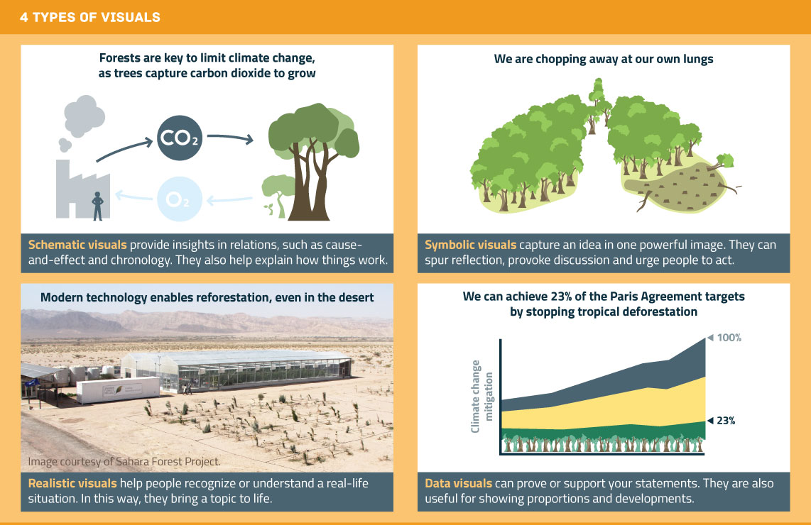
  • Bossen zijn belangrijk voor het beperken van klimaatverandering omdat bomen CO2 opslaan als ze groeien.
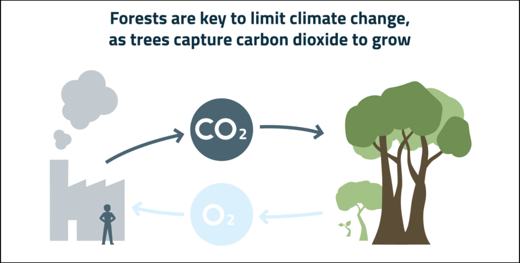
  • We hakken onze eigen bron van zuurstof om.
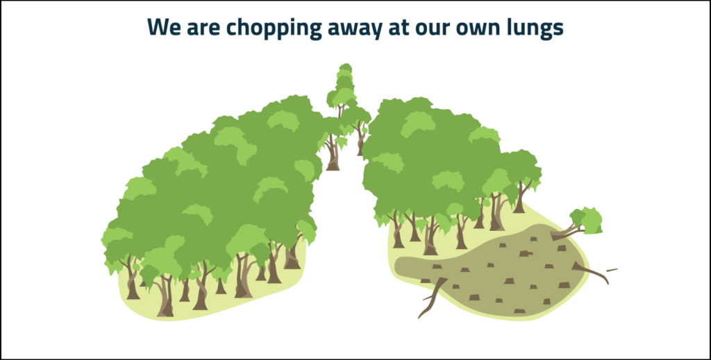
  • Moderne technologie helpt bossen terug te groeien, zelfs in de woestijn.
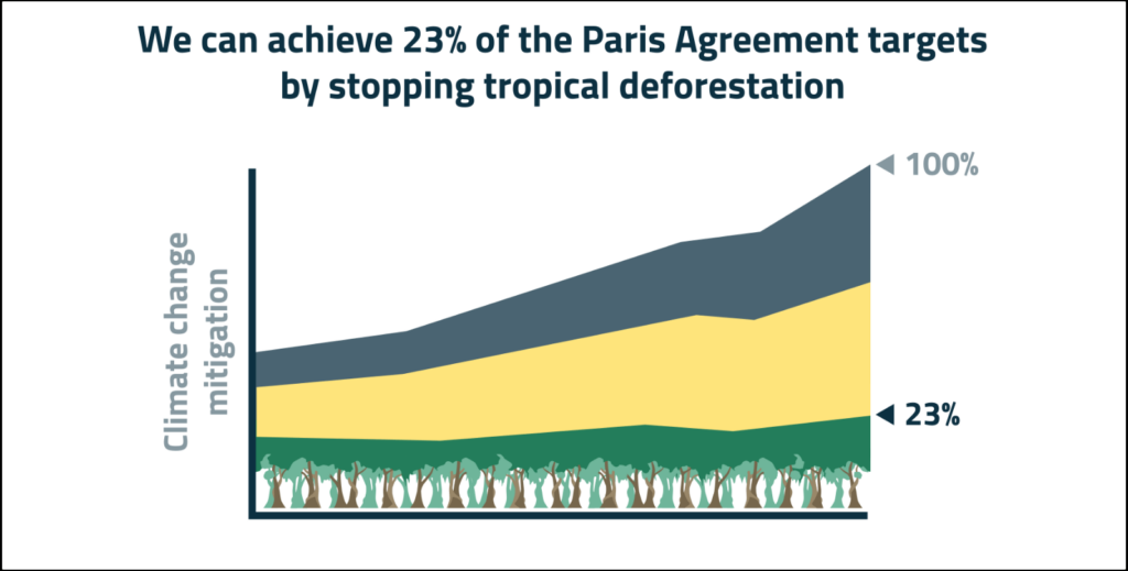
  • Als tropische ontbossing stoppen kunnen we 23% van de doelstellingen uit het Parijsakkoord halen.

Heb je je boodschap scherp? Dan ben je klaar om een passend type beeld te kiezen.

Beeldtype 1: schematische visualisatie

Een schematische visualisatie geeft versimpeld en abstract weer hoe iets werkt.

Met zo’n visualisatie kun je goed jouw mentale beeld overbrengen op je publiek. Bijvoorbeeld jouw beeld van een onzichtbaar proces:

Een schematische visualisatie kan ook de vorm hebben van een oorzaak-gevolgrelatie, een chronologie of een stappenplan.

Daarnaast kun je met een schematische visualisatie goed de complexe samenhang tussen onderdelen verduidelijken. Denk bijvoorbeeld aan de onderdelen van een apparaat, het lichaam of een organisatie.

Bekende voorbeelden van schematische visualisaties zijn een gebruiksaanwijzing van IKEA, een metrokaart, stroomschema’s, Venndiagrammen en een uitleg van elektrische circuits in een natuurkundeboek.

Ten opzichte van foto’s hebben schematische visualisaties een belangrijk voordeel. Je kunt in een schematische visualisatie namelijk precies bepalen welke details je laat zien. En zo de aandacht van de kijker richten op dat wat belangrijk is. Een afgebeeld mens hoeft bijvoorbeeld geen vrouw of man te zijn, als dat voor je verhaal niet uitmaakt.

Beeldtype 2: symbolische visualisatie

Wil je je boodschap krachtig overbrengen?

Overweeg dan een symbolische visualisatie.

In een symbolische visualisatie verbeeld je je boodschap met een metafoor of analogie. Daarom wordt dit type beeld ook wel ‘visual metaphor’ genoemd.

Een voorbeeld:


Een symbolische visualisatie zorgt dat je boodschap goed blijft hangen. Ook leidt hij eerder tot discussie, reflectie en actie.

Vanwege hun zeggingskracht worden symbolische visualisaties veel gebruikt in reclames, campagnes van ngo’s en in de politiek.

BMW maakte bijvoorbeeld een poster met een enorme hond met een minivoerbakje. ‘More power, less consumption’ was de boodschap.

Ook in de zakelijke communicatie bestaan legio voorbeelden van symbolische visualisaties. Denk aan een bergtocht naar de top (het doel), software als Zwitsers zakmes of mensen in een team die een kar trekken (of tegenhouden).

Deze voorbeelden zijn bekend, maar ook enigszins cliché. Alsnog zijn ze effectief. En dat geldt helemaal als je een originele en treffende metafoor weet te bedenken.

Beeldtype 3: realistische visualisatie

Kan je publiek zich weinig voorstellen bij wat je vertelt?

Bijvoorbeeld over een nieuwe techniek, een ziektebeeld of een onbekende diersoort?

Dan is een realistische visualisatie een goede optie.

In een realistische visualisatie laat je zien hoe iets eruitziet, meestal met een foto. Een voorbeeld:


Je publiek heeft waarschijnlijk geen duidelijk beeld van hoe bossen in de woestijn kunnen groeien.

Door de foto verandert dat: deze toont de locatie, de bouwwerken en objecten die een rol spelen en hoe groot die zijn.

Met een realistische visualisatie breng je dus in één oogopslag veel informatie over. Daardoor begrijpt je publiek je beter en stellen mensen bijvoorbeeld betere vragen of geven ze betere feedback.

Een realistische visualisatie maakt bovendien direct duidelijk dat iets echt bestaat en niet zomaar een plan is.

Beeldtype 4: datavisualisatie

Gaat je boodschap over data? Of kun je die met data onderbouwen?

Dan is een datavisualisatie vaak gewoon de meest logische optie.

Bijvoorbeeld:


Met een datavisualisatie kun je onder meer goed de verhouding tussen onderdelen tonen. Zoals die tussen de verschillende maatregelen om klimaatverandering te beperken.

Ook ontwikkelingen in de tijd kun je goed laten zien met een datavisualisatie. Bijvoorbeeld hoe de noodzaak van klimaatmaatregelen in de loop van de jaren toeneemt.

Datavisualisaties zijn meestal technischer en gedetailleerder dan andere typen visualisaties. Vaak passen datavisualisaties daarom het beste later in je verhaal.

In het begin van je verhaal is het meestal goed om in te gaan op het grotere plaatje: de ‘why’. Dat kun je meestal beter overbrengen met een ander type visualisatie.

Wil je beter worden in datavisualisaties? Het boek Storytelling with data is een aanrader.

Als je een type beeld hebt gekozen

Hopelijk heb je door de vier typen beeld nieuwe ideeën om je boodschap te visualiseren.

Heb je een type beeld gekozen?

Dan is de volgende stap om te bedenken hoe dat beeld er precies uit moet zien.

Ik raad je aan om daarbij eerst met pen en papier een schets te maken. Dan kun je from scratch nadenken over je beeld. En ben je niet gebonden aan iemand anders’ keuzes qua compositie, kleur en details.

Weet je hoe je beeld eruit moet zien? Dan is het tijd om het uit te werken in een softwareprogramma of op zoek te gaan naar een bestaande foto.

Succes!


Arnaud is trainer, adviseur en tekstschrijver bij Analytic Storytelling. Hij helpt klanten om een heldere en overtuigende boodschap op papier te krijgen in woord en beeld.

How to choose a fitting visual

Question.

Have you ever taken classes about designing or choosing visuals? For your slides, for instance?

For most knowledge workers, the answer is ‘no’. At universities, designing visuals is rarely part of the curriculum.

Even though almost everyone has to give presentations, later, at work.

The result?

Visuals anxiety. Image insecurity. Perhaps even image shame.

The sense that you are just improvising.

Based on intuition. Based on what you see others do.

Sounds familiar?

This article offers some tools to choose consciously between 4 types of visuals. Every type of visual has its own advantages and disadvantages.

This article helps you, for instance, when you often use the same type of visuals. For example, when 80% of your slide show depicts data visualizations, or schematic representations of cell structures.

The article also helps you when you use very few visuals. When 80% of your slides show bullet points with text, for example.

Start with your message

What type of image you choose depends on your message.

So make sure that you first know what message you want to get across to your audience.

My advice is to really write down your message beforehand. In a complete sentence, including a verb.

This forces you to formulate a message, and not just a topic.

The difference?

A topic is a word. Or a couple of words.

For instance: tropical deforestation. Or: modern technology.

A message is a complete sentence, with which you make a statement about such a topic.

For instance:

  • Forests are important for mitigating climate change because trees capture carbon when they grow.
  • We are chopping down our own source of oxygen.
  • Modern technology helps forests grow back, even in the desert.
  • If we stop tropical deforestation, we can achieve 23% of the targets in the Paris Agreement.

Did you sharpen your message? Then you are ready to choose a fitting image.

Type 1: schematic visuals

A schematic visual offers a simplified and abstract image of how something works.

With this type of visual, you can get your mental image across to your audience. For instance, how you picture an invisible process:

A schematic visual can also take the shape of a causal relationship, a chronology, or a step-by-step plan of action.

In addition, a schematic visual lends itself well for illuminating complex connections between components. Think of the parts of a machine, of the body, or of an organization.

Familiar examples are an IKEA manual, an underground map, flow charts, Venn diagrams and an explanation of electrical circuits in a physics book.

Schematic visuals have an important advantage over photos. You can decide precisely which details you depict. And therefore, guide the viewer’s attention to what’s important. For instance, a person in your image needn’t be male or female, if it doesn’t matter for your story.

Type 2: symbolic visuals

Do you want to make a powerful statement?

Consider using a symbolic visualization.

In symbolic images you visualize your message with a metaphor or analogy. For this reason, this type is sometimes called a ‘visual metaphor’.

An example:

A symbolic visualization makes your message stick. It is also more effective for encouraging discussion, reflection and action.

Because of their rhetorical power, symbolic visualizations are often used in advertising, in campaigns by NGOs, and in politics.

For instance, BMW made a poster with a huge dog looking at a minuscule feeder bowl. ‘More power, less consumption’ was the accompanying message.

There are also many examples of symbolic visuals in business communication. Think of a hike to the top of a mountain (the goal), software as a multi-purpose knife, or people in a team pulling a wagon (or obstructing it).

These examples are familiar, but also somewhat cliche. Still, metaphors are effective. Even more so if you can come up with an original and striking metaphor.

Type 3: realistic visuals

Does your audience have a hard time picturing what you are telling them?

For instance, about a new technique, a clinical presentation of a disease, or an unfamiliar animal species?

In that case, a realistic visual is a good option.

In a realistic visual you show the audience what something looks like, usually with a photo.

An example:

Your audience probably doesn’t have a clear image of how forests could grow in the desert.

This photo changes that: it shows the location, the buildings and objects that play a role, as well as their respective sizes.

With a realistic visual you convey a lot of information in one go. The result is that your audience will better understand your story, and that people ask better questions or give better feedback.

A realistic visual also communicates hat something actually exists, and isn’t just a plan.

Type 4: data visualizations

Is your message about data? Or can you support it with data?

In these cases, a data visualization is often just the most logical option.

For example:

A data visualization is useful for, among other things, showing how components compare to each other. Like various measures to mitigate climate change.

Data visualizations also lend themselves well for depicting developments over time. For instance, how mitigating climate change becomes more and more urgent over the years.

Data visualizations are usually more technical and detailed than other types of visuals. For that reason, data visualizations can often best be used later in your story.

It’s usually good to start your story with the bigger picture: the ‘why’. Usually, other types of visuals are more effective for doing this.

Want to get better at making data visuals? I would recommend Storytelling with data.

Once you have chosen a type of visual

I hope these 4 types have given you new ideas for visualizing your message.

Picked one?

The next step is to decide what it should look like, exactly.

I recommend first making a sketch with pen and paper. This allows you to design your image from scratch. Without the limitations of someone else’s choices of composition, color and details.

Do you know what you want the image to look like? Then it’s time to design it with graphic design software, or to start looking for an existing photo.

Good luck!


Arnaud is trainer, advisor and text writer at Analytic Storytelling. He helps customers to send out a clear and convincing message in both words and images

How to make sure your audience can follow you

A yawn. A frown. A remark that suggests they misunderstood you.

And you thought you explained something simple.

Why can’t people follow you? And more importantly: what can you do about it?

There is a technique for guiding people smoothly through your story, step by step. Even if that story is about something complex.

Since I started training people online, I have been using this technique more and more.

And I ask myself: why didn’t I do this before?

Like beads on a string

The technique that I am talking about is called ‘stringing’.

Or in any case, that is what I call it. As far as I know, there is no official name for it.

When you string, you connect a new concept to an old one – one that your audience is already familiar with.

Sounds simple?

It isn’t always in practice. Therefore: here are 6 tips for stringing properly.

1. Connect something new to something familiar

Theta interactions.

Without any context, this concept probably does not mean much to you. A concept only becomes understandable once it is linked to something familiar.

That is the reason why metaphors and analogies are so effective. When you string your concepts, you use a similar mechanism.

You always connect a new concept to a concept which you already introduced your audience. A concept you have made them ‘familiar’ with.

For instance:I took this example from a Nature article. For the sake of readability, I simplified it somewhat.

  • As you grow older, your working memory deteriorates.
  • This working memory deteriorates when certain brain circuits become less well connected.
  • The decreased connectivity in these brain circuits is the result of problems with two so-called theta interactions.
  • It is these theta interactions that we can stimulate using a new method.

As you can see, each new concept is explicitly linked to a concept in the previous bullet point.

As a result, the role of complex ‘theta interactions’ in this story is clear. Even to people who know nothing about these interactions.

As a knowledge worker you often communicate about complex, specialist concepts like theta interactions. For instance, about spin-lattice relaxation times (physics), Whole Life Costing (construction) or allogeneic hematopoietic stem cell transplantation (healthcare).

You can connect such specialist, unfamiliar concepts to a more general, familiar concept, step by step. A concrete, common concept, one which your audience is familiar with.

Your story is then shaped like a funnel: it moves from broad (general) to narrow (specific).

When you string your concepts, I recommend using color to mark the linking concepts – so these are the words that you repeat in the next bullet point. Just like I did in the example.

This is not my own idea, by the way. I got it from scientific writing coach Anna Clemens

So, this is what a good string of concepts looks like schematically:

  • AB
  • BC
  • CD

2. Don’t skip steps

Do you introduce a concept without connecting it to something familiar? That means you skip a step.

  • As you grow older, your working memory deteriorates.
  • Brain circuits become less well connected due to problems with two so-called theta interactions.

With this storyline, you assume that your audience is already knowledgeable about this topic. You assume that they know that the working memory has something to do with brain circuits.

Or that they can make this connection on their own.

Sometimes that’s the case, but you shouldn’t always count on it. Especially when you introduce more complex topics.

As an expert you tend to overestimate your audience. This phenomenon is known as ‘The curse of knowledge‘.

Even when you know your audience can make the connection, it is often still better to string these concepts together. It makes your story smoother and less bumpyThis text is understandable, but a bit bumpy:

Every year, the number of electrical cars increases.
The biggest challenge for policy makers is to decide where and when to add charging stations.
.

So don’t string like this:

  • AB
  • CD

3. Introduce one concept at the time

When you string, you build your story step by step.

Usually, it is wise to take no more than one step at the time. Which means: introduce no more than one new concept at the time.

If you don’t, you probably make your audience work too hard.

  • As you grow older, your working memory deteriorates.
  • The working memory deteriorates when certain brain circuits become less well connected, due to problems with two so-called theta interactions.

There is one exception to his rule of thumb.

Is your story about multiple concepts that have an equal ‘status’ in the story? Then it often makes sense to introduce these together.

In such cases it is extra important to make the structure of your story explicit.

  • These two theta interactions are the theta-gamma phase amplitude coupling (1) and the theta phase synchronization (2).
    • The theta-gamma phase amplitude coupling (1) takes place in the temporal lobe.
    • The theta phase synchronization (2) takes place in the frontotemporal cortex.

So, in general, don’t string like this:

  • AB
  • BCD

4. Familiar concepts first

A common writing advice is ‘complexity last‘.

This means that you should put simple information at the beginning of a sentence. And complex information at the end.

It is also a good approach when you string: start your sentences with the part that your audience is already familiar with.

The new concept is always ‘more complex’, more difficult to process.

If you don’t do this, your audience doesn’t know where you are going.

  • Your working memory deteriorates, as you grow older.
  • A decrease of connections in certain brain circuits lead to the deterioration of the working memory.
  • Problems with two so-called theta interactions result in these circuits being less well connected.

It takes more cognitive energy to follow this storyline. And it has a less pleasant flow.

That is because similar concepts sit far apart from each other. The link with the familiar, old concept doesn’t become apparent until you reach the end of the sentence.

So don’t string like this:

  • BA
  • CB
  • DC

5. Remove unnecessary repetitions

Stories about complex topics tend to contain many concepts.

How do you keep your story manageable?

The trick is to only use concepts when you really need them. Preferably clustered at one single pointThe previously mentioned article by Anna Clemens contains a nice example of this. in your story.

A concept then appears in two consecutive bullets. And only there.

Otherwise you risk conceptual overkill:

  • As you grow older, your working memory deteriorates.
  • Older people’s working memories deteriorate as a result of the fact that certain brain circuits are less well connected.
  • These important circuits for the working memory are related to two so-called theta interactions.
  • We can improve older people’s working memory by using a new method, which stimulates these theta interactions.

The green concept ‘working memory’ appears in every bullet point.

In the last few bullets, this concept is crowding out the new, more specific concepts. As a result, these new concepts may be overlooked.

Also, if you don’t cluster your concepts, your sentences become unnecessarily complex as you continue to add new concepts.

So don’t string like this:

  • AB
  • ABC
  • BCD

6. Avoid synonyms

Working memory, working memory, working memory.

To avoid such repetitions, people often use synonyms.

Stylistic variation makes a story less monotonous.

But synonyms can be dangerous when you are stringing.

  • As you grow older, your working memory deteriorates.
  • Your short term memory deteriorates when certain brain circuits are less well connected.

Because of the synonym, there is less emphasis on the concept that links the two bullet points: ‘working memory’. People can no longer see instantly how the new concept is related to the old.

In the best case, your audience has to work harder because of the synonym.

In the worst case, they don’t recognize the synonym as such.

To avoid repetitions, you can sometimes refer to the previous sentence by using words like ‘this’, ‘that’ and ‘these’.

  • This happens when certain brain circuits are less well connected.

So don’t string like this:

  • AB
  • βC
  • χD

String concepts whenever you can

The stringing technique is mainly useful when you are in the phase of building a story structure. By making a bullet list, for instance.

But you can also use it in a full text, a presentation, or any other type of communication.

For instance, you can string the titles of slides together. Or the first sentence of each paragraph. Or the sentences within a paragraph.

In online training courses, I often analyze the connecting concepts in a story, adding colors to a shared screen.

Clearly, you can do this too.

Not sure if your audience will be able to follow you?

Grab a pair of markers, digital or real!


Arnaud is trainer, advisor and text writer at Analytic Storytelling. He helps customers to send out a clear and convincing message in both words and images.

Hoe je zorgt dat ze het wél begrijpen (met 5 handgetekende voorbeelden)

Mike hoort zichzelf praten. De patiënt kijkt hem glazig aan.

Mike probeert het nog een keer. Geen jargon. Simpele woorden.

De patiënt knikt beleefd. Toch ziet Mike aan zijn blik dat hij het nog steeds niet begrijpt.

Hmpfh…

Hoe moet hij het dán uitleggen?

Iedereen die communiceert over een ingewikkeld onderwerp, loopt weleens vast. Dokters zoals Mike, maar ook wetenschappers, ingenieurs, beleidsmedewerkers en financiële experts.

Meestal zoeken we naar andere woorden om onze uitleg te verbeteren.

Heb je er weleens aan gedacht om het helemaal anders aan te pakken? Je kunt namelijk ook schetsen om iets uit te leggen.

Schetsen zijn doeltreffend

Inderdaad, poppetjes tekenen. En bomen, auto’s en appels.

Een simpele, handgetekende schets is vaak enorm effectief. Want door een schets begrijpt je publiek je beter en sneller.

Een schets waarmee je iets uitlegt, ziet er bijvoorbeeld zo uit:

De meeste kenniswerkers tekenen zelden.

Omdat ze er gewoon niet aan denken. Omdat ze niet weten hoe dat zou moeten. Of omdat ze denken dat een schets niet professioneel overkomt.

Tekenen ligt meestal buiten hun comfortzone.

Hieronder bespreek ik voorbeelden van uitlegschetsen. Zodat je een beeld hebt van hoe je zo’n schets zelf zou kunnen inzetten. En waar je daarbij op moet letten.

Alvast een geruststelling: je hoeft niet goed te kunnen tekenen!

Sketchplanations als voorbeeld

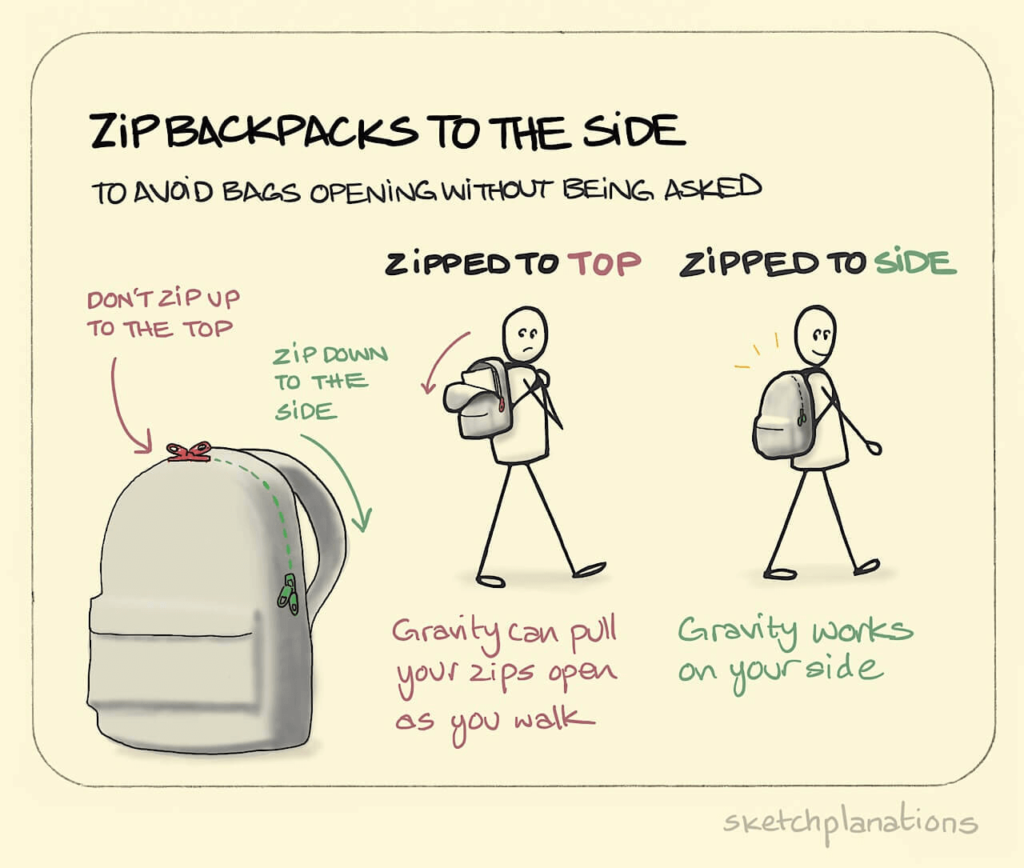
Het rugtasvoorbeeld komt van sketchplanations.com. Op die site plaatst ontwerper Jono Hey elke week een nieuwe schets over een onderwerp dat hem interesseert.

Het zijn leuke, visuele kennissnacks die je in een halve minuut weghapt.

Vaak leer je er ook nog wat van. De rugtastip pas ik zelf bijvoorbeeld consequent toe.

Als kenniswerker communiceer je meestal over complexere onderwerpen dan rugtassen. Zo’n onderwerp lijkt misschien moeilijker te tekenen omdat het abstracter is.

Gelukkig gaan sketchplanations ook vaak over complexe, abstracte onderwerpen. Ik heb er vijf geselecteerd.

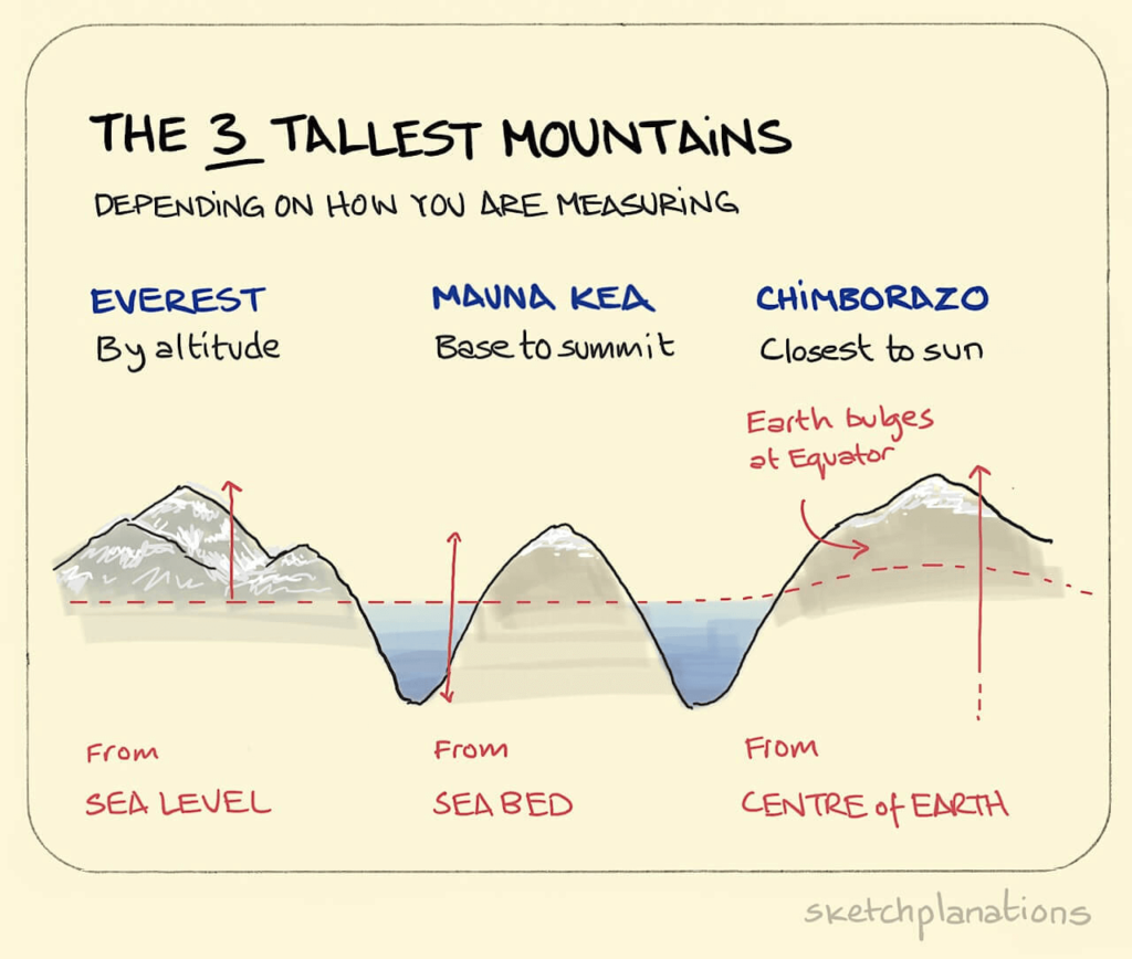
#1: The 3 tallest mountains

De Mount Everest is de hoogste berg op aarde. Dat weet iedereen. Toch zijn er nog twee bergen die aanspraak kunnen maken op deze titel.

Hey legt het als volgt uit:

Uiteraard kun je dit idee ook met woorden uitleggen. Maar met beeld gaat de uitleg sneller. Door beeld begrijpt het publiek bijvoorbeeld direct het effect van de uitstulping rond de evenaar.

Als je zelf schetst, is het vaak niet nodig om zo mooi te tekenen als Jono Hey. De bergen van Hey bevatten best veel detail. Het kost extra tijd om zo te tekenen.

Een aardrijkskundeleraar die dit idee wil uitleggen, heeft genoeg aan een paar simpele lijnen op het schoolbord.

Een lijn, een driehoek, een cirkel, en een vierkant. Met deze basisvormen kun je eigenlijk alles schetsen.

Goede tekenvaardigheden zijn dus niet zo belangrijk. Veel belangrijker is dat je kunt bedenken hoe je schets eruit moet zien.

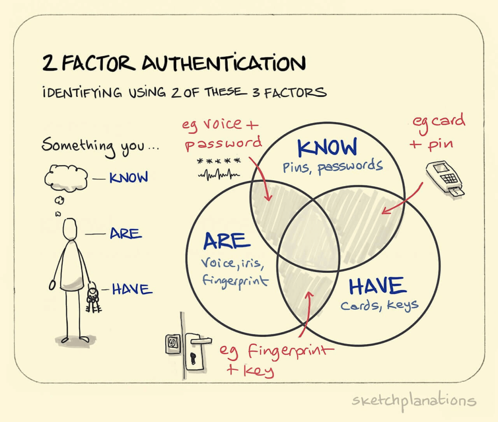
#2: Two-factor authentication

Deze sketchplanation gaat over two-factor authentication: een bekend concept in de beveiliging.

Om het concept op abstract niveau uit te leggen gebruikt Hey een venndiagram. Maar hij doet ook nog wat anders.

Hij tekent een mens. En met sleutels en vingerafdrukken laat hij zien hoe two-factor authentication eruitziet in onze alledaagse wereld. Als hij dat niet zou doen, zou de schets duidelijk zijn, maar vrij abstract blijven.

Dit kun je zelf ook toepassen als je gaat schetsen.

Bedenk hoe mensen in jouw onderwerp een rol spelen. Zoals je patiënt, je gebruiker of je klant. Als je hen tekent, wordt je uitleg duidelijker, invoelbaarder en urgenter.

Als je zelf mensen schetst, is een simpele ‘stick figure’ meestal voldoende.

Ook als je schrijft of praat, is het goed om het over mensen te hebben. Alleen doe je dit niet automatisch omdat je in taal makkelijk abstract blijft. In taal kun je het bijvoorbeeld prima hebben over ‘kennisvalorisatie’, ‘agile werken’ of ‘de circulaire economie’ zonder dat het expliciet over mensen gaat. Dat gebeurt je in een schets minder snel.

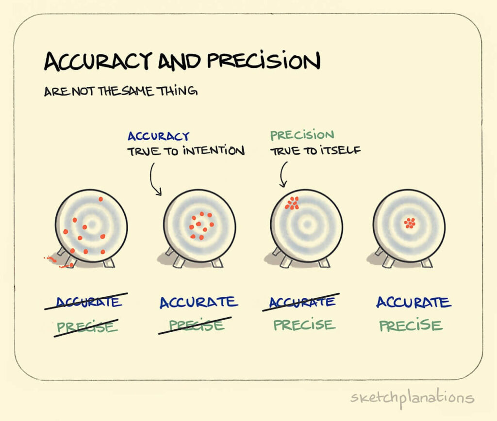
#3: Accuracy and precision

Het onderwerp van deze sketchplanation – het verschil tussen juistheid en precisie – is wat abstracter en complexer dan de voorbeelden hiervoor.

Een metafoor kan helpen om zo’n abstract idee uit te leggen. Zonder de metafoor van de schietschijf is dat niet heel makkelijk.

Ook in taal is een metafoor effectief. Maar omdat een metafoor vaak beeldend is, kun je hem meestal ook goed schetsen en dan begrijpt je publiek het nog sneller.

Met een beetje fantasie kun je zelf ook doeltreffende metaforen bedenken. Vaak is dit nog leuk om te doen ook.

Deze sketchplanation heeft nog een belangrijk element.

Kleur.

Jono Hey gebruikt altijd zwart als basiskleur. Daarnaast gebruikt hij kleuren voor de onderdelen die inhoudelijk van belang zijn. Elk onderdeel krijgt een eigen kleur.

Door kleur ziet je publiek in één oogopslag wat ‘hetzelfde’ is. Daardoor kunnen ze de schets sneller begrijpen. Daarnaast maakt kleur het beeld aantrekkelijker. Het beeld trekt zo meer de aandacht.

Je kunt ook te veel kleur gebruiken. Dan wordt het beeld juist onrustig en chaotisch. Gebruik in je schets dus kleuren bewust en alleen voor dingen die inhoudelijk belangrijk zijn.

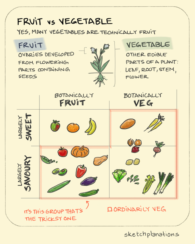
#4: Fruit vs vegetable

Tomaten zijn eigenlijk fruit.

Misschien heeft iemand dit wel eens tegen je gezegd.

Nu blijkt dat het groente-en-fruitspectrum nog veel ingewikkelder in elkaar steekt. Als tomaten fruit zijn, geldt dat ook voor avocado’s, komkommers en aubergines.

Beeld leent zich goed om een simpele tegenstelling uit te leggen. Het bovenste deel van de sketchplanation laat dat goed zien.

Hier is het fruit versus groente. In het vorige voorbeeld was de tegenstelling precies versus accuraat. Ook tegenstellingen zoals voor/na, nu/toekomst en goed/slecht lenen zich vaak goed voor een schets.

Doordat je onderdelen visueel van elkaar scheidt (meestal links/rechts) ziet je publiek direct wat waarbij hoort.

Het onderste deel van de sketchplanation toont nog een ander sterk punt van beeld: je ziet alle verschillende onderdelen tegelijk.

Dat heeft grote voordelen ten opzichte van tekst waarbij je publiek de verschillende onderdelen altijd na elkaar ervaart.

Beeld maakt de samenhang tussen de onderdelen sneller duidelijk. En je hoeft niet steeds opnieuw te verwijzen naar onderdelen zoals ‘botanically fruit’ en ‘largely sweet’, terwijl dat in tekst wel zou moeten.

Met een schets kan je bijvoorbeeld ook goed uitleggen uit welke onderdelen een cel, orgaan, machine, organisatie of netwerk bestaat. En hoe die onderdelen met elkaar interacteren.

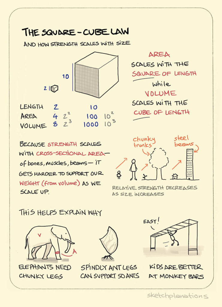
#5: The square-cube law

De square-cube law is een wiskundige wet. Zoals wel vaker bij wiskundige wetten is deze niet zo makkelijk uit te leggen.

Jono Hey combineert in deze sketchplanation twee dingen.

Aan de ene kant maakt zijn schets het technische, wiskundige gedeelte inzichtelijk. Je kunt dit vergelijken met het venndiagram bij de two-factor authentication.

Aan de andere kant geeft hij herkenbare voorbeelden uit de biologie en de bouwkunde. De olifant, de mier, het kind, de boom, het gebouw.

Voorbeelden en concrete, alledaagse objecten helpen enorm om een onderwerp toegankelijker te maken en tot leven te wekken. Eerder zagen we al het sleutelgat, de pinautomaat, de banaan en alle andere groente- en fruitsoorten.

En dan is er nog iets dat opvalt.

Deze sketchplanation bevat vrij veel tekst.

Schetsen hoeven natuurlijk ook niet altijd voor zichzelf te spreken. Meestal kun je er zelf immers iets bij vertellen of iets bij schrijven.

Een schets met erg veel tekst is vaak wel minder effectief en minder aantrekkelijk. Maar tekst is dus zeker niet verboden.

Zelf aan de slag: schetsen kan vaker dan je denkt

Ik hoop dat de sketchplanations je inspireren om vaker zelf het schetspotlood ter hand te nemen.

Het kan vaker dan je denkt.

Ik zal niet snel vergeten dat mijn aankoopmakelaar voor me tekende hoe sommige huizen in Haarlem op palen staan. En hoe je kan controleren of zo’n huis verzakt is.

Ook de radioloog die het ‘divertikeltje’ (uitstulping van de darmwand) in de buik van mijn zoon tekende, scoorde daarmee punten. En de tekening hielp me echt om beter te begrijpen hoe het zat.

In veel van onze trainingen maken wetenschappers en andere kenniswerkers schetsen over hun onderwerp. Eigenlijk iedereen blijkt in staat om te tekenen. Ook mensen die acht uur per dag achter de computer of in het lab zitten.

Bovendien blijkt dat eigenlijk elk onderwerp zich leent voor schetsen.

Meer voorbeelden?

Wil je meer inspiratie opdoen? Op sketchplanations.com staan nog veel meer uitlegschetsen over uiteenlopende onderwerpen. Je kunt je ook aanmelden voor de nieuwsbrief. Zelf bekijk ik elke zondag met veel plezier de nieuwe uitlegschets in mijn inbox.


Arnaud is trainer, adviseur en tekstschrijver bij Analytic Storytelling. Hij helpt klanten om een heldere en overtuigende boodschap op papier te krijgen in woord en beeld.