

You have worked hard, and now you present your result to your audience.
Your audience shows no response.
Did they not understand? Were they bored? Or both?
It’s a common challenge for everyone who works on specialist topics: how do you prevent people from tuning out when you discuss complex information?
To what extent you get your audience involved depends on multiple factors. But one of those factors is often overlooked by communicators: how much abstract language you use. That makes a big difference.
Abstract language won’t get your audience engaged
We all do it. Programmers don’t build banking apps, they build mobile payment solutions. Scientists experiment on test subjects – not on Sean, Alexandro and Natasha. And urban planners work with data points in urban mobility studies, not with sweaty, crowded subway carriages.
Abstractions like these may be useful for expert communication. But for most readers and listeners, excessively abstract language can be pretty confusing and, frankly, quite boring too.
To tell vivid, engaging stories that are easy to understand, you need colorful, concrete details.
Since abstract language is very common in science and policy, you may be accustomed to using it. Which makes it difficult to recognize, let alone turn it into something more lively.
6 suggestions to make your abstract story more concrete and vivid
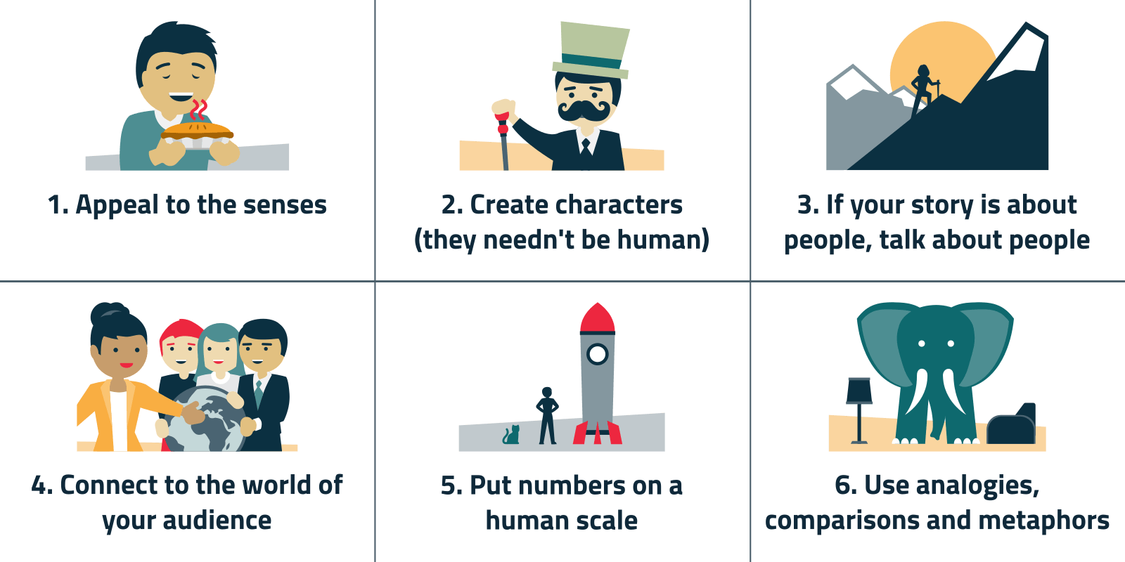
1. Appeal to the senses
When you describe things in sensory terms – hairy, pale brown, plate-sized – you help your audience create a mental image. These images turn your into a vivid experience. Which will get your audience more involved.
Let me give you an example. A famous book about the devastating effects of pesticides on the environment is titled Silent spring. It´s possible to formulate a more abstract title that better summarizes the main idea. The adverse environmental effects of indiscriminate pesticide use, for instance. But ´Silent spring´ invites you to imagine what spring would sound like if pesticides would have eliminated all birds. That is a much more effective way to deliver the message.
No matter how good we are at abstract thinking, we experience the world first and foremost through our senses. That is why sensory descriptions are much easier for us to process.
Sensory language is also useful to describe things we can´t experience through our senses. For instance, nanomaterials are sometimes described as ‘smooth’ or ‘rough’. We could never touch these surfaces, but we can imagine what they are like, because we know what roughness and smoothness feel like. Abstract descriptions of their ‘surface topographies’ are less effective.
A polished beach ball
In 1957, the first man-made satellite, Sputnik, was launched into orbit. Most people had no idea what this novel technology looked like. Therefore, a Time magazine journalist included some concrete details in his news article about the launch:
“…hundreds of miles from the earth, a polished metal sphere the size of a beach ball passed over the world’s continents and oceans.”
That the Sputnik was polished, spherical and beach-ball-sized was probably not the most important thing there was to say about it. (It was launched by the Soviets, for instance.) But these little details were essential to help Time readers picture this novel thing. A more abstract definition – something like a man-made device orbiting the earth – would have been less helpful.
A hairy pumpkin seed
Recently, scientists discovered a new and unusual looking species of microbes. One that seemed very different from known species – which most people are not very familiar with anyway. Therefore, a popular-science journalist described what they looked like as follows:
“…under the 3D magnification of scanning electron microscopy, the creatures somewhat resemble hairy pumpkin seeds.“
What was striking about these microbes was that they appeared to belong to a previously unknown super-kingdom. This meant that the ‘tree of life’ had to be reorganized. The image of the hairy pumpkin seed is the cartwheel that carries this more abstract information about biological classification. And the odd mental image may help you remember this story too.
2. Create characters (they needn't be human)
It’s less common to use characters in information-driven stories – but not less effective. Using a character, you can make your complex story more accessible and easier to understand.
So, if your story is about people, don’t hide them behind abstractions. Describe them as real human beings.
In a story about Alzheimer patients, you could describe a specific patient. Perhaps seventy-eight-year old Joanna, who can’t remember her children’s names, but loves to walk with them in the park.
In a story about the super-rich, you can mention Shahid Khan, a man with a handlebar mustache whose net worth is 8.1 billion dollar, which includes a British football club and a 300-foot superyacht.
Is your story not about people? No problem. Anything that can carry the plot like a human character can, is suitable.
For instance, you could describe corruption from the perspective of a bribe that goes from hand to hand. Or explain photosynthesis by describing it from the ‘viewpoint’ of a carbon dioxide molecule. Or show how misinformation spreads online, by reconstructing the spread of a single conspiracy theory.
Complex processes become easier to understand when you describe them from such a single perspective. A character provides a red thread that helps your reader navigate the complexities of your topic.
So, ask yourself: who or what could serve as a protagonist in your story?
A potato’s journey
In 1997, Asian countries were on the verge of a financial crisis. This crisis threatened to spread to the American market. A financial journalist called Richard Read was tasked with explaining this to his American readers.
Read knew that they would not have the patience to plough through abstract economic analyses. So, he decided to focus on something very concrete instead: a batch of potatoes, grown in the US, and destined to be sold as French fries in a McDonald’s in Indonesia.
These potatoes became the main characters of the story. And their trip to Asia became the red thread. From the potato farm, via a fries factory, to the freighter ship that took them to Asia. This allowed Read to tell the stories of the people who handled them along the way: the potato farmers, truck drivers, sailors and potato distributors – all of whom might be affected by the crisis.
By focusing on a single batch of potatoes, Read could make a more abstract point: that the American and Asian economies were intertwined.
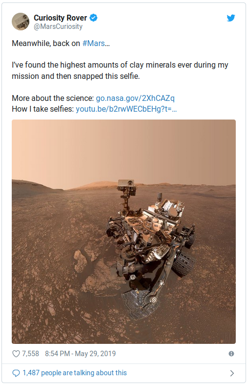
Tweets from Mars
NASA’s current Mars mission has an ambitious research agenda. What is the chemical and mineralogical composition of Mars´ surface? Are there traces of the ‘building blocks of life’? What are the weather and climate like? – and many more research questions. The mission has already produced a pile of scientific publications on a wide range of topics. But these are, of course, not very accessible to non-experts.
Enter Curiosity, the Rover that landed on Mars in 2012. She is the central character in a more accessible story about this mission.
NASA presents her like a creature indeed: she has a ‘body’, ‘eyes’, a robot arm with a ‘hand’, and a ‘neck and head’ (a mast with cameras).
What is more, NASA gave Curiosity a voice, or rather, a Twitter account. That’s how the rover keeps the world up to date about research and discoveries. She currently has about 4 million followers.
Through Curiosity, NASA created a single perspective that helps people follow the mission: that of a brave little robot on a faraway planet. Looking good on selfies like this one:
3. If your story is about people, talk about people
Take ‘gentrification’. What does that mean?
A dictionary definition may give you an idea: ‘the buying and renovation of houses and stores in deteriorated urban neighborhoods by upper- or middle-income families or individuals, raising property values but often displacing low-income families and small businesses.’
But that’s still quite abstract. What does ‘deterioration’ mean – crumbling houses, or crime and violence? And what exactly happens to you when you are ‘displaced’?
The abstract definition describes worldwide similarities. But gentrification looks and feels different in London, Shanghai and Cape Town. Ignoring such local differences makes comparative analysis possible. That is the value of abstraction.
But if you want to tell an engaging story to an audience that isn’t familiar with this, then the messy, colorful local realities are indispensable. Specific details about real people and their experiences help your audience picture your topic.
You could zoom in on, for instance, a poor resident of a previously segregated neighborhood in Cape Town. Describe how luxury hotels and apartments are being built. Explain how this pushes up his rent, and how his neighbors and friends have moved away. Describe the streets that are being swept and the expensive shops that have replaced his local grocery.
To get your audience engaged, to help them create a mental image, you need such specific details.
We all live on Dollar Street
Global wealth inequalities are often expressed in big numbers. You have probably read somewhere that forty-two million people, or 0.9 percent of the world population, possess more than 1 million dollars. Or that the top 26 richest people have the same net worth as the poorest half of the world’s population, which is about 3.8 billion people.
But what does that mean for the people involved? What is it like to own a million dollar? What is ten dollar worth in Madagascar, Ecuador or Moscow?
The online photo project Dollar street makes wealth inequality concrete. In this project, the whole world population lives on one imaginary street. Households are sorted according to monthly incomes, with the poorest people living on one end of this street, and the richest on the other.
You can browse photos of everyday objects of these households. Click on a family, say, the Paramanik family in Bangladesh, and see their kitchen, bedroom, toilet, toys, toothbrush. At the bottom of each photo is their monthly income.
You can also sort the photos of all families by category. Select ‘kitchens’, and you see how people cook across the world – from open fires to built-in kitchens.

A very telling category is ‘most loved item’. On the poor left end of Dollar street, people cherish a pair of scissors, a plough, and, strikingly often, passports and other official documents. On the right, people love their camper cars and Ipads.
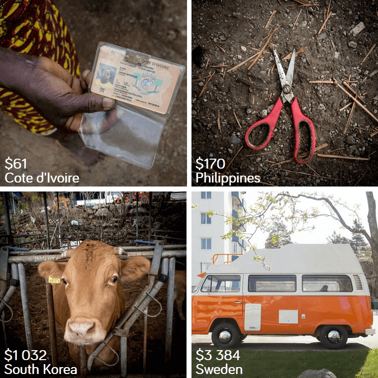
As it turns out, comparing what shoes people wear across the world, where they pee, and what things they cherish most, gives you a much better idea of wealth inequality than numbers can.
4. Connect to the world of your audience
That is relatively easy when you work on topics in medicine or economics, for instance. After all, all people in your audience have bodies. And most are affected by economic developments.
Still, such connections often remain implicit. Many people use generalizing, abstract language, out of habit. When you do this, your story feels more distant to your audience than it actually is. Which means that you miss an opportunity to get them involved.
An example. In a presentation about diabetes, you may discuss high glucose levels in ‘the’ blood, and how these may damage ‘the body ‘. But you can also refer to your audience´s blood sugar levels, which may be spiked by the sandwich they just ate. Or estimate how many of them are at risk of developing diabetes, based on statistics.
This is also possible with topics that are more distant from your audience’s everyday experience. Compare a newly discovered microbe to the ones that live in their kitchens or on their skin. Or, when you discuss cosmic rays, mention the effects that this radiation can have on your audience’s computers. Even if the relevance is less obvious, you emphasize the fact that this is about your audience’s world.
These are your cells
These are the first few lines of an article about genetic mutations:
“As you read this article, the cells in your body are dividing and the DNA in them is being copied, letter by letter. So long is the human genome—more than 3 billion letters—that even an astonishingly low error rate of one in many million letters could amount to 10 new mutations every time a cell divides.”
People may not be happy to be reminded of what could go wrong in their bodies – which is probably why the author proceeds to discuss how most of these mutations are harmless. Nevertheless, this opening is an effective way of emphasizing the relevance of the topic to the readers. It makes it difficult for the reader to think this is not about them.
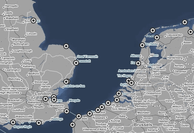
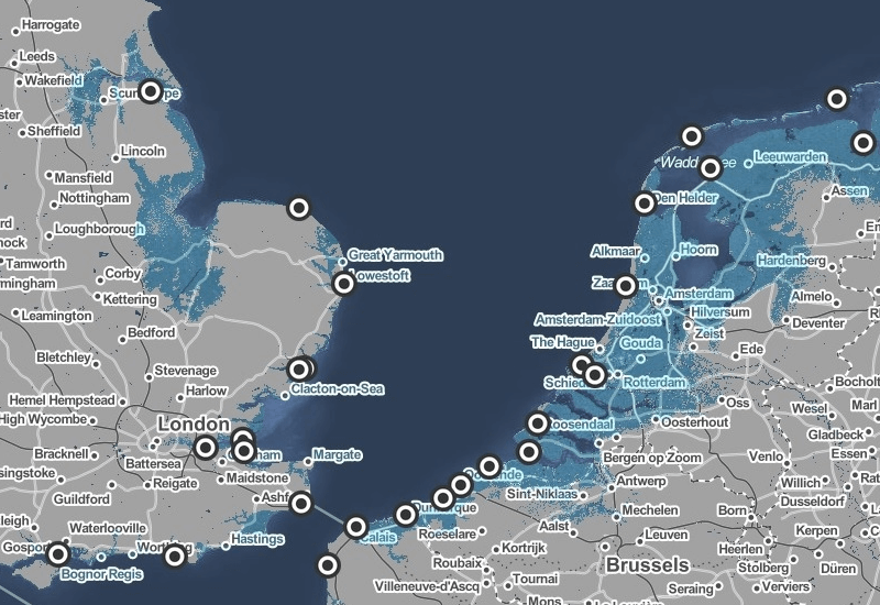
This is your city
Projections show that because of global warming, the sea level may rise up to one to two meters at the end of this century.
That sounds urgent. But it is also difficult to picture and connect to our everyday world. Any idea how one meter would affect your hometown? Or two?
In the app Surging seas you can check this out. It shows you a map of the world, which you can manipulate by tuning the sea level up or down. You can zoom in on your home in, say, The Netherlands or England, to see which areas flood when the sea level rises 1.5 meter, and which at 3, or 10. You see your own city flood before your eyes, street by street, as you turn up the sea level dial.
The app also tells you in what year this would happen, in different emission scenarios. With unchecked emissions, The Netherlands will see 1 meter sea level rise 70 years from now. That really brings it home:
5. Put numbers on a human scale
But in another way, we suck at dealing with big numbers. We really struggle to comprehend them. How much is 23 billion dollar? Is Iceland’s economy doing well? Do humans have a large or a small genome?
It´s likely that your work involves big numbers too. Perhaps millions of years of evolution, hundreds of thousands of patients or billion-euro budgets. If you want a non-expert audience to get a feel for these numbers, you must translate these numbers to a more human, everyday scale. That is: to amounts, distances and time periods that we know from experience.
An example. A billion and a trillion are both incomprehensibly large numbers. That makes it easy to overlook how different they are. The BBC explains it like this:
“A million seconds is 11 days, a billion seconds is about 32 years and a trillion seconds is 32,000 years.“
Only when you translate these numbers to unities that we know from experience, you see that a billion and a trillion are very different indeed.
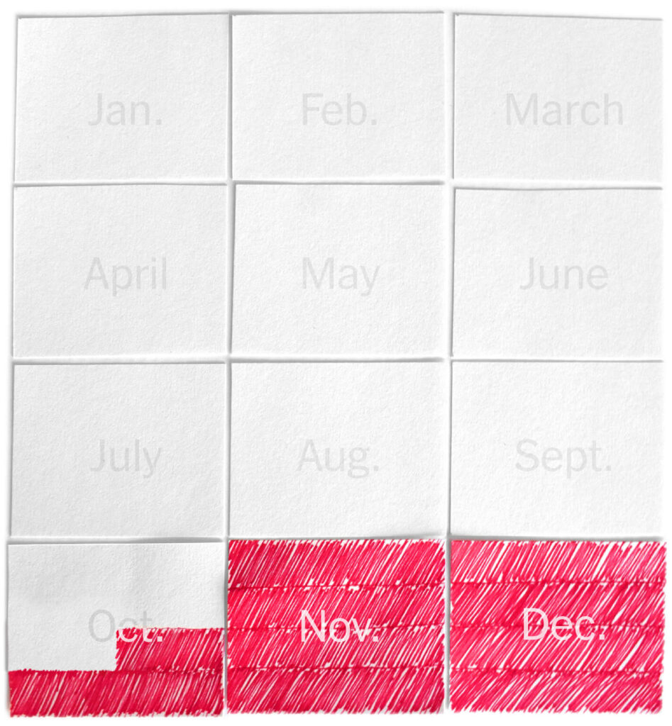
The cosmic calendar
The cosmic calendar is a one-year calendar, like the one on your wall or in your agenda. But this one comprises the whole history of the universe. The Big Bang takes place on January 1st. The present is always midnight, December 31st.
Our solar system formed on September 2nd. Multicellular life emerged on December 5th. The dinosaurs arrived at Christmas day and disappeared on December 30th – compare that to us, modern humans, who appeared on December 31st, only a couple of cosmic minutes ago.
Projecting ~13.8 billion years of history onto a single calendar makes it possible to compare such otherwise incomprehensibly long periods of time.
Free labor
You have probably heard of the gender pay gap: the difference in average salaries for men and for women who do the same job. Perhaps you have seen some percentages, or a bar graph. Those are quite clear ways of explaining it. But now consider this interpretation by The Washington Post:
The median salary for women working full-time is about 80 percent of men’s. That gap, put in other terms, means women are working for free 10 weeks a year.
Ten weeks of working for free is easier to imagine – and much more striking.
Expensive chicken
In Great Britain, it is quite hard for people under forty to buy a house. In the past 20 years, house prices have increased about seven times faster than their average incomes.
Got that? House prices didn’t increase sevenfold, they increased at a rate that was seven times higher than the average income. What does that mean in concrete terms?
Catrina Davies wrote a book about the British housing crisis, called Homesick. In it, she explains the increase as follows:
“If food prices had risen as fast as house prices in the years since I came of age, a chicken would cost £51 (or £100 for those living in London).”
People don’t go out buying houses every day. But they do buy food often. By translating real estate trends to chicken prices, the increase becomes much easier to comprehend.
6. Use analogies, comparisons and metaphors
The world that you have found down there looks radically different from the everyday world that you share with your audience. Most people don´t ever encounter or even think about quantum phenomena or algorithms or the earth´s core.
So how can you explain to them what you’ve seen down there?
Literal descriptions are not very useful to explain unfamiliar things that are hard to visualize or counterintuitive. And a quick introduction into quantum mechanics, or algorithmic trading, or geophysics usually is not feasible.
In such cases, you can bridge the gap between your specialist world and your audience’s frame of reference by using a comparison, analogy or metaphor.
For instance, physicist Carlo Rovelli argues that the linear flow of time as we experience it is an illusion. That is quite difficult to comprehend. So he uses a comparison:
“The events of the world do not form an orderly queue like the English, they crowd around chaotically like the Italians.”
Another example. China censors and regulates the internet in myriad ways. It would take time to list them all. The metaphor ‘The Great Firewall of China’ summarizes the main point in one neat concept.
This metaphor works because it makes effective use of two simple, very familiar concepts. First, the Great Wall of China. And second, the firewall, which most people have on their own computers.
In this way, you can communicate an idea without going into the complex and technical details.
Perverse incentives
Years after the financial crash of 2008, still very few people understood what had happened. The Dutch journalist Joris Luyendijk wanted to understand the root causes of the crisis. So he immersed himself in the complex financial world of the London City.
The main problem, he finds, is that the financial system is riddled with perverse incentives. These incentives make otherwise good people act immorally.
But how to explain this without going into technical details? According to Luyendijk, he found a useful analogy when he tried to explain it to a seven-year old. This is what he told the child:
“Ok, so suppose the kid who stole a cookie and the kid who didn’t are both punished. What do you call that? … Right, that is unfair. Now, you do your homework, and your friend Loes doesn’t do her homework, and you both get the same grade. What will you do next time? … Exactly.”
Punishment and grades, instead of financial law and market incentives. That is how Luyendijk makes the financial world comprehensible for everyone.
One third of humanity
Try to picture a group of 2.2 billion people. It’s impossible. The number is far beyond our imagination.
That’s how many Facebook users there are.
This is how a New Yorker journalist makes this number a little bit less abstract:
“If Facebook was a country, it would have the largest population on earth. More than 2.2 billion people, about a third of humanity, log in at least once a month.”
The huge number of Facebook users becomes a bit easier to grasp when you compare it with two big entities that we are familiar with: the nation state and humanity as a whole. It gives you a better sense of the scale.
Warning light
Many people suffer from chronic pain without a clear physical cause. No one quite knows how this works. One theory holds that sometimes it´s not the body, but the perception of the body that´s broken.
You can visualize this idea like this:
“When your car’s dashboard warning light keeps telling you that there is an engine failure, but the mechanics can’t find anything wrong, the sensor itself may be the problem. [..]
Doctors have persisted in treating [types of chronic pain] as nerve or tissue problems—engine failures, as it were. We get under the hood and remove this, replace that, snip some wires. Yet still the sensor keeps going off.“
The metaphor clearly distinguishes the body (the motor) and the perception of the body (the warning light). It also makes pain, which is notoriously subjective and invisible, visible: as an annoying warning light that just won´t stop blinking.
Final advice: find a test audience
Often, we are blind to our own abstractions. We use these terms day in, day out, and so to us, it’s perfectly clear what they refer to. To us, they are concrete.
That’s why it’s smart to look for a willing, critical and honest test reader or listener, who can tell you where your story becomes too abstract. And when you try to explain to them what you mean, you may also find more creative explanations than you would if you would work alone.

Marieke is trainer, advisor and editor at Analytic Storytelling. As an experienced science journalist, she always looks for an engaging story behind complex subjects.