

The logic of discovery is different from the logic of presentation
Years ago, I read a column by political scientist Stephen Walt.
In the article, he presents a concept that I haven’t encountered anywhere else. It’s something I share regularly.
There is a difference between the logic of discovery and the logic of presentation.
According to Walt, many scientific papers read like a narrative about the whole research process. First we read the literature, then we derived a hypothesis, then we collected data. Et cetera.
This is usually not a convincing way to present your results.
Not all the literature you read and not all data you collect are relevant for your message. And perhaps you confirmed your hypothesis only partially – but you may also have discovered some other interesting mechanism on the way.
The trick is to zoom out after your discovery, and have a fresh look at the presentation. For instance, with the following questions:
- What is my conclusion or plan?
- What would it require to convince my audience of this?
- What question have I answered, what problem have I solved?
- What does my audience need to know to understand the problem?
So you start at the end, and reason backward, toward your audience. This is hard, because you came from the other side: the beginning.
On top of that, you’ve probably been immersed for a long time in all kinds of discovery details. And you’ve collected all kinds of materials that you don’t want to throw away.
Still, my advice is: after the discovery, start with a blank piece of paper.
Regards,
Arnaud
The rhododendron flowers in April
Rhododendrons are beautiful, colorful shrubs.
Between April and the end of June, they bloom exuberantly. By regularly pruning and fertilizing them, you stimulate their growth.
Why this information?
I use the rhododendron(s) today to discuss a language trick, for making your text more straightforward.
The trick is: use the singular more often. Even if you are talking about the plural.
My example sentences above are about rhododendrons. But I can just as well write ‘the rhododendron’. The reader (the readers) will understand very well that it’s about all rhododendrons.
When I use the singular, it’s slightly easier for your brain to picture the topic, and as a result, to process and remember the information.
Especially when that information is about people.
A refugee crossing the Mediterranean from Africa, often does so in a small, overcrowded boat. With this single refugee, you empathize more than with the plural.
And the singular is shorter.
By the way, what is that ‘h’ doing in ‘rhododendron’?
Regards,
Arnaud
Find your way in interdisciplinary communication
You see it more and more often.
Organisations collaborate in chains. Researchers work in interdisciplinary consortia. Professionals step outside their field of expertise, to solve problems that emerge from specialisation.
All this interdisciplinary work doesn’t make the world – or your communication – easier. That is why there’s such an enormous demand for Analytic Storytelling 😉
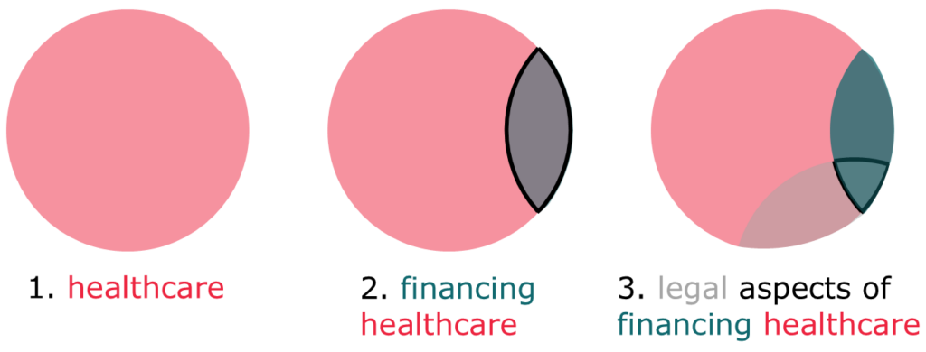
If your topic has many different facets, you can probably think of it as a Venn diagram.
Let’s take a hypothetical example: you want to say something about the legal aspects of the way our healthcare system is financed. Your diagram looks like this
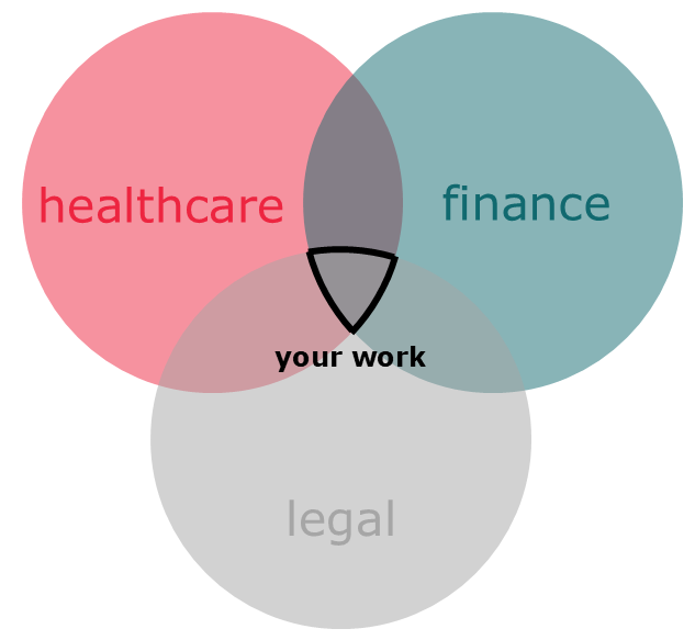
In cases like this, how can you tell a story about your topic?
I sometimes see people trying to introduce all circles at the same time – overwhelming their audience.
My advice is to do it step by step.
You start with the circle that the audience is most familiar with. With healthcare professionals, you first talk about healthcare, then about financing healthcare, and then about the legal aspects of financing healthcare.
In reality, topics are even more complicated than in this example. A participant in our training once showed me a Venn diagram of interdisciplinary research with nine circles…
So: do you have a multifaceted topic? Venn it!
Regards,
Arnaud
Either too much or too little
Today: a concept I sometimes use when I give feedback.
Either too much or too little.
The words are simple. But what do they mean?
Here’s an example of a text written for a broad audience:
Microbes in your intestines ferment indigestible carbohydrates (such as dietary fibers). In the process, they generate by-products that are important for your digestion, such as short-chain fatty acids and succinate. These seem to help prevent obesity.
The terms I want to discuss are short-chain fatty acids and succinate.
The target audience is not familiar with these compounds. That’s alright, you can use unfamiliar terms every now and then. But when you do, you have to explain them.
Wat kinds of compounds are these? What is their function? How are they different from each other? Which information is relevant, depends on the rest of the story.
If you need these terms, this text offers too little.
Another option is to remove the two compounds from the text. Without an explanation they mean very little to your audience. Succinate, pummilate, mulliprate – very similar effects.
In this case, the text contains too much.
So, decide whether an unfamiliar term is important enough to spend more time and space explaining it. If not, remove it.
Regards,
Arnaud
How maybe is maybe?
Judith likes to be alone. And she likes to keep some space in her calendar.
A while ago, Judith told me she would ‘maybe’ come to my party. I know what that means: she is not going to come. But to literally say so is a bit rude.
I admit that I sometimes use the word ‘maybe’ in that way myself. Even though it violates my principle of straightforward communication.
Anyway. Today I want to share a study with you. About probability phrases.
Words like almost, always, often, usually, sometimes and rarely. And maybe.
A number of researchers (three) asked people to translate probability phrases to a percentage. A small risk of side effects, does that mean a 3% or a 15% probability?
The answers vary enormously.
Generally, for instance, is interpreted as meaning between 60% and 95%. With an average estimated probability of 76%.
Words at both ends of the probability spectrum had the smallest range in interpretation. However, even the words never (average estimation 6%) and always (average estimation 96%) are – remarkably – interpreted differently.
What to take away from this?
In general: be careful with probability phrases. Specify probability phrases with a percentage when possible. And perhaps use illustrations.
The same goes for other qualitative words like big, long and many.
With maybe, the average estimation is a 41% probability. So, possibly, Judith didn’t participate in this research.
Regards,
Arnaud
YYMY
Experiment:
When you receive an email with a subject line that doesn’t quite make sense to you, do you open it? Does it make you curious? Or do you think: ‘never mind’?
It seems it’s the former 😉
YYMY stands for you – you – me – you. It’s a tool for determining at what point in your story you focus on your audience.
In the first Y, you describe the situation that your audience currently finds itself in. For instance:
Nurses in your organisation regularly administer risky medicines. In these cases, a second nurse double-checks the dosage. This is required by law.
In the second Y, you describe the problem that emerges as a result. Again: from the audience’s perspective.
This double-checking costs your employees time, while there is a huge shortage of nurses.
In the M, you explain how you solve this problem.
Nurses working at our service centre double-check the administration of medication via video calls.
The last Y describes how your audience can benefit from this.
Which means your employees have more time to help other patients.
I read in a book about communication that 75% of your story should be about your audience. The percentage suggests a precision and a one size fits all that I don’t believe in – however, YYMY aligns with this quite nicely.
Regards,
Arnaud
Let’s talk about spelling errors
There are two kinds of people.
People who get worked up about spelling errors and typos. They will say things like ‘it’s comprise, not comprise of‘. They get a rash when you say ‘a whole nother level’ or write ‘experiance’ instead of ‘experience’. And they are ashamed when they misspell my name.
And then there are relaxed people.
I’ve been working for years as a text writer. So most people expect me to be in the first category.
But I’m quite relaxed. And I’m not that interested in spelling errors.
Why not?
In communication, what’s important is that your message reaches your audience, so that they act on it.
If you write ‘pays your taxees via this bank accuont’, and everyone pays, tax authorities have very little reason for concern.
Still, there is one legitimate reason to worry about spelling mistakes.
Ethos.
Ethos – it’s from Aristoteles – is the credibility of the communicator. It influences the attitude with which the audience receives the message.
A spelling error diminishes your credibility. Subconsciously, your audience will think: this person is sloppy, so there may be errors in their data as well.
You don’t want that.
So: in principle, don’t worry if it’s okay to start a sentence with a conjuction (it is!). Or about a spelling mistake in an email to someone you works with everyday. But do worry about your ethos when it really matters.
Regards,
Arnaud
Your software is bossing you around
Chart and graph software is awesome.
With one click, you can generate a treemap, waterfall chart or word cloud based on your data.
Still, there lurks a danger in the ease with which you can create these visuals. I might sound a little conservative here 😉
Let’s look at an example first.
I found a dataset online about the novel Les Misérables. It’s about how often characters appear, how often they appear together, and to which group they belong.
When I enter this dataset in the program Gephi, it gives me this visual:
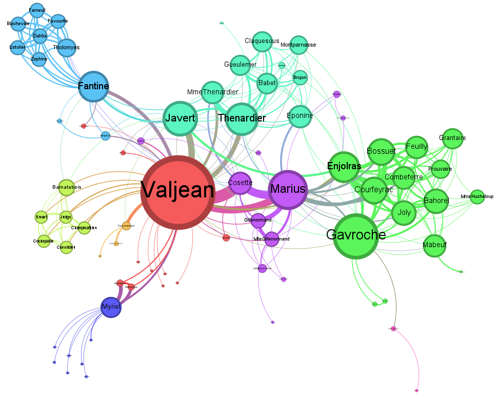
Two minutes of work. And I have something substantial for my presentation or article.
Still, it’s good to realize that the program has made an extremely large number of choices.
First, it has decided to make a network visual. Even though a bar chart with the groups might be better for my message.
It also decided what colour each group should have, where to place them, how many characters are included, et cetera.
My advice when you create an image like this?
First decide what your message is. What do you want to say?
Then, get a blank piece of paper and a pencil. Sketch until you’re more or less happy with the result.
Only then is it time to open your software program.
Old-fashioned – but if you do it this way, you hold the reins.
Regards,
Arnaud
Who’s afraid of the teddy bear?
A training, early last year.
A researcher is working on a story for a broad audience. About UAS: Unmanned Aircraft Systems.
I ask why he doesn’t just use the word ‘drone’.
Well, UAS is a term used in European legislation. And that’s what the research is about. What’s more: UAS is a broader term that also encompasses the person operating the drone.
But ‘drone’ may be easier to understand for your audience, I propose.
Resistance.
Later in the course, I have another suggestion: he could give an example of one specific drone. Maybe a drone that flies here, through this city, to deliver a teddy bear to a sick little girl.
Resistance again. His research is not about teddy bears or sick girls.
I admit: I made this conversation up. But I regularly have conversations like this one.
Many experts are afraid to make their story simpler and more ‘popular’.
Maybe it helps to think of communication as a spectrum.
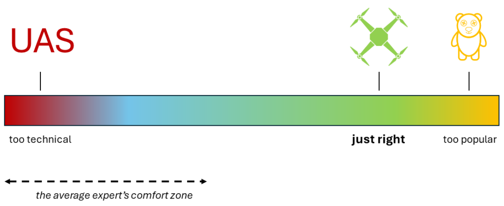
Good communication is a fair bit to the right side of this spectrum: approaching ‘popular’. But ‘too popular’ also exists.
Most experts don’t have to worry about that. Their comfort zone ends way before that.
Therefore, I often challenge experts to move to the right side of this spectrum. And to make their story more accessible, understandable and fun.
To not be too scared of the teddy bear.
Regards,
Arnaud
Where’s Waldo?
Do you know Where’s Waldo?
Waldo is a jolly guy. He wears blue pants and a red-and-white-striped sweater.
In books about Waldo, you find illustrations depicting huge crowds. On the beach, at the fair, on a ski slope: you name it.
The game is to find Waldo. This is difficult: he is usually well-hidden, and only partially visible. So it’s all the more satisfying if you find him.
Knowledge workers with whom I work sometimes make the opposite of a Waldo illustration. That is because, when you communicate about a complex topic, you very soon end up with abstract concepts. And zero people.
This is a disadvantage. Because people find stories about other people usually more appealing than an abstract alternative.
Example?
Let’s say your story is about underground CO2 storage.
You may talk about global heating, CO2 capture, transport, storage in deep rock layers, risks and costs.
To make the story more relatable, you then ask yourself the question: where are the people? Or: where’s Waldo?
You might describe people having to leave their houses because of forest fires resulting from global heating. Scientists from technical universities who develop technologies to capture CO2. And crew members from ships transporting liquid CO2, taking training courses about safety.
Et cetera.
Looking for Waldo is fun. But you shouldn’t hide the people in your story.
Regards,
Arnaud
Paragraphs are like slides
Paragraphs are like slides.
You may not be immediately convinced by my thesis.
So let me make my case.
Both slides and paragraphs deliver main messages. They’re the most important building blocks of your story.
To discuss this, it’s helpful to have a word for ‘slide or paragraph’. Let’s call it a paraslide. Sounds like a fun extreme sport.
A good paraslide has one main message. And that message comes first.
With slides, this message is conveyed in the heading. With paragraphs, it is in the first sentence.
If your paraslide is very dense, that’s probably because you put multiple messages in it. This happens all too often: long paragraphs, overcrowded slides.
If this is the case, see if you can spread the message over multiple paraslides.
In a good paraslide, each element supports the main message. Every sentence. Every visual detail.
This is what I call vertical alignment.
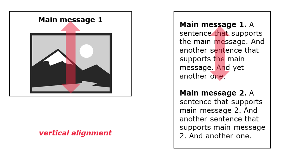
If your paraslide isn’t vertically aligned,you can adjust the main message. Or change other elements of your paraslide. Removing something often works well.
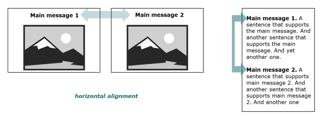
A good paraslide is also explicitly connected to the previous (and the next) paraslide. Often because it repeats a term from the previous paraslide.
I call this horizontal alignment (even though, with paragraphs, it’s not literally horizontal).
For instance:
- Main message 1: Paragraphs and slides can be thought of as ‘paraslides’.
- Main message 2: Every paraslide has one main message.
- Main message 3: Try to get these main messages connected.
Paragraphs are like slides.
Convinced?
Regards,
Arnaud
What will they talk about over drinks?
On a table, on the stage, sits a small, upside-down glass jar.
Right in the middle of his TED-talk, Bill Gates casually lifts the jar.
There are mosquitoes inside the jar. He releases them into a room with mostly rich, successful Americans.
Gates’ presentation is about malaria. A disease that predominantly hits poor countries, nowadays.
Which is why investments in the fight against malaria are relatively small. More money is spent on developing medication for hair loss, for instance.
‘There’s no reason only poor people should have the experience’, Gates says, as he releases the mosquitoes (which are malaria-free).
The crowd laughs uncomfortably.
What can we learn from this?
Gates gives one moment in his presentation a higher intensity. That moment dramatizes his main message.
It’s the moment that his audience will talk about over drinks, afterwards.
Presentation expert Nancy Duarte calls it a S.T.A.R. moment: Something They’ll Always Remember.
This aligns with the ‘peak-end rule’from psychology. It states that people’s judgment of an experience will be influenced most by the (emotional) peak of that experience, and the end.
People will give higher ratings to a trip with a single, very special experience (whale watching) than to a trip with multiple, moderately special experiences (watching many beautiful fjords and birds).
So: important presentation? Invest in a peak experience!
Regards,
Arnaud
Financial storytelling
A movie with a lesson about the financial world in the middle of it?
Adam McKay, the director of The Big Short, just did that.
Actress Selena Gomez sits at a blackjack table. People holding martinis are standing behind her.
Gomez is dealt a good hand and places a bet of 10 million dollar.
This 10 million represents a set of mortgages. It’s called a mortgage bond.
The people standing behind Gomez are also betting – on the outcome of Gomez’s bet.
‘I love Selena Gomez. I bet you 50 million she wins,’ says a woman with glasses. A man in a suit accepts the bet.
This bet about a bet is analogous to a synthetic CDO. Synthetic CDO’s played a big role in the 2008 financial crisis.
Behind the woman with glasses stands a man with a beard. He bets 200 million that the woman with glasses wins the bet. Synthetic CDO number 2.
A bet about a bet about a bet.
The casino is packed, so even more synthetic CDO’s are created. Eventually, people are betting billions of dollars. And the amounts and odds are far removed from the original blackjack hand – from the real economy.
Want to explain an abstract, theoretical concept? An analogy with something that your audience is familiar with can make a big difference.
Regards,
Arnaud
PS The Big Short offers more inspiration for making abstract topics concrete: the Jenga scene.
So it goes
Slaughterhause Five is a horrific and at the same time funny novel about the Second World War by Kurt Vonnegut.
The story is set in the Ardennes, Dresden and various other places. But it also features beings that look like upright toilet plungers who can travel through time, to nice and difficult moments.
An important stylistic device in the novel is the sentence ‘So it goes’. It appears after almost every negative event, often after a death.
The author Kurt Vonnegut also appears in a great short online video.
It’s about story structure.
On a blackboard, he draws a line graph. The y-axis has ill fortune at the bottom and good fortune at the top. The x-axis runs from beginning to end.
The first type of story structure he discusses starts a little above average on the y-axis. But soon, the protagonist gets into trouble. And then he gets out of it again.
People love that story.
But the most popular story structure starts at the very bottom of the y-axis – in deep misery.
With a little girl whose mother has died. Her father has remarried a mean woman.
So it goes.
From there the situation slowly improves, with the help of a fairy godmother.
When she finds happiness (she dances with the prince at the ball), she loses it one last time. To achieve it definitively at the end of the story.
Want to improve your own story? Check if there is enough movement on the y-axis, between negative and positive parts. And avoid a flatline.
Just like Vonnegut’s structures.
Regards,
Arnaud
Are zombie nouns sucking the lifeblood from your text?
I don’t know what to think of zombies.
Nothing wrong with a bit of horror. But zombies don’t scare me.
Too far-fetched for me, I guess.
Anyway.
Today, I wanted to talk about nominalisations. These are verbs that are turned into nouns.
To improve a bridge becomes the improvement, or the improving of a bridge. To finance a theatre show becomes the financing of a theatre show.
When you use a lot of nominalisations, your text becomes distant and boring.
Helen Sword – a professor who writes about academic writing – calls them zombie nouns. Because,
[…] they cannibalize active verbs, suck the lifeblood from adjectives and substitute abstract entities for human beings.Sweet.
Sword gives a nice example in a TED video:
The proliferation of nominalisations in a discursive formation may be an indication of a tendency towards pomposity and abstraction.
No less than seven zombie nouns in one sentence.
Her alternative?
Writers who overload their sentences with nominalisations tend to sound pompous and abstract.
Suddenly the sentence comes to life, and it becomes clear who does what. The sentence has a concrete subject (writers), meaningful verbs (overload, sound) and a concrete direct object (sentences).
Much better.
Did I miss a great zombie movie? Let me know!
Regards,
Arnaud
A recipe for layer cake
Recently, my children and I embarked on an ambitious baking project.
Baking spekkoek.
Spekkoek is an Indonesian layer cake with spices. It has thin layers of two colors, usually yellow and brown, or green and brown.
Baking spekkoek takes a lot of time, because you have to build it up, layer by layer.
But it’s worth the effort.
In communication, ‘spekkoek’ can be good too. I took the metaphor from my colleague Marieke.
So what is spekkoek communication?
It means that you build your story in distinct layers.
When you tell your story, you alternate between these layers. For instance, between:
- Theory and a concrete example
- How things are now, and how things could be
- Data and enticing anecdotes
- Text and images
- Information for scientists and information for policy makers
When you move from one layer to another, ‘hard transitions’ work best – don’t use too many linking sentences. That way, you add contrast and variety. And your audience pays more attention.
Enjoy!
Regards,
Arnaud
How to make sure you receive useful feedback?
What do you want people to do after you told them your story? What is your call-to-action?
This is what I always ask participants during courses. Because a call-to-action is an important building block for your story.
Often, they tell me their call-to-action is: give me feedback. They would like to receive feedback from a superior, colleagues, people from other fields, or from expert practitioners, for instance.
That’s a fine call-to-action.
But what happens next is a bit odd.
In the story, they never mention the feedback in any way. And so they risk missing out on that.
How to do this differently?
Often, you can just explicitly state your call-to-action in your text or presentation.
If you want feedback, you ask for feedback. If you want money, you ask for money. If you want permission, you ask for permission.
This may sound crude and very Dutch. But it works. Why else do you think all those influencers are asking for likes?
The more specific your call-to-action, the better.
What do you want feedback on, exactly? On a specific part of your research method? On your choice of collaborators? On the possibilities to apply your new technique elsewhere?
Spell it out.
Do you have any feedback on this email? I would be happy to hear it. 😉
Regards,
Arnaud
Why legends give you headaches
They are indispensable in data visualization.
Graph and chart legends.
Without a legend, the audience doesn’t know what they are looking at.
Which is why a standard graph in Excel, for instance, looks like this:
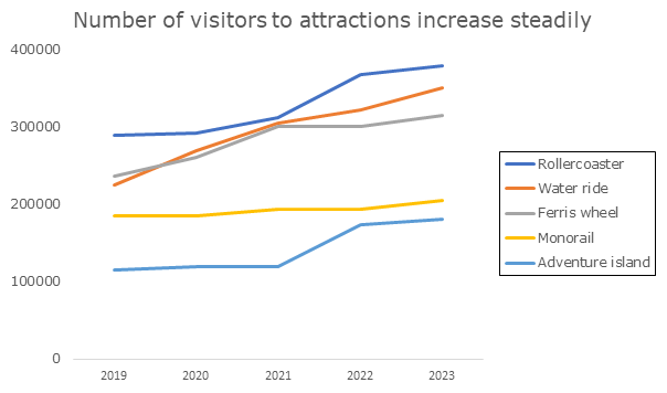
However, there is a problem with this way of labeling information.
Namely, your audience has to travel with their eyes back and forth between the lines and the legend. This takes energy. Energy that the audience cannot spend on the content.
Is there an alternative?
Certainly.
The alternative for legends is called ‘direct labeling’. It looks like this:
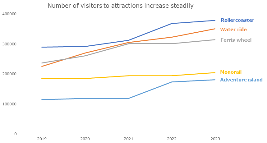
Convinced?
Then the next question is: how do you do this?
If you have been reading my emails for a while, you know that I usually don’t discuss technical how-tos. I prefer to share conceptual tools and fun examples.
But today is an exception.
Because there is a simple and useful trick.
Step 1: Remove the legend.
Step 2: Add text boxes. Then drag them to the right spot.
Done.
It is a little quick and dirty, but it always works.
For a more thorough way to do this in Excel, I want to refer you to a blog article by Elizabeth Ricks (Storytelling with data).
Regards,
Arnaud
How to get the attention when your audience zones out
We see a man and a woman waking up entangled on a couch.
The man opens his eyes and tenderly kisses the blonde woman on her shoulder. She looks at him, beaming.
‘What’s your name anyway?’ she asks.
Surprise number 1.
The man smiles. His torso is naked. Then he puts on a green shirt.
She asks if he wants to stay for breakfast.
In the next shot, we see the man and the woman in full for the first time.
Surprise number 2: the man is in a wheelchair.
He turns to the camera and wants to roll towards the door.
Surprise number 3: the woman’s husband enters with a bouquet of roses.
In the final shot, the man in the wheelchair asks the viewers: ‘What if I would take your spot?’ In the background, we see the husband crying.
Next, a voice-over delivers the punchline – surprise number 4: ‘Do not park in spaces for disabled people’.
When things go as you expect, your brain can go into slumber mode. But when something surprising happens, that catches your attention.
That’s how it was on the steppe, and it still works like that.
This is why surprise is such an important ingredient for communication and storytelling. Just pay attention to this the next time you watch a tv series or a movie.
Time to add a surprising twist to your next presentation or blog post?
Regards,
Arnaud
My friend Yasser
A triumphal arch for Lowlands, an outdoor music festival.
An artwork made of metal on a roundabout, with rails and clouds.
A colorful tree made of steel, in the Bijlmer, a neighborhood in Amsterdam.
My friend Yasser Ballemans creates enormous sculptures. Most are several meters high.
Yasser regularly has to convince people to get a new commission. People want to get an impression of the artwork they consider paying for.
Yasser can’t really bring a four-meter-high prototype to a meeting.
So, sometimes, he makes a sketch in a 3D program. He brings VR-glasses. So people can virtually walk around the artwork.
Still, there is one thing that works even better, Yasser confided to me while sitting by the campfire.
A small mockup.
Mockups can be touched, held, turned around. People can take them home and show them to their partner and children.
At Analytic Storytelling, we often encourage people to appeal to the senses when they communicate. Usually, this is about sight.
Yasser’s story illustrates that appealing to other senses also works well. Touch, in his case.
At the bakery that sells fresh croissants, it’s smell.
And with you?
Regards,
Arnaud
This blogger makes you smile (and write better)
The origin of the Latin plant name Zyzyxia lundellii.
What makes the poetic novel This Red Line Goes Straight to Your Heart so good.
The problem with having two rounds of peer review for scientific journals.
Canadian evolutionary ecologist Stephen Heard writes about a wide variety of topics. In fact, about everything that interests him.
He does so in his blog Scientist sees squirrel. The squirrel represents a quick thought flashing by.
Heard also wrote a book about scientific writing: The Scientist’s Guide to Writing. Manyof his blog articles are about writing, or about teaching how to write. That’s why I started following him.
But after a while I read almost every article – with a smile.
Heard is smart, original, reflective, and funny. In this way, he even makes a text about rounding numbers interesting. Really.
But I would start with Heard’s articles about writing.
He wrote about titles, abbreviations, jargon, footnotes, metaphors, an effective writing process, and other topics.
I would first take a look at the articles about:
- topical sentences (the first sentences of paragraphs)
- grant proposals (a series)
- using ChatGPT for scientific texts.
Have fun!
Regards,
Arnaud
How to begin?
Love, relationships, sex.
These are the topics of the podcast Where should we begin? with Esther Perel. In each episode, you listen to a couple’s therapy session.
For instance, a session with a Spanish woman and an American man. They had a good marriage, but the woman cheated on her husband during work training weekends, while he stayed home with the kids.
She is ashamed because she hurt him. But the affair is also important to her. It emancipated her from the ‘child position’ she took towards her older husband.
The man is alternatingly angry and understanding. And the affair confronts him with his deeply held conviction that he ultimately has to face the world alone.
Interesting stuff.
‘Where should we begin?’ may be something you ask yourself with your communication.
How to start a presentation or blog, for instance?
A description of the context, or a definition, is a solid choice. But it’s also a bit conventional and boring.
The alternative?
A hook. Something that draws the audience into your story. Often with an (inter)action.
Things you can use as a hook are, for instance:
- A question to the audience
- An anecdote or mini-story (like in this email)
- A surprising or exciting fact.
Good luck!
Regards,
Arnaud
The stuff in wine that makes you feel strange
A helicopter is a sky boat with turning wings.
A microwave a food-heating radio box.
And corn is yellow food wrapped in leaves.
What exactly is going on here?
In the book Thing Explainer, Randall Munroe explains complex stuff in simple language. Things like the electromagnetic spectrum, tectonic plates, the atom bomb, the constitution, and cells.
He only uses images and the thousand most commonly used words.
For instance:
This bag breaks tiny things into even smaller, simpler parts they’re made of. Your body uses it in many ways, like to get rid of the stuff in wine that makes you feel strange […].
You probably won’t use Munroe’s approach anytime soon in your professional communication.
And it isn’t necessary to avoid words like helicopter, microwave, corn, alcohol, and liver.
Still, Thing Explainer inspires us to use less jargon (big words). Because jargon is not appropriate in every situation, nor for every audience.
As a quick exercise, try writing a few sentences about your topic in this way. And then check the result in Munroe’s simple writer.
Too much effort? Then just consider this a book recommendation 😉
Regards,
Arnaud
I can’t cry
A slightly weird confession.
I never cry.
Not when a lover leaves me. Not when someone dies. Not when I’m chopping an onion.
I can’t.
What does that have to do with storytelling?
In these e-mails, I haven’t discussed emotions very often. But emotion plays a key role in storytelling.
Emotions get us involved, make us pay attention to and remember information. And emotions steer our decisions. Ask any salesperson, politician or psychologist.
But emotion almost never plays a role in communication by knowledge workers.
Reports, scientific papers, organizational strategies…
There is so little emotion there, it makes you want to cry.
Can’t we do this differently?
In written text, conventions sometimes leave us very little space for emotions. In presentations, much more is possible.
It often helps to locate the emotions in the story, and to explicitly mention them.
In the problem, for example.
It’s frustrating that children with delayed language development have so few opportunities. It can make them feel like they lack any perspective.
Or in the solution.
It is moving to watch the volunteers teach private lessons. It gives them satisfaction, and the children get joy and inspiration out of it.
Try it – make your audience happy.
Regards,
Arnaud
Better collaboration with sticky notes
A classical TED-talk in the world of communication.
Tom Wujec’s Got a wicked problem? First tell me how you make toast.
Wujec explains how you can use drawings to tackle complex issues in a group. For instance, for your organizational strategy, your views on sustainability, or a better customer experience.
When you draw a topic, you divide it into smaller steps (nodes), which you connect. Often with arrows (links). As a result, a visual ‘systems model’ emerges.
By drawing it, you also make it concrete. Because it forces you to include tangible items, such as, in the case of making toast, people, a toaster, and a pot of jelly.
And by drawing something, you also visualize how you think about that something. With making toast, some people emphasize the human experience, others focus on the supply chain, or on the technology of toasters. And the American way of making toast turns out to be very different from the European way.
When you draw on sticky notes, you can remove, add and re-arrange parts of your visual model. Improving it step by step.
Wujec recommends this approach as a tool for collaboration. Because you can include various perspectives in the model, and bring them together.
In this way, meetings become more effective and more fun.
Regards,
Arnaud
The importance of procrastination
Oblomov is passive.
The nobleman is the main character in a classical Russian novel. In the first 150 pages, he hardly leaves his bed.
In the 19th century, ‘oblomovism’ became a catchphrase for (aristocratic) laziness. It was considered a threat to Russian society.
When you write, you probably think of passivity and procrastination as negatives too.
Writing is hard work, so it’s always tempting to postpone a writing task until tomorrow. But it doesn’t make you very productive.
Still, you can also start writing too early. You yourself may do this.
Broadly speaking, the writing process consists of 4 steps.
- Step 1: Researching and brainstorming
- Step 2: Structuring
- Step 3: Writing
- Step 4: Editing
All of these steps look like writing. You can do all four in a Word document with text.
But if you start with step 3 before you’ve finished doing your research, or making a structure, you’re probably doing three things at once. With the risk of cognitive overload and a writer’s block.
Sounds familiar?
Then it’s wise to divide your process into several steps, and to postpone writing.
It’s not oblomovism, it’s just an effective process.
Regards,
Arnaud
The Manga Guide to Databases
A concrete story about my topic? It’s way too complex for that.
This is a response I sometimes get when I talk about storytelling.
Sounds familiar?
Today, for inspiration, an example with a super abstract topic. Databases.
To show you that it is possible.
The Manga Guide to Databases is a 200-page basic explanation of databases. Cartoon style.
The main character of the cartoon is princess Raruna.
Raruna’s parents are away on a journey, and she has become responsible for the fruit kingdom. She has an enormous pile of reports about the good harvests. If only she could manage them efficiently!
When the apple price goes up, the bookkeeping becomes a mess. An employee of the overseas department misses the price increase. And at the export department, they accidentally raise the price too much.
Then, Raruna receives a mysterious package from her father. A book about secret technology from a foreign country. From the book, a fairy emerges, who explains everything to Raruna.
More exciting than the average study book, right?
A PhD told me that The Manga Guide to Databases isn’t just entertaining, it’s also just very clear.
If this can be done for databases, maybe it can be done for your topic as well?
Cheers,
Arnaud
A knowledge gap is not enough
I take issue with the term ‘knowledge gap’.
A hole in our understanding– it’s a common term in academia.
So what is the problem?
A knowledge gap is the reason for doing research. There is a gap, and we need to fill that gap…
But is it that simple?
There are, after all, thousands of knowledge gaps. So we will need to decide which gaps are worth the effort of filling them.
Also: not every gap is a problem.
There is probably much we don’t know about the effect of smartphones on recreational fishers’ catches.
Is that a bad thing?
To emphasize the urgency of a study, you need to explain why this particular knowledge gap deserves our attention. You do that by answering the So what? question.
The molecular function of Treg proteins in T cells is unknown.
So what?
Because of that, we don’t know what role they play in the onset of autoimmune diseases, such as MS.
So what?
This keeps us from developing early interventions for autoimmune diseases.
Urgency + knowledge gap = an effective scientific storyline.
Regards,
Arnaud
Help, my audience is mixed!
A question from Anna, a while ago:
You often hear people say you should profile your audience. But how can you do that when you’re dealing with a mixed audience?
An important strategy in this case is ‘segmentation’: dividing your audience into segments.
The best example I know comes from a speech Ronald Reagan gave after a catastrophic accident with a space shuttle.
In the speech, he explicitly switches between different parts of his audience:
We know we share this pain with all the people of our country. This is truly a national loss.
[…]
For the families of the seven, we cannot bear, as you do, the full impact of this tragedy.
[…]
And I want to say something to the schoolchildren of America who were watching the live coverage of the shuttle’s takeoff.
[…]
I want to add that I wish I could talk to every man and woman who works for NASA or who worked on this mission […]
Segmenting is hard when people in your audience have very different knowledge levels. Even then, explicitly switching between them is the best strategy.
Regards,
Arnaud
PS I learned about this example from the book Resonate by Nancy Duarte, about presenting. Highly recommended!
Are you a koala parent?
In the 1990s, psychologist Bent Hougaard came up with a new word.
Curling parent.
It’s a term that’s easy to remember. I immediately picture parents who are busy swiping to remove obstacles for their child.
You could also say ‘overprotective parent’. But that term is less sticky because it doesn’t evoke any images.
Do these kinds of visual terms also exist for terms from your field? Or can you come up with them yourself?
For inspiration, a few more examples about parenthood – borrowed from the animal kingdom.
Tiger parents are strict, enforce obedience and are focused on the (school) success of their kids. The dry alternative is ‘an authoritarian parenting style’.
Jellyfish parents do the opposite. They set few rules, have few expectations and move flexibly with their kids. ‘Permissive parenting’.
As a koala parent, you keep your child close to you – psychologically and physically. ‘Attachment parenting’ or ‘natural parenting’.
And then there are dolphin parents, helicopter parents and bulldozer parents.
Which type are you?
Regards,
Arnaud
Do you use this Netflix technique?
With my kids I watch Cobra Kai, a Netflix series.
The series is a sequel to the Karate Kid movies from the 1980s and revolves around two dojos – karate schools.
Cobra Kai is a tough, no-nonsense dojo that’s all about attacking and winning. ‘Strike first, strike hard, no mercy’, that’s their slogan. The dojo raises children to be strong, disciplined and resilient individuals. But they can also become aggressive bullies.
The Miyagi-Do philosophy is about defense, inner peace and balance. The dojo balances children emotionally and gives them a sense of justice. But there’s also the risk of falling short in the harsh reality.
Cobra Kai and Miyagi-Do are very different: there’s a lot of contrast. That makes the series easy to follow and ensures variety in the scenes.
In professional communication, you can also use contrast. For example, the contrast between:
- treatment A and treatment B
- an introverted and an extraverted manager
- your product and your competitor’s product
- the situation before and after your solution
To create contrast, you sometimes need to enlarge a specific part. Therefore, you certainly can’t use contrast in every situation.
But if possible, contrast makes for kick-ass communication.
Regards,
Arnaud
Pie charts are evil
In primary school, I ate pie every day for a week.
It was like this.
We learned fractions. My teacher had asked a few parents to bake a pie with their child. The idea was that we could cut them into pieces, so that we got a feel for ‘a twelfth’ or ‘an eighth’. And also had fun learning about fractions.
So my association with pies and numbers is downright positive. 😉
Yet there is one area in which you have to be careful with pies and numbers: data visualizations. Just google ‘pie charts are evil’.
What’s the problem?
In a pie chart, you can’t see exactly how the pie slices relate to one another. Especially if values are close to each other. Take, for example, this chart about freight transport:
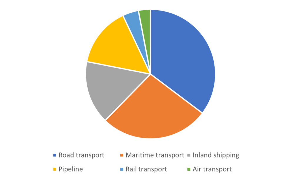
Which one is larger, the yellow or the gray segment? That’s not easy to see.
Even more dangerous are 3D pie charts. With those, you enter the realm of propaganda and tabloids. For example:
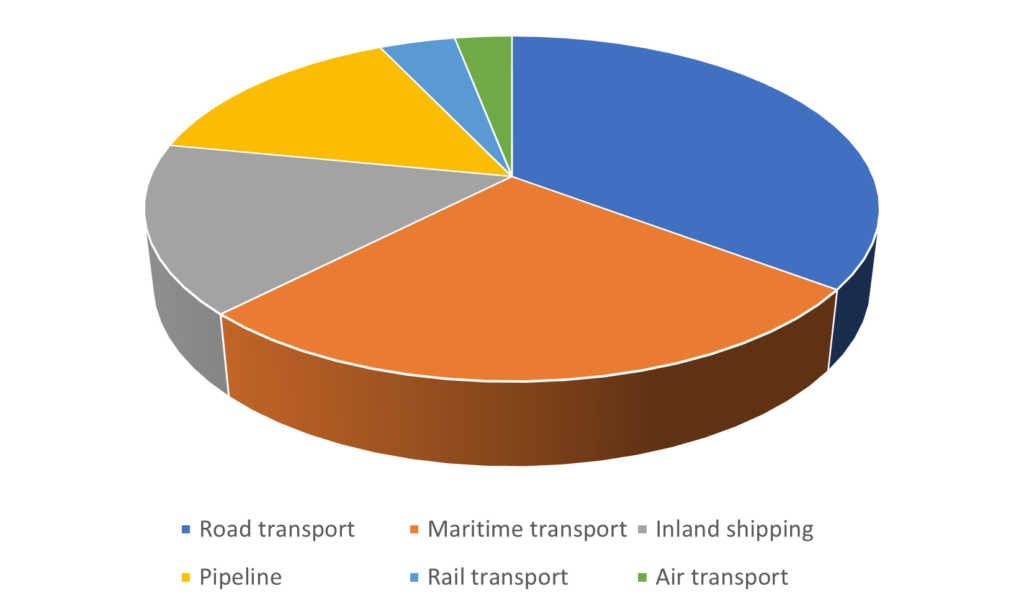
The orange segment here now appears to be the same size as the dark blue one, while there’s in fact a big difference.
Then what should you do?
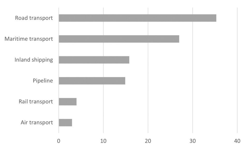
Make a bar chart. In bar charts, your audience immediately sees the proportions.
Look at this:
It also helps you get rid of the Excel colors.
Regards,
Arnaud
PS The only advantage of a pie chart is that it’s a way to show segments as part of a total. If that’s important, consider a pie chart.
An aging population isn’t a great problem
There are more than 3.5 million over-65s living in the Netherlands. That’s about 20% of the population.
In 1990, 12.8% of the population was over 65. In other words: the Dutch population is aging.
That leads to higher pension costs and a greater demand for care.
A problem…
If you read my emails more often, you probably know that problems are important for storytelling. Problems give urgency to a story and create tension.
Is aging therefore storytelling gold?
No.
In a good story, the central problem is (usually) solved. For example, a movie about evil aliens is most satisfying if the aliens are defeated at the end. That completes the story.
If aging is your central problem, you won’t be able to complete your story in a similar way. After all, you can’t solve the aging problem (without introducing radical plans).
It’s therefore better to focus on (smaller) problems that can be solved.
For instance:
| Problem | Solution |
| Not all people receive the care they need. | E-health (all people receive the care they need) |
| There are too few workers to bear the pension costs. | A higher retirement age (enough workers to cover pension costs) |
So yes, problems in your story are important. But you should always ask yourself the question: can I (partially) solve this problem?
Regards,
Arnaud
This is not a love song
There’s a peculiar song from 1983, by the band Public Image Ltd.
The lyrics consist largely of the title phrase. Sometimes it’s sung with a head voice, sometimes in lower tones.
The phrase – This is not a love song – comes up about 115 times during the song. Clearly, the singer wants to emphasize his message. 😉
But is it getting across?
It reminds me of the ‘don’t think of a pink elephant’ joke. Hearing this sentence, you immediately imagine a large pink trunk – and not a cactus. Despite the word ‘not’.
This is not a love song.
For this reason, it’s wise to think about denials in your communication.
For example, would you describe the culture in your organization as nonhierarchical? Or would you use the term ‘flat organization’ instead?
Do you ask your kids not to yell like that to each other? Or to talk sweetly and softly?
This is not a love song.
Regards,
Arnaud
Do you weaken your statements without knowing?
Be bold, don’t hedge.
I get that advice from time to time from the Hemingway app, an online writing tool. Nice to try.
The source of inspiration of the app – Ernest Hemingway – wrote novels in a compact, clear style. His sentences are short. He uses everyday words. And few adjectives and adverbs.
The app helps you to write like that as well.
When you enter a text, the app highlights words and sentences that you can improve. Sometimes with a comment.
Like: Be bold, don’t hedge.
For example, the following sentence contains a lot of hedges:
I think aspirin in a relatively high dose can alleviate the symptoms of migraines to some extent.
I think. Relatively. To some extent. Can.
Words like these weaken your claim. Without hedging, you would say:
Aspirin relieves migraines.
In a scientific education, you learn how to hedge. After all, a scientist’s claims must be correct, careful and nuanced.
But sometimes people hedge out of habit. Hedge words have then become a kind of catchphrases. And that’s a shame, because it makes your text less readable, clear and convincing.
So: be bold (if possible)!
Regards,
Arnaud
Is your story recognizable enough?
Mark is 40 years and has autism.
He want to watch the movie The Blues Brothers every day. Before he starts, he puts on his black glasses, his hat and his tie.
Every time again, he laughs at the jokes, get’s excited by the car chases, dances to the songs. Even though he knows the movie by heart.
I met Mark (not his real name) when I worked at a group home for people with an intellectual disability for six months.
Mark likes what he knows. And he’s extreme in that respect.
But to a slightly lesser extent, other people also like what they know. Your audience as well. You may not take that into account enough.
Especially if your story contains a lot of new, complex information, it helps to add known elements.
An iPhone in a story about semiconductor chips. The 2004 tsunami in a story about remote sensing. Antibiotics and Uganda in a story about healthcare systems in low- and middle-income countries.
The known elements give your audience something to hold on to, give them a breather.
So don’t be too afraid to tell your audience something they already know. Think about The Blues Brothers.
Regards,
Arnaud
How to improve your flipchart right away
I remember it well.
I shared a video about ‘graphic facilitation’ in the app group with my Analytic Storytelling colleagues. This one.
My colleague Stijn replied: ‘The star man is going to change my life!’
The star man is useful if you want to quickly draw a person on a flipchart. He looks like this:
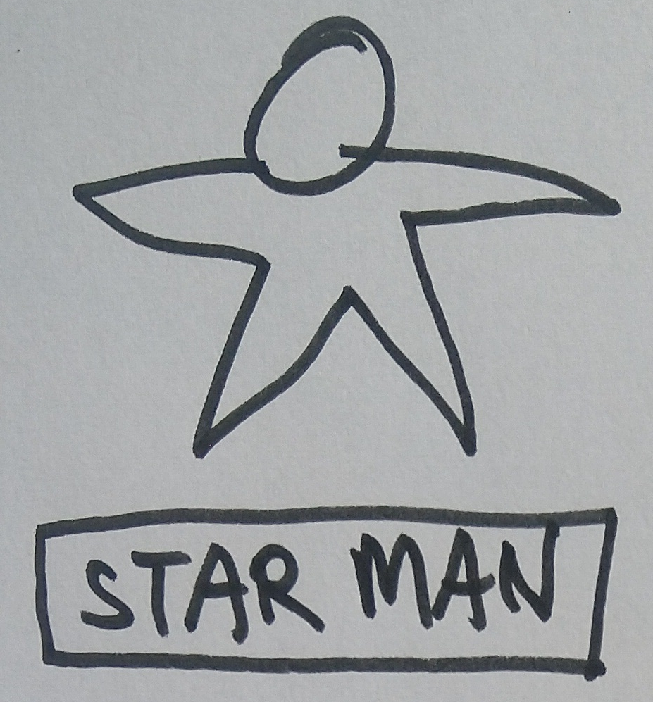
(The star man might as well be a woman, but ‘star person’ isn’t that catchy.)
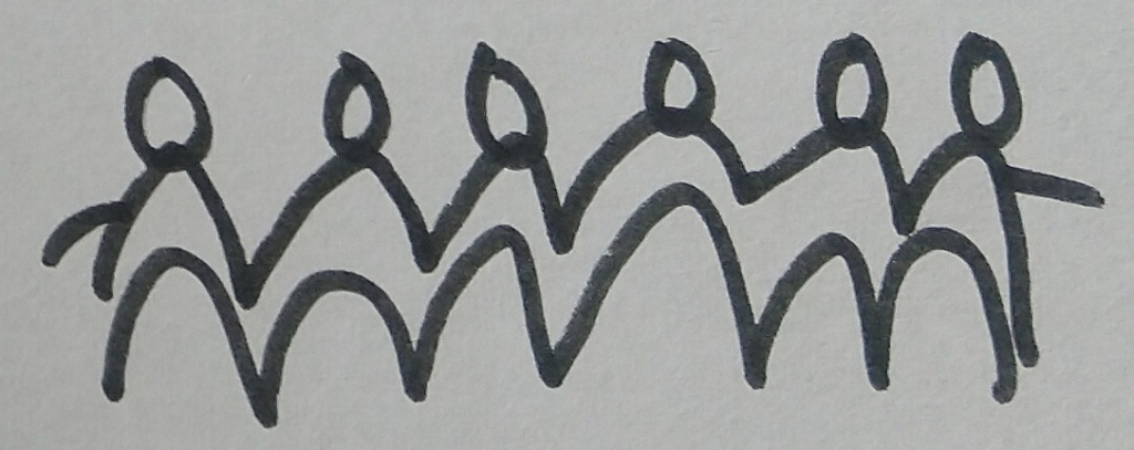
You can draw the star man in all kinds of poses. And you can make a group of them:

Later, in a workshop, I learned three other ways to quickly draw people:
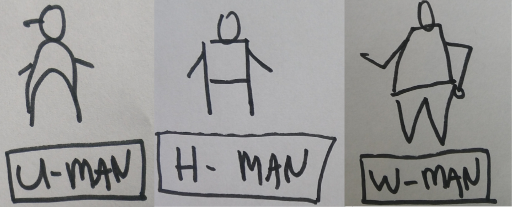
With the U-man, you can also quickly draw a group:
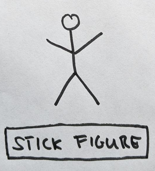
Of course you can also opt for a classic stick figure:
If you can draw people quickly, it’s easier to bring your flipchart to life, and to make it more than just a large sheet of paper full of text.
Which one is your favorite?
Regards,
Arnaud
My biggest writing sin
It’s time for a confession.
About something I’m guilty of quite often. Something that breaks my reader’s flow and slows down their reading experience.
Which is…
Metadiscourse.
Metadiscourse is text about your text. For example:
Chapter 1 described what blue-green algae are and how blue-green algae growth occurs. This chapter deals with the risk of blue-green algae. Chapter 3 discusses ways to combat blue-green algae.
For a long time I thought, structure in your text is good. Signal words and cross references are good. Reading guides are good. Summaries are good.
Until I read Steven Pinker’s article Why Academics Stink at Writing.
Pinker argues that metadiscourse mainly helps the writer, not the reader. He compares it to directions for a shortcut that take longer to figure out than the time the shortcut would save.
Metadiscourse is a typical sin of analytic knowledge workers. You rarely come across it in a novel or during a conversation. Then it’s about the topic, not about the text.
So are you – just like me – also guilty of this writing sin?
See in your next text whether you can do without it.
Regards,
Arnaud
Rich people are tall
Jeff Bezos owns 151.9 billion dollars.
A lot more than you and me. But how extreme is the difference exactly?
Wealth inequality is an important social theme, but it’s difficult to get a clear picture of it.
Dutch economist Jan Pen came up with a solution: Pen’s parade.
In this parade, wealth is expressed in height. A person of average wealth has an average height. In the Netherlands, for example, 231,900 euros in assets equals 174 centimeters.
In Pen’s parade, the entire population passes by in exactly one hour. From poor to rich, so from smallest to largest.
The first minutes take place underground: the people with debts.
From minute 12, 2-centimeter dwarfs parade past.
After 39 minutes, we see homeowners. They are already taller than a meter.
The average Dutchman only passes after 44 minutes. (In other words, the mean is higher than the median.)
In the last minutes, heights increase rapidly. A small number of giants close the parade. In the very last minute, they’re on average more than 33 meters tall.
Pen’s parade makes abstract financial information concrete with a few simple elements.
Space, time, movement and people.
If you add those, your information becomes much easier to process.
Regards,
Arnaud
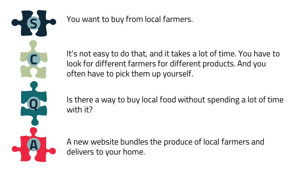
Nerd alert 🤓
Beware.
Today it’s about SCQAs in SCQAs.
New here?
At Analytic Storytelling, we use the SCQA method to structure stories. SCQA stands for Situation – Complication – Question – Answer.
An SCQA structure looks like this, for example:
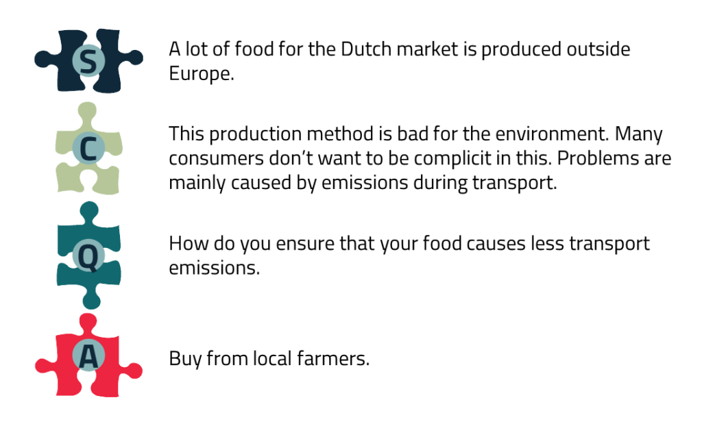
Are you working on a complex topic? Then it can help to create multiple, connected SCQAs. SCQAs in SCQAs.
You can do this by using the A of the first SCQA as the starting point for the second. Like this:

For example, a second SCQA on local food might look like this:
For a story about a complex topic, you often need to create at least a second SCQA level. And sometimes even a third.
So sit yourself down and wake up your inner SCQA nerd.
Regards,
Arnaud
If you can’t afford an expensive market research company
How do you find out what people understand? Or what’s important to them?
I get this question from time to time in a training, when we talk about how to adapt your communication to your audience.
To do that, you need to know roughly three things about your audience:
- what topics they care about
- what their goals are
- what they already know about your topic
But do you know exactly who’s in the room when you speak at a conference? Do you know what jargon you can use for a master student? Do you know what prejudices a customer has about your service?
By no means always, I would say.
And it’s not always easy to figure out these things.
The big market research companies – like Nielsen and Kantar – spend days or weeks on audience research.
As a knowledge worker, you usually don’t have the budget to hire such an agency.
But there’s one simple thing you can always do.
Drinking coffee with your intended audience. Or send an email. Or call.
And ask questions.
Drinking coffee is always better than making assumptions about your audience. Or communicating without adapting to your audience.
It sounds simple, but not many people do this. I don’t always either.
So, note to self: more coffee!
Regards,
Arnaud
The clickbait challenge
A funny call on Twitter from a while back:
Write your dissertation title as clickbait.
Clickbait has a dubious name, and rightly so. Overpromise, underdeliver – that’s clickbait.
But this call made me curious.
Because formulating your research (or policy, or product) as clickbait, forces you to zoom out. To think about the core of your work, and what might be fascinating about it for your audience.
If you have that in focus, you have a good basis for your communication.
In fact, writing clickbait is not as easy as it may seem. ‘Click here and it will blow your mind’ – that won´t do the trick.
Essential in clickbait is the ‘curiosity gap’.
You need to provide enough specific information to trigger your audience’s curiosity, preferably information about something that interests them. But not enough to satisfy that curiosity.
A few thesis titles as clickbait, for inspiration:
New spines *LITERALLY* grown from trees. Big-Biotech’s best kept secret revealed.
Ten incredibly easy things your kids’ school textbooks have got totally wrong!
Pregnant deer do this ONE WEIRD TRICK to stay alive in the winter… and it makes the whole forest go BONSAI!
Are you ready for the clickbait challenge about your work?
Regards,
Arnaud
Short!
A famous Dutch TV interview features ‘meneer Mandje’. That means ‘Mr. Basket’.
He is interviewed about antiques. The friendly, older gentleman holds up a Delft blue object.
This is a very nice basket made by the company Tichelaar. It was used on the table as decoration and as a fruit basket.
The interviewer is relentless: ‘Way too long, make it shorter!’
Mr. Basket tries again.
Basket by Tichelaar, made in Makkum.
The interviewer again: ‘Even shorter.’
Basket by Tichelaar.
Mr. Basket looks at the interviewer with frightened eyes. The interviewer remains strict. ‘Even shorter. Short!’
Basket!
Every time I watch the video, I feel pity.
I think a lot of knowledge workers will recognize Mr. Basket’s pain. If you communicate about your subject to a wide audience, you always have to dump down your message.
Still, what Mr. Basket is trying to do aligns with an important piece of writing advice: avoid redundancy.
Avoiding redundancy means that you relentlessly check which words can be deleted. So that you can get to the core.
Want to try yourself?
The following sentence can be reduced to four words:
It’s important to remember to always wear your seatbelt when you drive in your car.
Good luck!
Regards,
Arnaud
Funeral speech/Tinder profile
It’s not a joke, but it sounds like it: what’s the similarity between a funeral speech and a Tinder profile?
I won’t keep you in suspense.
In both, you usually come across positive descriptions of people. And in both, those descriptions are often general, abstract.
Grandpa was caring, sweet and funny.
Janneke loves nature.
Marie-Lou always chose her own path.
Duncan likes to travel and often visits festivals.
I can imagine something of these people, but the image is quite blurry.
A description of a personality only comes alive if you make it specific. For example:
Grandpa always bought falafel when I came over. Even though he was an ardent carnivore himself. He used to say that he loved me even more than his steak.
I’m Janneke. I know the best place in the woods to spot wild boars at sunset.
You can try the other two yourself. 😉
In professional settings, you can also color personal descriptions by making them more specific.
For example, in a job application, in an introduction round or at a farewell talk.
Regards,
Arnaud
These are five stupid words
Must, necessary, crucial, essential, important…
These are words I don’t like.
Why?
These words are used to emphasize urgency – but then often without the urgency being properly highlighted.
For example:
The hygiene in refugee camp Moria must change.
It’s crucial that this insurance company increases its solvency.
It’s important to research side effects of medical cannabis use.
Can we do better?
If you want to convince people of what’s necessary or important, one question will help you further. What goes wrong if this doesn’t happen?
Describe that. And use enough words for it.
The alternative may look like this:
Camp Moria is home to 13,000 refugees and migrants. There is little soap, no hot water, one tap per 1,300 people and few toilets. As a result, many people suffer from vomiting, diarrhea, skin disorders and other infectious diseases.
In this way, you show that hygiene needs to improve, instead of saying so. And you explain why.
After that, you can always summarize with ‘So we must …’.
Regards,
Arnaud
This communication hack will engage your audience
Turn an empty (clean) ketchup bottle into a vial for your pancake batter.
Color-code important keys with nail polish, so you immediately recognize them on your key ring.
Light your campfire with Doritos if you’re out of paper. They burn well.
The internet is full of these kinds of life hacks. Handy, simple tricks that you don’t just come up with.
Are there hacks for your communication as well?
Certainly.
My favorite is this one:
Use the word ‘you’ more often.
A good story is about your audience. The word ‘you’ is a shortcut for this. When you use ‘you’, you automatically engage your audience.
Want to try?
First a text without ‘you’.
We’ve developed a training course for new managers. The training focuses on personal leadership styles and communication styles. Our trainers have themselves worked as managers for many years.
In this text, the emphasis is on the sender (we, our) and on the subject (the training).
That changes if you add the word ‘you’.
Your first management position is exciting. To do your job well, you need new skills. For example, you need to develop a leadership style and communication style that suit you. That’s what you work on in our training. You will be supervised by trainers who have worked as managers themselves for many years.
Handy hack, right? What do you think?
Regards,
Arnaud
The best TED Talk about storytelling?
A juicy anecdote, a touching confession, a metaphor that sticks.
At TED, they know how storytelling works.
But what are the best TED Talks about storytelling?
That’s what I wanted to dedicate a weekly email to. So I sat myself down to do some research.
But…
Most TED Talks about storytelling disappointed me.
I already knew the one by presentation guru Nancy Duarte. About switching between what is and what could be.
But Duarte’s story gets off to a slow start. And in my opinion, it lacks some focus.
I had also seen Andrew Stanton’s TED Talk before. Stanton wrote, among others, Finding Nemo and WALL•E.
His story is entertaining. But his lessons don’t easily translate to a professional setting.
Other TED Talks about storytelling weren’t good enough to share here. Sorry, TED Talkers. 😉
Until I came across the TED Talk by leadership expert Karen Eber.
Eber convincingly states that data and storytelling reinforce one another. She calls it a power balad.
According to Eber, data never speaks for itself. And it’s not enough to convince people to make different decisions.
This requires emotional involvement, which you achieve with a story.
Fun to watch!
Regards,
Arnaud
PS Did I miss a good TED Talk about storytelling? Please email me!
Improve your slides in 6 steps
For years, I worked as a copywriter.
I researched, interviewed, brainstormed, wrote and edited.
The emphasis was always on language. On words that the target audience understands, nicely readable sentences, well-structured paragraphs.
Sometimes I worked with a graphic designer, who formatted my text.
I saw design as a whole different ballgame.
I rarely interfered with things like composition, color and choice of image.
That has changed.
In 2019, the evaluations of our training courses revealed a wish of our participants. They wanted more feedback on their visuals – the visuals they used in their daily practice.
For example, slides, data visualizations or scientific posters.
We decided to fulfill that wish. Although I did suffer from imposter syndrome in the beginning. What did I know about visuals?
But now, I find discussing visuals one of the most enjoyable parts of a training.
I even developed a 6 step plan for creating and improving slides and other visuals.
You can check it out in my new blog article.
Hopefully it helps you!
Regards,
Arnaud
PS I also share the article in a LinkedIn post. I would appreciate it if you like it or tag someone for whom the article might be interesting!
This will make you want to write
Just a simple tip today.
Read the blog articles by Henneke Duistermaat.
Why?
For two reasons.
Firstly, Henneke teaches you more about writing than any writing book will do.
Henneke’s advice is about, for example, your ideal reader, conversational writing, suspense, sensory writing, creativity and the writing process.
Secondly, Henneke’s articles make you want to write: you get inspired.
This is partly due to her tone. Henneke shows empathy for how difficult writing can be. But she also gives you the feeling that you can get started right away with her tips.
What also helps are the many practical examples. From novels, non-fiction books about mosses and whales, legal blog posts and Apple advertisements, among others.
And then I haven’t even mentioned the drawings accompanying the articles.
Convinced yet?
A nice article to start with is the one about the Zoom-In-Zoom-Out technique. About how to switch between the big picture and specific, sensory details. And how it’s better to avoid the half-zoomed scenes.
Enjoy!
Regards,
Arnaud
How to convince a group of gangsters
Once Upon a Time in America, a classic movie.
Four New York street boys want to make money. Therefore, they make a proposal to the gangsters in their neighborhood.
It’s 1920, at the time of Prohibition. The gangsters smuggle alcohol with a boat. If the police are after them – which happens a lot – they throw the crates overboard.
Street boy ‘Noodles’ comes up with something.
Salt bags and balloons.
To attach to the crates with the alcohol.
When the salt dissolves, the crate rises to the surface through the balloons. Once the police are out of sight, the street boys pick up the crate with their boat.
In exchange for money, of course.
Does this work?
To convince the gangsters, Noodles gives a demonstration.
In a corner of a café, he makes a test set-up in a barrel of water. When the package surfaces after a while, the gangsters agree to the plan.
In some cases, you can also use a demonstration in your communication.
For example, you can show how your 3D printer, new app or infrared panel works. In real life or in a video.
If you solution works well, a demonstration is always more convincing than a verbal description.
Regards,
Arnaud
Once upon a time in a meeting room
Do you ever make up a story for your children? Or for your nieces or nephews?
Then I have something for you.
The story spine.
The story spine comes from improvisational theatre. The technique helps you to quickly create a well-structured story.
It’s also useful for a presentation or a blogpost.
The story spine starts like this.
Once upon a time …
Every day, …
You describe the world in which the story takes place, and the habits and characteristics of the main character.
Then some event sets the story in motion.
But one day, …
The main character’s routine is broken, which leads to a chain reaction with an uncertain outcome.
Because of that, …
Because of that, …
Because of that, …
Until the climax is reached: the main character succeeds or fails.
Until finally …
The story spine ends with a new routine, often incorporating a moral.
And, ever since then …
I admit it sounds more like a fairy tale than a TED Talk. 😉 But it’s a fun exercise if you’re looking for ideas for a story about your work. Or if you want to add suspense to a presentation.
Enjoy!
Regards,
Arnaud
The start of a good grant application
Let’s be honest.
Nobody reads policy plans and mission statements for fun.
However, sometimes it’s important to study such texts thoroughly.
For example, if you apply for a grant.
Take Anita, who is trying to get a grant from the Amsterdam Fund for the Arts (AFK). Anita is making a film about tango.
In the policy plan of the AFK, Anita identifies the following aspects the organization considers important:
- art that gives meaning to life in the city
- art on behalf of the city of Amsterdam and its inhabitants
- Amsterdam as a cultural, international metropolis
- art accessible to the people of Amsterdam in every neighbourhood
Though it’s not that difficult to figure out aspects like that, not everyone who applies for a grant does so.
Anita’s list then helps her to emphasize the right aspects in her application. For example:
- The film largely takes place in Amsterdam, and the ‘main characters’ live in Amsterdam.
- The film shows the international Amsterdam tango scene.
- Tango is a way to experience meaning, beauty and community in a large, anonymous city.
- Anita and her crew have been living in Amsterdam for over 10 years.
- Venues in 4 Amsterdam neighborhoods have agreed to show the film.
These aren’t groundbreaking points. But without such a list, you won’t probably think of them all.
Which policy plan are you studying soon?
Regards,
Arnaud
How to create a scientific poster that works
Are you a scientist and do you ever communicate with a poster?
Then I have something for you today.
Mike Morrison’s better poster videos. This one and this one.
According to Morrison, a lot goes wrong with classic scientific poster sessions.
For the presenter, it’s stressful to make the poster. And in the end, the session usually doesn’t lead to a lot of conversations.
Poster sessions are also frustrating for the audience. Mostly, it takes much time to understand the posters. They are walls of text, copied directly from a paper.
The threshold for reading such a poster is high. That’s why the audience views only a small proportion of all posters, and the learning outcomes are limited.
Morrison makes simple – but radical – suggestions to improve the poster experience, for both parties. He bases his advice on scientific insights, in particular on User Experience Design.
For example, Morrison advises the following:
- Give little information: remove everything that’s not necessary.
- Formulate your conclusion in everyday words and put it large on your poster.
- Use images and colors that support your conclusion.
- Add a QR code for people who want to read the full paper.
Morrison’s better poster templates have been downloaded 250,000 times. Also something for you?
Regards,
Arnaud
PS I wrote this email in response to a question from Can Özkan. Thanks, Can!
What you can learn from Mexico vs. Poland
Last night Guillermo Ochoa saved a penalty in the 57th minute. A shot by Robert Lewandowski towards the lower right corner.
I’m talking about the match between Mexico and Poland at the World Cup in Qatar.
Do you care much about Ochoa’s safe?
Probably not. Unless you’re from Mexico or Poland. Or if you feel somehow connected to one of those countries or had a bet running.
Mexico vs. Poland teaches us something about storytelling.
To get involved – in a football match or in a story – it helps to choose a perspective. At a football match, you’ll choose the perspective of one of the parties.
If you root for someone things becomes more interesting.
Now what can you do with this in your own communication?
There, too, you can ask yourself: Who should your audience root for?
This is especially helpful if your story has no perspective or a multitude of perspectives.
For example, choose the perspective of a customer, a citizen or an employee. Or that of an endangered plant species, a historic building or an enzyme.
In this way, you prevent your story from looking like a random football match.
(Sorry, Mexicans and Poles.)
Regards,
Arnaud
Hello, scanning reader!
Interested, focused, thorough.
That’s how you want people to read your text.
But do they?
Unfortunately, not always.
Most people want to quickly unravel the essence of a text, so they can see if it’s relevant for them.
That’s why many readers are scanning readers.
Not just people looking for a cheap toaster online, but also people who read project proposals, policy plans and scientific papers.
So it’s often smart to write scannable.
How to do that?
Let’s take a look at an example.
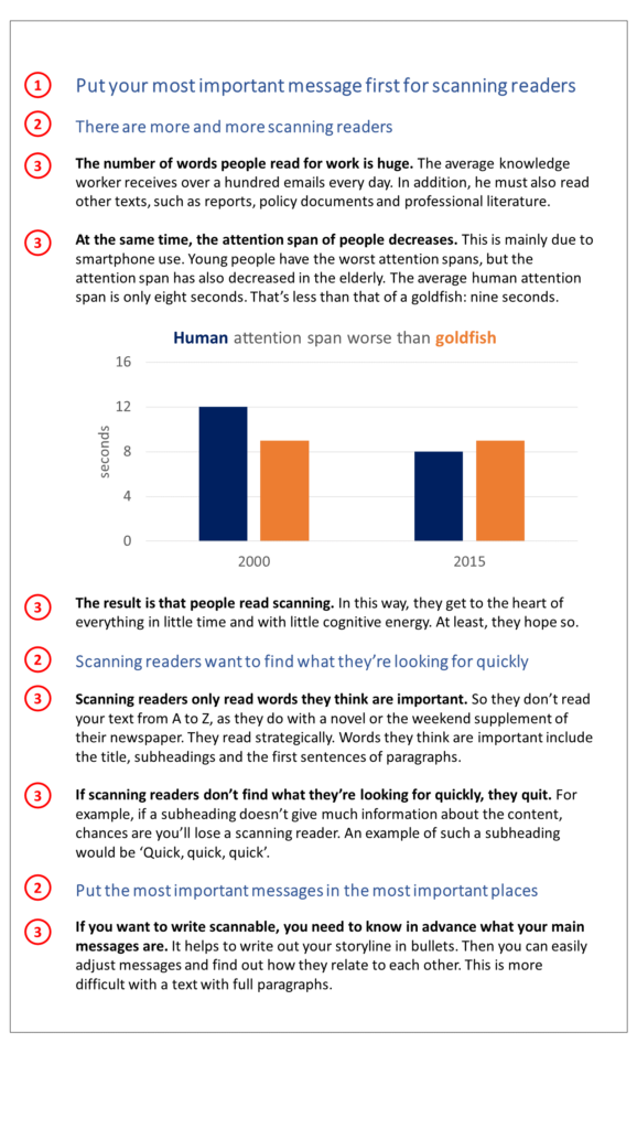
A scanning reader first reads the headline (number 1). That’s what’s most important.
Next, a scanning reader looks at the subheadings (numbers 2).
Finally, a scanning reader looks at the first sentence of every paragraph (numbers 3). I’ve made these bold in the example, so you can quickly identify them.
All other sentences have a low status in the scanning reader’s brain. He only reads it if he wants to know more about the subject.
So, to make your text scannable, put your most important messages in the most important places: in the headline, in the subheadings and in the first sentences of your paragraphs. This way you can be sure your reader notices it.
By the way, I didn’t write this email as scannable, but in conversational style.
Regards,
Arnaud
A monkey and a monster
Today: inspiration to make your story concrete.
From Tim Urban.
You may know him from his philosophical blog Wait But Why.
One of Urban’s most famous articles (and his TED Talk) is about procrastination. To explain that kind of behavior, he introduces three characters in our brain.
He draws the first, the rational decision maker, as a stick figure behind a big steering wheel. This character is mature, it thinks about what is reasonable for the long term.
Urban’s second character is the instant gratification monkey. It lives in the moment and wants to play. Watch YouTube videos about deep sea creatures and Justin Bieber’s mother.
Even when there’s important work to be done.
Until a deadline approaches, for example for a thesis.
Then a third character makes its appearance: the panic monster. A huge red creature that screams ‘aaaaaahhhhh’.
The panic monster fears the negative consequences of procrastination. Like failing a thesis.
When the panic monster appears, the instant gratification monkey flees into a tree. And then the rational decision maker can finally concentrate on working.
I read Urban’s story about procrastination years ago, but still I remember exactly. Especially because he makes abstract processes concrete with funny characters.
Therefore: inspiration.
Regards,
Arnaud
Do you sell fish to a cow?
Partnerships in healthcare.
That’s what Mario’s research is about.
He’s interested in success factors for collaboration between, for instance, district nurses, general practitioners and hospital staff.
But Mario has a problem.
Hardly any of these professionals fill out his questionnaire.
What to do?
Sometimes someone like Mario reaches out to us for advice, with high expectations of communication. For example: ‘If I communicate well, they will fill out my questionnaire at last.’
That’s not always true.
Compare it to selling fish to a cow. No matter how convincingly you communicate, the cow probably won’t buy fish from you. You will have to offer it something different (grass, for example) or choose a different target group (think of a seal).
Something similar might be happening in Mario’s case.
For example, does it take half an hour to complete his questionnaire? And does he offer a 5 euro gift card in return?
Then it will be difficult to persuade busy GPs, transfer nurses or directors.
No matter how clear the questions are and how strong the cover letter is.
So don’t think of communication as a wonder drug, as something separate from the content.
And first check whether that content – your proposal, product or questionnaire – sufficiently matches the wishes of your audience.
Regards,
Arnaud
The problem with synonyms
What to make of synonyms?
Simone emailed me this question last week.
Just to be sure: a synonym is a word that means (roughly) the same as another word.
Map is a synonym for plan.
People often use synonyms to introduce stylistic variation in their text. They fear that otherwise, the text will be repetitive and boring.
For example:
Luka Jovic no longer plays for Real Madrid. The Vikings let the striker leave on a free transfer. Previously, the Champions League winner already leased Jovic to Frankfurt for six months.
As a football fan, obviously you’ll see right away that Real Madrid is the same as ‘the Vikings’ and ‘the Champions League winner’.
Piece of cake.
But as the topics get more complex, it gets more difficult to recognize synonyms.
For example:
Alpha-synuclein plays an important role in Parkinson’s disease. When molecular protection mechanisms fail, proteins in the brain clump together. It’s still unclear how these polypeptides interact with αsyn multimers and which multimers are involved in the formation of the Lewy bodies.
Recognizing polypeptides as synonym for proteins and αsyn as a synonym for alpha-synuclein demands concentration. And without prior knowledge, it’s impossible to figure out that a Lewy body is a clump of alpha-synuclein proteins.
When it comes to your topic, people probably won’t always recognize synonyms either. And then they’ll lose the thread.
Therefore: be careful with synonyms.
Regards,
Arnaud
Small anniversary
At the end of June, I received an email from Roberto.
I’ve been receiving this kind of email for a long time now (maybe one and a half years?), and just wanted to thank you for the great tips.
These short posts are very interesting, quite useful and sometimes even funny (in the good sense). […] Keep it up!
An enthusiastic response always makes me happy.
But in Roberto’s response, there was a specific passage that caught my eye.
Maybe one and a half years…
It made me check when I sent my first tip: on October 13, 2021.
So we’re far from a year and a half. 😉
Still, I want to take a moment to think about my small anniversary: for a year now, I’ve sent these weekly tips.
I’d like to use this moment to collect inspiration for another year.
That’s why I’m asking you:
Is there a communication topic you would like to read a tip about?
You can simply email me: a.bom@analytic-storytelling.com. I’ll always get back to you.
I’m curious!
Regards,
Arnaud
Do you have a plan?
Have you even been on a camping holiday with kids?
I have.
Before you drive off with a car packed with sleeping bags, folding seats and inflatable crocodiles, there are a lot of steps to take.
Choose a destination.
Find out what there is to do at the destination.
Book a camping.
Make a packing list, print the packing list. Get stuff from the attic a few days in advance. Buy missing items from the packing list (why are those headlamps lost again?).
When packing the car, start with the big items, such as the tent and the pram.
And I’m sure I forgot a lot.
If you don’t follow some sort of step-by-step plan like this, the whole thing won’t work.
Then you forget the folding table, the pram no longer fits in the car and you leave a day later than you planned.
Communicating with storytelling may not be as difficult as a camping trip. Let´s leave that an open question.
But it’s safe to state that it’s also good for storytelling to have a step-by-step plan.
So that the result won´t get messy, and so that you won’t get completely frustrated during the process.
I wrote a new page about such a step-by-step plan: the Analytic Storytelling method.
Check it out here before you go.
Regards,
Arnaud
This is a mouse
January 2016.
My colleagues had a new idea. From now on, we would start each training with a drawing on the flipchart.
In the center was a figure: the training participant.
What we drew around it, depended on the brainstorming about the audience of our participants. For example, grant providers, businesspeople, doctors, patients and laymen.
I admit that the idea didn’t immediately appeal to me.
Since I’m definitely not a drawing talent.
Slightly stressed I practiced at home on common audiences.
My patients, for example, were all in a wheelchair, even when they had a burnout.
And my layman was always on a birthday.
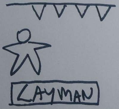
To my surprise, most people acted like nothing was wrong with my drawings. A few joked about it, but that only added to the atmosphere.
The most important lesson?
You decide what your drawing means. Your audience goes along with that.
As an example, take a look at this quick scribble:

If you say this is a mouse, your audience will accept it as a mouse – and recognizes the next scribble that resembles this as such. If you say it’s a magnifying glass too.
So not able to draw, just like me?
That’s not a valid excuse to give up on it.
Regards,
Arnaud
Why don’t you bring a washing machine?
Have you ever used an object in a presentation?
If the answer is no, it might be inspiring to watch a presentation by Hans Rosling. No one I know uses objects with more charm.
One of Rosling’s TED Talks is centered around a washing machine.
Literally, on stage.
Rosling – an elderly Swedish doctor and statistician – talks about the day his mother used a washing machine for the very first time.
His grandmother was invited to this event. She had done hand washing for seven children her entire life. Grandma kept staring at the washing machine until the program was finished.
Rosling’s story is about bigger subjects than washing machines or his grandmother.
He wants to talk about global wealth distribution, population growth, climate change, energy use and literacy. From now until 2050.
Important but abstract topics.
With the washing machine, he makes his subject concrete. That is, he makes it visual, understandable and interesting.
Are you looking for inspiration for a presentation?
Try to focus on an object. An object smaller and lighter than a washing machine usually does the trick as well. 😉
Regards,
Arnaud
You’re a funny warthog
In storytelling, there are a few fixed roles.
The most important is the hero: the protagonist.
On the other hand, there’s the villain – the antagonist – who opposes the protagonist.
In The Lion King, for instance, Simba is the hero. We experience the story from his perspective and empathize with his goals and problems.
Simba’s uncle, Scar, is the villain. He wants to kill Simba and become king of the animal kingdom himself.
A lesser-known role is that of helper.
This is the one who supports or saves the hero in difficult moments.
Simba has two helpers: Timon the meerkat and Pumbaa the warthog.
If you use storytelling in your communication, it’s good to think about this division of roles. Because there’s a danger that you assign yourself, your organization or your product the role of the hero.
It works better to give your audience that role. For example, to tell your story from the perspective of the customer, patient, employee, student or citizen.
Certainly, you have a role as well, but that’s the role of helper. The one who saves or supports your audience.
That’s a very important role. But you’re not Simba.
You’re a funny meerkat or warthog.
Regards,
Arnaud
Is this heaven?
A song by comedian Bo Burnham starts like this:
An open window
A novel, a couple holding hands
An avocado
A poem written in the sand
Fresh fallen snow on the ground
A golden retriever in a flower crown
It seems like a collection of random, idyllic images. It’s only in the chorus that it becomes clear what those images have got to do with each other.
Is this heaven?
Or is it just a white woman’s Instagram?
I can work with that. 😉
On social media, we often show an idealized reality.
You don’t share that your mud-legged golden retriever just soiled your couch, or that you no longer have the concentration for a thick novel.
The same goes for professionals and organizations: they also usually present an idealized version of themselves. They show how good and successful they are.
Does that work?
Certainly not always.
We might be impressed by the white woman on Instagram. But we don’t feel a strong connection with her.
For that reason, it’s interesting not only to communicate about the things you’re good at, but also about your doubts, problems and shortcomings. In a presentation, for example.
That’s scary and requires a lot of fine-tuning.
If you do it carefully, your audience won’t think of you as a loser. They will think of you as human, reliable and sympathetic.
Regards,
Arnaud
I’m just improvising
Question.
Have you ever taken classes about designing or choosing visuals? For your slides, for instance?
For most knowledge workers, the answer is ‘no’. At universities, designing visuals is rarely part of the curriculum.
Even though almost everyone has to give presentations, later, at work.
The result?
Visuals anxiety. Image insecurity. Perhaps even image shame.
The sense that you are just improvising.
Based on intuition. Based on what you see others do.
Sounds familiar?
This article offers some tools to choose consciously between 4 types of visuals. Every type of visual has its own advantages and disadvantages.
This article helps you, for instance, when you often use the same type of visuals. For example, when 80% of your slide show depicts data visualizations, or schematic representations of cell structures.
The article also helps you when you use very few visuals. When 80% of your slides show bullet points with text, for example.
Curious? Read it here!
Regards,
Arnaud
How do you come up with a metaphor?
A popular science article begins like this:
[…] imagine a company of drunken students who wander in the streets, and whenever they come to an intersection one of them just spins around and they all go down the path that ends up being in front of the spinning student’s eyes.
In this way the author, Oliver Nagy, makes the mathematical concept of ‘random movement’ concrete. That’s an arbitrary route in a network. Random movement is used, among other things, to describe stock prices and the distribution of pollen.
Is your subject also abstract and do you communicate with a wide audience?
Then it really helps to use a concrete metaphor.
But how do you come up with that?
Usually it helps to articulate the underlying idea first.
In Oliver’s case: sequential, random movements on nodes.
The next step is to brainstorm where you encounter that idea in a familiar sensory setting.
Streets and intersections make the network physical in a logical way. And drunken wandering is a beautiful depiction of random movements.
The metaphor allows Oliver to quickly explain later what distribution is (places where the students can be and the probability that they are indeed in that place) and mixing time (the time that elapses until it no longer matters for the distribution what the starting point – the pub – was).
Well done!
Regards,
Arnaud
PS Oliver wrote his article in a workshop of my colleague Marieke for The Network Pages. Are you interested in such a writing workshop for your organization? Please email us.
PPS Oliver’s article is meant for people with a basic knowledge of mathematics.
Ode to your shitty first draft
Are you a perfectionist?
When you write, perfectionism is both a blessing and a curse.
A blessing because your text gets better when you rigorously sharpen formulations and spot errors.A curse because perfectionism often frustrates the beginning of your writing process.
The beginning of a writing process is almost always messy. For a perfectionist, that’s hard to accept. The result may be that you start late or don’t start at all writing your text.
Therefore, today in the spotlight: the shitty first draft (SFD).
When you allow yourself an SFD, you consciously insert a phase of imperfection.
You write in this phase just to explore lines of thought and formulations.
No one is looking at it.
No one criticizes you if your thoughts are childish, your paragraphs messy, or your sentences clichéd.
You just write. Preferably at a good pace.
Is your SFD finished?
Then you take some distance from your text and start the next writing phase. For example, you can create a new structure plan (bullet list). Or you start with a new version in which you copy a successful passage.
With the shitty first draft you create a first, accessible step in your writing process. So that you can start writing more easily.
Regards,
Arnaud
PS The idea of the shitty first draft comes from the book Bird by Bird by writer Anne Lamott.
PPS Due to the holidays, I won’t send you any tips for the next four weeks. See you the end of August!
More than a *$&#ing shitload
China produces 56,432,811 tons of tomatoes annually.
What are you picturing when you read this sentence?
And would it have been different if it were 28,216,405 tons of tomatoes?
A difference of 50% is huge. Yet our brain doesn’t necessarily experience it that way with large numbers.
An episode of the TV show Bullshit! explains this nicely.
Penn, an overweight American in a suit, stands behind a table. On that table are cups with chocolate candies: N&N’s.
His producer doesn’t allow him to mention brand names.
The first cups contain 1, 2, 3 and 4 N&N’s. Penn eats them and explains that he understands this well. 3 is 3 times as much as 1. But still, it’s not much.
5 to 8 N&N’s is already better: he calls them ‘a few’. And 10 to 30 N&N’s are ‘a bunch’.
There are many things Penn would like to eat ‘a bunch’ of.
Then we come to ‘a lot’ (10 bunches). And after that it’s just a big pile. An assload, a shitload, etcetera.
On the table is a cup with 2347 N&N’s. Penn explains what that means for his ‘monkey brain’: ‘more than a mother*$&#ing shitload’.
Do you ever communicate about large numbers? Try to make them relative. Or to relate them to something your audience can imagine.
For example:
Facebook has 2.9 billion users. About a third of the world’s population logs in monthly. If Facebook were a country, it would have the most inhabitants in the world.
Regards,
Arnaud
A has to do with B
Until the beginning of 2020, I gave face-to-face training sessions.
With name plates and flipcharts. With coffee pots and cheese sandwiches for lunch.
I can hardly imagine it anymore.
Since the COVID-19 pandemic, I mainly see training participants on Zoom and Teams.
That has its drawbacks, but not only…
In online sessions, I started to discuss one communication technique much more often. And that worked out so well that I thought, why haven’t I done this before?
The technique is called ‘stringing’.
When you string, you connect a term you introduce to a term you’ve already used.
For example:
- As you grow older, your working memory deteriorates.
- This working memory deteriorates when certain brain circuits become less well connected.
- The decreased connectivity in these brain circuits is the result of problems with two so-called theta interactions.
A has to do with B, B with C, C with D. Etcetera.
On a shared screen, I use colors to analyze a text or a bullet list in this way. You usually don’t have a whole piece of text ready on a flipchart, do you?
Stringing is a simple technique, but it often greatly improves the flow and comprehensibility of a story.
So: string!
Regards,
Arnaud
PS Want to know more about stringing? I wrote this article about it.
Brainstorming for an hour about two words
A while ago I spoke to Renske.
And Renske made a stimulating remark about titles.
‘You can easily brainstorm for an hour about an appealing title. Even though a title only consists of a few words.’
Okay, take a step back.
Who is Renske?Renske is a teacher-researcher at Hogeschool Utrecht. Her subject is ‘youth’.
For a new website, she called in my colleague Priscilla.
The website describes nine working methods. And those methods have titles.
Two of the original titles were ‘Triade Conversation’ and ‘Multiactor Intervision’.
Those titles provoked alarming reactions.
‘Erm, what do you mean?’ ‘If you want to recruit people, you really have to come up with another name.’
That’s why Renske decided that things had to be done differently. And that it could take some time. To make sure the titles would evoke curiousity.
Do you ever create titles yourself? For your report, your presentation or your project?
Invest time, brainstorm, come up with alternatives and check them with your target audience.
Just like Renske.
Regards,
Arnaud
PS You can read the entire conversation with Renske below. The communication lessons from her project are, for example, about dealing with a broad target audience, formulating calls to action and informal writing. And you can read what the new titles are. 😉
PPS Do you want to work with us in your communication project, just like Renske? Email me or leave a message on our website!
Getting used to an informal writing style
Communication lessons from Renske Schamhart
How do you address many different people at the same time? That was one of the most important questions in the project called ‘Learn with us in the youth domain’. Teacher-researcher Renske Schamhart, from Hogeschool Utrecht (HU), wanted to share working methods with ‘the entire youth domain’ on a website. This domain extends from crèche to neighbourhood team and from university to juvenile detention.
Six characters as target audiences
In the project, it quickly became clear that the website has six target audiences: young people, parents, researchers, professionals such as youth care workers, and teachers and students from courses such as pedagogy and Social Work.
Renske: ‘On the website, we gave each target audience its own color and ‘character’. For example, the parent character is a father with a baby in a carrier. The associated color is red. If you click on a character, you’ll see the working methods that are interesting for that target audience. So you can click through the site from your own perspective.’
What’s in it for me?
If visitors just click around, it’s not enough: they also have to do something with the working methods. And for that, they need to be motivated.
Renske: ‘On the website, we didn’t only describe what the working method entails, but also what it yields. The only thing was, that differs per target audience. A teacher doesn’t get the same out of a working method as a professional. That’s why we answered the same question from the perspective of each target audience: What’s in it for me?’
A related question is how exactly the audience should get to work with the working methods. Renske: ‘Through conversations with Priscilla, I started to think about this a lot more. We wanted to include a clear call to action, instead of just inform. At first glance, the call to action seems clear: choose your working method and get to work. But a student, for instance, can’t do this on his own initiative. He will link up with a teacher or with someone from a network who organizes a working method. So you have to find out for each subgroup how you can help them to get started.’
Away from ‘university worthy’
The style of the texts on the website is informal: short sentences and accessible language. Some sentences are even incomplete. A sentence that, for example, starts with ‘And’. When you read the texts, it’s almost as if someone is talking to you. Because Renske works in higher professional education every day, she had to get used to this informal writing style.
Renske: ‘I’ve been trained to write ‘university worthy’, with complete sentences. If students use colloquialisms, I correct them. So I had to get used to the informal style, but I also like it and I’ve learned a lot from it. Moreover, we get enthusiastic reactions to the texts.’
The project also made Renske think about communication tools in the university, such as PowerPoint presentations and study manuals. ‘Our means of communication are university worthy, but often quite boring. There is much to be gained if we attune it more to the students’ perception of the world.’
Titles and image reinforce each other
Each working method has its own title. For Renske, the importance of an appealing title became increasingly clear during the project.
Renske: ‘Two of the original working method titles were ‘Triade Conversation’ and ‘Multiactor Intervision.’ We received alarming reactions on those titles. ‘Erm, what do you mean?’ ‘Difficult word.’ ‘If you want to recruit people, you really have to come up with a different name.’ Those comments made me realize that we needed to pay more attention to the titles. Even though a title only consists of a few words. In the end, we chose ‘Triple profit’ and ‘Intervision outside your bubble’ as the new titles.’
Renske also points out the interaction between title and image. ‘Each working method has its own image. If we had a good title, it turned out to be easier to come up with that image. This applied, for example, to ‘Intervision outside your bubble’. In the image accompanying this working method, four people puncture each other’s bubble. You won’t come up with something like that with ‘Multiactor Intervision’.’
A lot of work, but then you have some
When asked about a last lesson, Renske reflects on the time investment. ‘Realize that such a project is labour-intensive, also as a client. If you want to do it carefully, you’ll have to think about a lot of choices, and check everything you create with your target audiences. But then you’ll get something really nice in return!’
The downside of a free audio tour
Fleur works for a large museum.
She has a plan to improve visitor ratings. That is: free audio tours for every exhibition.
Visitors who follow an audio tour, rate the exhibition on average 0.6 point higher than other visitors. And if the audio tour is free, it will be used more.
Not much to argue with, right?
Unfortunately, Fleur’s audience – the museum’s management – will probably have a different view.
Usually, you mainly think about the benefits of your own plan. While your audience primarily focuses on the risks. Because your audience has status quo bias: it unconsciously prefers to leave things as they are.
The status quo is known and ‘safe’. Despite the imperfections.
If you propose to change the status quo, your audience won’t know what it’s getting. That’s why such a proposal leads to reservations.
Is the data solid?
Is it financially possible?
What does this mean for counter staff?
Do we have enough equipment?
Can we do this with every exhibition?
If Fleur addresses and removes such objections, her story becomes more convincing.
Do you have a plan that you believe in as well?
Use your enthusiasm in your communication. But also look at it through the lens of the status quo bias.
Regards,
Arnaud
Storytelling: what is that exactly?
The organization I work for has ‘storytelling’ in its name.
I give training on storytelling. I advise on storytelling. I do executive storytelling work.
So you would expect me to know exactly what it is: storytelling.
But do I?
Of course I have an image of the term. But I must admit that I couldn’t describe it one-two-three. And that’s what I wanted to do for a new page on our website.
The thing is, people use the term ‘storytelling’ in a variety of ways.
Storytelling in a presentation can relate to (personal) anecdotes and emotions.
In (corporate) storytelling in companies it’s often about meaning and the ‘why’.
Storytelling in reports and scientific papers usually refers to a ‘narrative’ structure.
Do you get confused by the term ‘storytelling’ as well? On our page ‘What is storytelling?’, I’ve broken down storytelling into three main ingredients.
So you can quickly see if it is for you. And get ideas on how to apply it.
Curious?
Regards,
Arnaud
PS Also check the cool visualizations. Thanks to my colleague Priscilla!
I Have a Dream in PowerPoint
Is there something wrong with PowerPoint?
In any case, the program has a dubious reputation.
For example, there is the expression ‘death by PowerPoint’. It occurs when you’re in a musty room listening to someone who monotonously reads slides full of boring walls of text.
Switzerland even has an Anti PowerPoint Party. The aim of the APPP is to ban PowerPoint through a referendum.
According to the party, in 95% of the cases PowerPoint leads to poorer presentations. With major economic damage as a result. (The solution? Flip charts.)
A third and final example of the resistance that PowerPoint provokes comes from Belgium. It’s from the comedian Arnout (sic) van den Bossche.
In a skit (in Dutch) he shows a PowerPoint version of Martin Luther King’s I Have a Dream speech. Including agenda, inimitable 3D bar charts, spinning text, moving arrows and action plan.
Very funny.
According to Van den Bossche, PowerPoint takes the soul out of a presentation. Because people start with the technology and not with the story.
Does that make PowerPoint intrinsically bad?
I don’t think so. I actually like working with it myself.
If you know and avoid the pitfalls, PowerPoint is a fine tool.
If you don’t, it turns into a murder weapon.
Regards,
Arnaud
The true nature of the Smurf
Blue gnomes with white pants and a floppy pointed hat.
Smurfs may seem innocent.
But nothing is less true.
In a book from 2011, the French political scientist Antoine Buéno shows the true nature of these creatures.
The gist? Smurfs are totalitarian racists. Kind of Nazis.
First of all, the Smurfs have a dictatorial leader: Papa Smurf. They must hand over all of their possessions to him.
And then Smurfette has blond hair. A clear reference to the Aryan ideal of beauty.
Finally, there is Gargamel, the evil enemy of the Smurfs. Whoever studies his appearance, identifies a stereotypical Jew. And why else is his cat named Azrael?
I don’t want to burn my fingers on whether Buéno is right. In any case, I had never looked at the Smurfs that way before. 😉
One statement I do dare to make, is that you should watch out for Smurfs in your texts. To be precise: for what we call in Dutch ‘smurf words’.
Smurf words are generic words that can mean anything. They make your text abstract. Well-known examples are ‘to realize’ and ‘to facilitate’.
So please try to smurf an alternative for those kinds of words.
Regards,
Arnaud
The name of the CEO
The housewife’s syndrome.
Betty Friedan first wrote about it in 1963.
Back then, when women got married or became pregnant, their careers usually ended. And often not because they wanted it.
The involuntary life as a housewife led to problems.
Loneliness, boredom, dissatisfaction. The feeling of not being part of society. And sometimes even alcoholism, depression or suicide.
Now, in 2022, things are different.
Are they indeed?
Of course, much has changed since 1963. But to say that the opportunities in the workplace are equal for both sexes…
For example, only 4.8% of the CEOs of Dutch listed companies are women. Reason enough to continue drawing attention to gender equality.
Recently, a remarkable fact was used as a communication weapon.
Dutch listed companies have more CEOs named Peter than CEO’s who are female.
This little fact is so powerful because it is specific. It’s not about 4.8%, but about one name. And thus it immediately evokes images and emotions.
It was therefore quickly picked up by the media. And around International Women’s Day, many Dutch women changed their first name on their LinkedIn profile to ‘Peter’. As a playful reminder.
Do you want your message to stick as well?
Be alert to specific facts.
Regards,
Arnaud
Metal monster
Duel is one of Steven Spielberg’s first movies.
The main character, salesman David Mann, drives a small red car through a desolate landscape. It’s hot.
He comes to drive behind a huge, brown truck. He overtakes it.
Moments later, he sees in his rearview mirror that the truck is tailgating. Mann waves and lets him pass.
The truck cuts him off. But after that, it seems like nothing happened.
Mann stops to refuel. The truck stops as well. Mann drives on and again, the truck tailgates. Even when Mann accelerates and reaches high speed.
For a moment, Mann manages to shake off the truck. But the menacing metal monster keeps appearing. It becomes increasingly clear what it wants: to kill Mann.
At the end of the duel – spoiler alert – the two vehicles face each other on a dead end. The truck approaches Mann. Mann locks the accelerator with his briefcase and jumps out of the car.
After a collision, the truck rolls into a canyon.
As a viewer, you feel nothing but relief.
Duel is simple, but pure storytelling.
We get to know a main character with whom we identify. That main character has a problem. And in the end, that problem is overcome.
If you look closely, you can see this structure in many films.
And you can also use it to make communication about your work more interesting. Though that may sound farfetched.
How?
Check our page about the SCQA structure.
Regards,
Arnaud
They seduce the mamils
In the village Ouderkerk aan de Amstel, they’re not a fan of cyclists.
At least, that’s how I imagine it.The village is located south of Amsterdam and opens up a beautiful cycling area.
On a sunny Sunday, thousands of cyclists cycle through Ouderkerk, on their way to polders and ditches.
Most of them are ‘mamils’: middle-aged men in lycra.
Until recently, you couldn’t walk safely through the narrow Dorpsstraat of Ouderkerk on such a summer day. Left and right, the mamils raced by.
But now, the municipality has come up with something clever. A friendly sign to tempt cyclists to detour, and thus avoid the Dorpsstraat.
This is the sign:
This sign is clever because it speaks the language of the target audience.
Among cyclists, KOM stands for King of the Mountain. In the Strava sports app, you get the KOM crown if you’re the fastest in a segment – hilly or flat. ‘Kom’ is also the Dutch word for ‘come’.
I am a mamil myself.
Every time I see the KOM sign, I have to smile. And I am more than willing to change my route.
Do you want your audience to be more benevolent and understand you better?
Speak its language, use its words.
Regards,
Arnaud
Little green man
‘Suppose a little green man…’
Stephen Hawking once wrote this sentence in a scientific paper.
The playful formulation didn’t make it to the final draft. An editor forced him to change it into ‘Suppose an observer…’.
I came across this anecdote while researching for an article on academic writing. I couldn’t find out if it’s true.
In my research I stumbled upon more little jokes from scientists.
At the time, I didn’t include them in my article. But today I’d like to share a few with you.
Scientists find, for example, room for humor in the titles of their papers:
Both have really been published.
The names of new animal or plant species sometimes contain a joke as well.
For example, there’s a mite that’s called Darthvaderum. And a mushroom with the name Spongiforma squarepantsii. Both because of their shape.
The names of the species come from an article by biologist Stephen B. Heard. Heard also wrote a Scientist’s Guide to Writing.
He argues that we should include ‘touches of whimsy, humanity, humour, and beauty’ in papers more often. Obviously, as long as it doesn’t get in the way of clarity.
Regards,
Arnaud
How to create a group
You’re going to the supermarket for nine groceries.
Strawberries, broccoli, butter, raspberries, kiwi, cucumber, milk, tomatoes and white bread.
But you’re not allowed to make a list.
Remembering nine groceries is a lot for your brain. So it’s useful to create groups. Categories, clusters, silos…
But how do you create logical groups? Not only for your groceries, but also for structure puzzles at work?
A tool that can help you is MECE: Mutually Exclusive, Collectively Exhaustive.
For example, the groups ‘dairy’, ‘fruit’ and ‘green’ are not MECE. Because ‘fruit’ and ‘green’ are not mutually exclusive. Just ask the kiwi.
The groups ‘dairy’, ‘fruit’ and ‘vegetables’ are not MECE either. Since white bread doesn’t fit into any of these groups.
Then what is MECE?
For example, the groups ‘red’, ‘green’ and ‘white’. At least for this collection of groceries.
In your work you can use MECE to analyze data or arguments, to get a grip on complex matters or to make a chapter division.
That’s why consultants love it.
Regards,
Arnaud
The problem called template
Suppose I start a presentation like this:
I’m Arnaud from Analytic Storytelling.
Today I’m going to talk about templates.
By the way, I work at Analytic Storytelling.
A template is a standard layout for slides. Often with an organization logo and fixed colors.
I work at Analytic Storytelling.
Sounds absurd?
According to communication expert Jean-luc Doumont (recommended!), many people do something similar in presentations. Maybe you do it too, without knowing it.
Obviously, nobody literally says their name after every sentence.
But people do use a template on every slide.
For example, the Kennesaw State University (Georgia) template looks like this:

This isn’t about me trying to bash Kennesaw State University. Because almost every organization has a template like this.
If you’re working on a presentation, a template might feel comfortable.
There’s nothing on your slide yet. But it already looks professional.
Jean-luc Doumont thinks very differently about templates.
According to him, everything on a slide should contribute to the message. Anything that doesn’t, is visual noise. And visual noise makes your message less clear.
Doumonts own slides are very minimalistic. I’m a little less radical myself.
But seeing your template through his eyes is stimulating.
Regards,
Arnaud
By monkeys 🐒🐒
Your monthly internet costs are increased. By monkeys.
What does this sentence have to do with good communication?
One of the most important pieces of writing advice is to use the active voice. And to avoid the passive voice.
An example of an active sentence is ‘Joseph cooks the spaghetti’. The passive counterpart is ‘The spaghetti is being cooked’.
An active sentence is more direct and visual: it paints the whole picture. Active sentences are therefore usually clearer, more attractive and easier to read.
If you want to use the active voice, it’s important that you recognize passive sentences immediately.
You can do this by paying attention to the auxiliary verb ‘to be’. Cooking is taking place, decisions have been made, internet costs are increased…
But wait – it’s much more fun this way.
Check if you can add ‘by monkeys’ to the sentence. Possible? Then the sentence is probably passive.
Regards,
Arnaud
PS I found the monkey trick on the website of Monzo. You can also use zombies, if you prefer.
Blood and milk
One day in high school, I passed out.
During geography, on my school desk.
The lesson was about the Maasai, a nomadic tribe in Eastern Africa. One of the Maasai traditions is bloodletting.
A Maasai selects a cow from his herd. He ties the neck with a belt. Then he shoots the cow in the neck with bow and arrow, causing the cow to bleed. He collects the blood in a gourd.
When the gourd is filled with about half a liter of blood, the Maasai pinches the wound edges together. This stops the bleeding. The Maasai adds milk to the blood and drinks it.
I had a teacher who expressed himself very visually. And I couldn’t stand blood.
Before the milk came in, I was knocked out on the table.
This anecdote shows how strong the effect of a good story can be. You’re drawn into a world and have an emotional reaction on what you’re picturing in your mind. And sometimes even a physical one. 😉
You probably don’t want your audience to faint.
But if you want to get your message across, emotional involvement really helps. You achieve this involvement with a visual description full of sensory details. With blood and milk.
Regards,
Arnaud
What’s the fire?
Today I have a little exercise for you.
Storytelling often revolves around an opposition. The opposition between problem and solution, between before and after.
The opposition creates tension: we aren’t yet where we want to be.
Sometimes you’ve been working on a subject for so long, you forget the opposition. You’re no longer focused on the problem part. So you forget to talk about it.
In other words, you only communicate about the solution: your advice, proposal, research, policy or product.
Therefore, as an exercise: find the corresponding problem for each solution below. And take at least half a minute to describe the problem.
Here’s an example to get into it.
Is the solution ‘firemen’? Then say that annually, there are over 66,000 house fires in the Netherlands. In about 50 cases with a fatality. And with 800 people every year with very severe burns. This often leads to years of trauma. The average financial loss per fire is almost € 21,000. Etcetera.
Describe details, numbers, consequences and the associated emotions.
Ready?
Here we go:
Toothbrushing
A reversing camera for your car
A website with medical information verified by specialists
A campaign for understandable government language
A quality mark for fair fashion
Good luck!
Regards,
Arnaud
How do you convince a skeptic?
In my training sessions, participants sometimes ask difficult questions.
I like that.
One of the most difficult questions is: how do you convince someone who fundamentally disagrees with you?
For example, someone who doesn’t believe in climate change. While your story is about heat pumps.
Or someone who thinks that 5G towers emit dangerous radiation. While there is no evidence for that.
And I haven’t even mentioned corona yet.
So it’s a topical question…
My answer?
It’s hard. Sometimes it’s impossible. But not always.
The most important thing is that you really start from the world, the knowledge and the values of your audience.
The best example I have found is in the book Made to Stick: about a campaign against the litter problem in Texas.
How do convince the stereotypical young, male Texan who occasionally leaves something lying around?
That Texan has a pickup truck and doesn’t care about seals. He is proud and independent and doesn’t let anybody tell him to clean up his mess. He’ll decide that himself!
The ‘Please no litter’ signs had little effect. 😉
In the campaign, Texan pride eventually became the deciding factor.
For example, there was a TV commercial with a tough, famous Texan baseball player throwing garbage in a trash can with a fastball.
The slogan? Don’t mess with Texas!
Pretty good.
Regards,
Arnaud
Is a question mark in your title a good idea?
Today I have something funny for you.
It’s called Betteridge’s Law of Headlines.
Betteridge’s Law states that to any headline that is formulated as a yes/no question, you can answer ‘no’.
Wanna try?
Is this the new medicine to cure AIDS?
No.
Is Algeria a paradise for renewable energy?
No.
Are cryptocurrencies taking over the world?
No.
If the answer were ‘yes’, the headline would be different. That’s the idea behind Betteridge’s Law.
A journalist would love to put in the headline that a cure for AIDS has been found.
That’s why headlines with a question have a bad reputation. A reputation of overselling and sensationalism.
Since I know Betteridge’s Law, it’s difficult for me to read headlines with a question in a neutral way.
More examples? There’s a dedicated Betteridge’s Law website with an extensive collection.
Regards,
Arnaud
A much better slide (within a few minutes)
Today’s tip has just four words.
Use The Noun Project.
Really.
Use it for your presentations. And for your infographics and graphical abstracts, if you make them.
What is it?
The Noun Project is a database with icons created by graphic designers.
You can find an icon for just about everything. There are over 3 million icons.
Wanna try?
Let’s take the following slide about police investigation as an example.
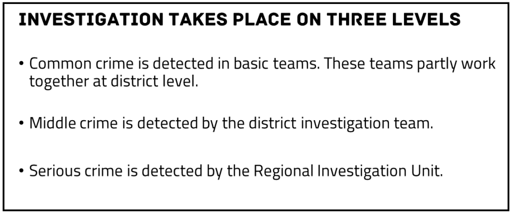
There are just a few sentences on the slide. But still, your audience has to concentrate to grasp it.
And it’s not very appealing, such a slide full of text.
Enter The Noun Project.
In a few moments, you’ll find an icon for every important word.
Sometimes you need to be a bit more creative. For example, with ‘common crime’, I used the keyword ‘pickpocket’. And with ‘serious crime’, I used ‘mafia’.
The result may look like this:
I’m not a graphic designer. And I’m sure my alignment isn’t perfect.
But I did make a slide that is much better than the one with just text.
In less than 15 minutes.
Regards,
Arnaud
PS I don’t have any shares in The Noun Project. Just to make sure. 😉
Talk to me
A blogpost from 2005.
You can see from the layout that it was a while ago: MS-DOS vibes.
But it’s still one of the best articles on writing I’ve ever read. And I’ve read quite a few.
The title alone.
Conversational writing kicks formal writing’s ass.
Author Kathy Sierra advises to write the way you talk. But then without the um’s and you-know’s.
Not only in blog articles. Also in books.
Even books on complex topics.
When you write conversationally, something strange happens.
Your reader knows he’s not having a real conversation. Yet his brain subconsciously thinks it needs to talk back. So it pays more attention.
Research also shows that people remember conversational writing better than formal writing.
You may know this intuitively. But most people have unlearned writing informally in high school.
Too bad, Sierra says. Your sixth-grade teacher was wrong.
Sierra ends her story with a nice one-liner.
If your brain had a bumper sticker, it would say: I heart conversation.
So, do you want me to pay attention?
Address me as ‘you’. Ask me questions. Use everyday words.
Just like in a conversation.
Regards,
Arnaud
Advice from the art academy
In my twenties, I studied for two years at the art academy.
My specialization was ‘Image and Language’, and one of the courses was ‘Writing’.
I wrote a story that was set in Mongolia – I had been there. I have always remembered the criticism of one of my sentences.
Mongolia is a vast country, with magnificent, untouched nature and an authentic nomadic culture.
I wrote something like that.
I was still young. 😉
The teacher was resolute. Cliché formulations. Too much ‘tell’, too little ‘show’.
This is how I got introduced to the basic rule for creative writing: Show, don’t tell.
You can tell your audience that a country is vast. But it works better to show that. With images and details.
How do you see it?
For example, do the characters ride a horse for a day without seeing anyone? Do they buy two kilos of rice because they know they won’t see a shop for the next week?
Show, don’t tell is also good advice for professional communication.
If you want to say that your product is user friendly, of high quality or sustainable, for instance.
Does the phone have a four-year warranty, is it made from recycled materials, and can you repair all parts yourself (with a manual)?
How do you see it?
Regards,
Arnaud
Baby, Werewolf, Silver Bullet
Never in my weekly tip has a werewolf passed by.
That must change.
Here it comes.
In our Analytic Storytelling method, we use a fixed format to structure stories. The SCQA: Situation – Complication – Question – Answer.
The SCQA-structure makes your story comprehensible and urgent. And I fully support the method.
But…
The abbreviation is somewhat abstract. And maybe hard to remember.
Some time ago, in a blog post by biologist Andrew Hendry, I came across a more visual alternative.
Baby – Werewolf – Silver Bullet.
(The Q is missing, but that’s not a problem.)
Andrew Hendry says to start your story with a cute baby. A subject we find interesting or important. Like biodiversity.
Then explain that the baby is being threatened. So that the audience will start to worry. This is the werewolf part. For example, the biodiversity is being threatened by habitat loss.
Finally, describe the silver bullet you use to make the werewolf (more) harmless. For example, designing ecological corridors in a new way. A way that limits the impact of habitat loss.
Can’t remember the abbreviation SCQA for a moment? Think of Baby – Werewolf – Silver Bullet.
That’s hard to forget.
Regards,
Arnaud
How Can I Make This About Me?
Are you on Twitter?
I am, although I rarely post. I mainly look around for input and distraction.
An account I enjoy following is ‘How Can I Make This About Me?’. HCIMTAM shares messages from people who put themselves a little too emphatically in the spotlight.
Like Prof. David Pinto:
Renowned psychologist Prof. Dr. Willem Hofstee passed away. Sad. Prof. Hofstee was a member of the reading committee of my Dissertation and he wrote about me: “The greatest possible respect is due to the contributions the author has made to civilization and humanity.”
Another fun HCIMTAM example is Instagram model Natalie Schlater.
She posted a picture in which she stands prominently in front of a rice field, in underwear. Caption: ‘Thinking about how different my life is from the man picking in the rice field every morning.’
HCIMTAM shows extremes of narcissism and vanity.
But the tendency to relate something back to yourself is not extreme in itself. It is human.
And your audience has that tendency – consciously or unconsciously – as well.
Therefore, it’s best to ensure that your story is already explicitly about your audience. Because people find themselves most interesting after all.
Regards,
Arnaud
You overestimate your audience
Everyone knows this!
Do you ever think that when it comes to your subject?
Many experts know this experience. You think you’re explaining something in a very simple way. And yet your audience looks at you questioningly.
How come?
The mechanism that plays a role here is called the curse of knowledge.
As an expert, you’ve been trained in your subject for years. And the knowledge you’ve gained, determines the way you perceive the world.
An ornithologist recognizes a merlin, while a layperson only sees a falcon, a bird of prey or just a bird.
An ornithologist has all kinds of associations with the word ‘merlin’. How it looks, that it’s rare, that it’s small, that it doesn’t hover, like a kestrel.
And many more.
Such associations are important for your work as an expert. But when you communicate, they just get in the way.
Because your audience doesn’t have those associations. So they don’t automatically draw the same conclusions as you.
Are you unsure whether you should explain a basic term of image from your field?
Then the answer is probably ‘yes’.
Regards,
Arnaud
Grumpy Old Man
‘The first rule for a good style is to have something to say; in fact, this in itself is almost enough.’
This is a quote by the 19th century philosopher Arthur Schopenhauer.
As a former philosophy student, I can’t help but share such a snippet of wisdom with you every now and then.
Schopenhauer was popular among my fellow students.
This was partly due to his provocative, pessimistic view of life. He was a grumpy old man. Selections of his work have been compiled in Dutch as De wereld een hel (The world a hell) and Er is geen vrouw die deugt (There are no good women).
Schopenhauer was also popular because his work is so easy to read. He has an elegant, attractive, literary style.
But according to him, the basis of a good style is that you have something to say.
He is right.
And it also applies to communication about your work.
Sometimes I see people worrying about form early on. Sentence length, passive sentences, spelling. Fonts, colors, and alignment on slides.
All important.
But not the essence.
Make sure that first, you know what you want to say. What your message is. And pay most attention to that.
Only then, worry about form.
Regards,
Arnaud
Keep your stories in shape
Analytic Storytelling tips in your inbox?

"*" indicates required fields
Do you have a question you’d like to discuss? Feel free to call us or send an email:
 Priscilla Brandon
p.brandon@analytic-storytelling.com
+31 6 14 50 98 91