A slide filled with bullets and text.
A graph with stacked 3D-bars.
An infographic with ten different colors.
You can find bad slides everywhere.
But if you recognize a bad slide, does that mean you know how to make a good one? A slide that makes your story more attractive and easier to understand?
Not necessarily.
This article helps you improve your slides in six steps – with six questions.
Questions you can – and, in fact, should – ask about every single slide.
Side note: these questions are not just relevant for slides. You can also use them for infographics, and for images in documents or posters.
Question 1: Is the message in the title?
An image captures the attention.
But before your audience sees your image, it usually sees something else.
The title.
The words at the top of the slide.
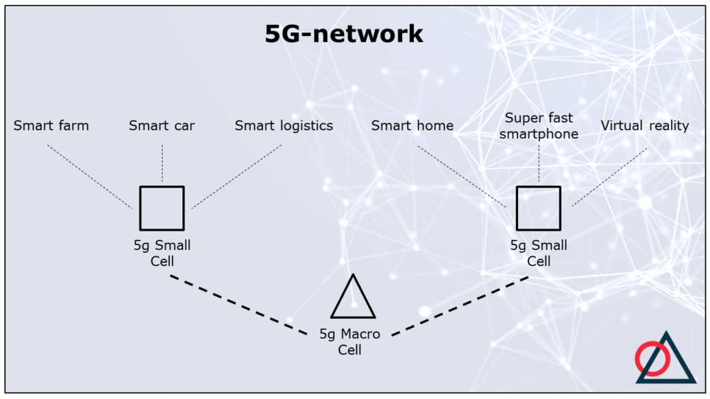
For instance:

The title determines the way your audience looks at the slide and how they interpret it.
That’s why it’s smart to put the message of the slide in the title. That way, you steer their interpretation.
The title above – 5G-network – doesn’t convey the message. It just explains what the topic is.
As a result, the audience has to find out what this slide has to say about the 5G-network.
This is dangerous.
Because the audience can interpret the slide in a different way. Or zone out, because it doesn’t understand the slide.
So what does a title with a message look like?
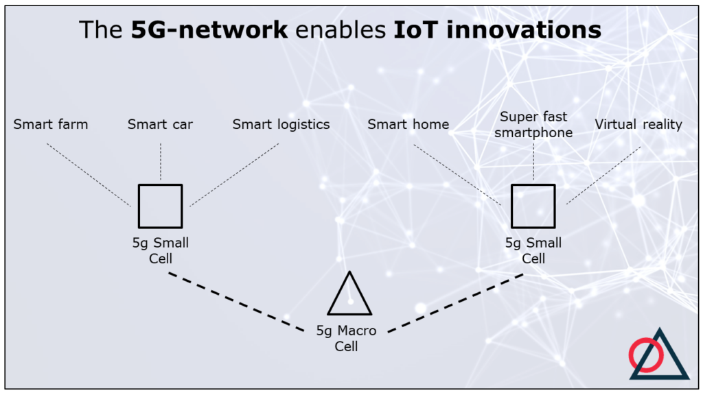
Here is an example:

IoT stands for Internet of Things.
With a statement title the audience will quickly see that the top section of the slide is about IoT-innovations. And the bottom section about the 5G-network that enables these innovations.
Of course, other titles are possible. If, for instance, the emphasis is on the macro cells and small cells, it’s smart to mention these in the title.
More tips for statement titles can be found here.
Question 2: Does the image match the title?
The next step is to check if title and slide align.
In our example, this is more or less the case. But not quite. Superfast smartphones and virtual reality are not IoT-innovations. The term ‘IoT’ is used only for devices that weren’t connected to the internet before (like a fridge), and now go online.
If title and image don’t match, there are two options.
Option 1 is to change the title. You could leave out ‘IoT’. Then, the title is about innovations in general.
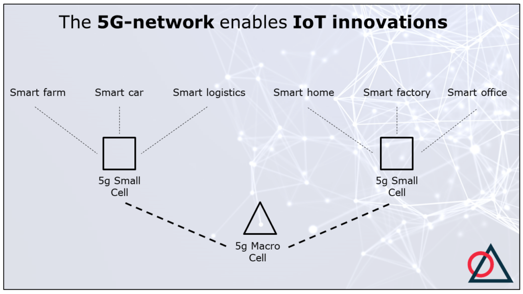
Option 2 is to change the slide so it matches the title. For instance:

I added two new IoT-innovations: smart factories and smart offices.
It would also be fine to visualize just four IoT-innovations.
Of course, the slide can offer more details than the title. As long as the title covers the main points of the slide.
For instance, on this slide, you can see examples of IoT-innovations. And the slide show that the 5G-network consists of a macro cell and a couple of small cells.
Does the slide offer a lot more detail than the title? Consider spreading this information over two slides instead of just one.
Question 3: Can you replace text with images?
(Most) people find visual information easier to understand and to remember.
So, always check if there are words on the slide that you haven’t visualized yet.
Often, there is a lot of room for improvement. (Especially if the slide contains a lot of text.)
In our example the IoT-innovations are only represented by words. The macro cell and small cells are visualized, but in a very abstract way.
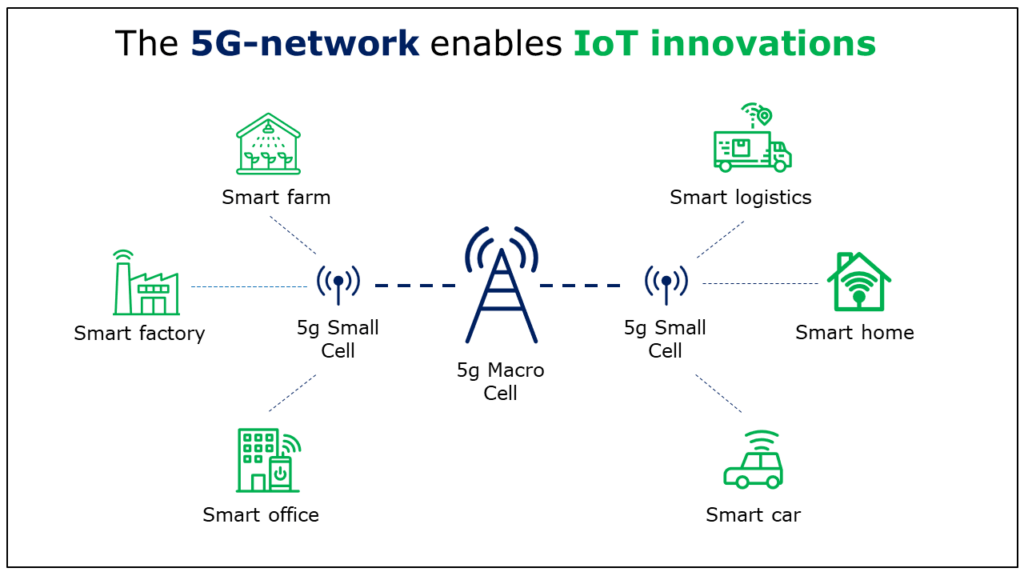
Here is an alternative:

Often, more images make your slide easier to understand and more attractive. The icons show that a macro cell and small cells are some kind of antennas.
Do you want to use icons too?
I find The Noun Project a useful database. It offers more than 3 million icons, so probably also about your topic.
Do you think that your abstract, specific topic is difficult to visualize? Then read this blog about 4 types of visualizations. And don’t give up too easily.
In my experience, a bit of creativity gets you pretty far.
If you search The Noun Project for ‘global warming’, ‘efficient’ and ‘democracy’, for instance, you find these icons:

Still using text on your slide?
Then make sure your audience can understand the text quickly. On the one hand, avoid contextless, technical keywords. And one the other hand, don’t put long paragraphs on your slide.
Question 4: Does the composition support the message?
For convenience, I take the word ‘composition’ to mean two things.
The arrangement of the visual elements, and their size.
First, about the arrangement.
Usually, a slide is designed to steer the eyes of the audience. Like a visual reading direction.
Often, this direction goes from
- Left to right;
- Top to bottom;
- Centre to periphery.
So, how does our example do?
It has a ‘reading direction’, but it’s counterintuitive. Namely: bottom up.
We could improve this slide by putting the network on top and moving the innovations to the bottom.
Another option is to put the network center stage and the innovations around it.
For instance, like this:

Next to the arrangement of the icons, I also changed their size on this new slide.
On the previous slide, all icons had the same size. As a result, the audience will think they are of equal importance, and they don’t know where to look first.
With size and arrangement, you can create an ‘information hierarchy’. This helps the audience distinguish main points from details.
On the new slide, the small cells are the smallest. The audience will now think these are details.
Question 5: Do the colors support the message?
Our example slide is black and white.
That is, except for the Analytic Storytelling logo. 😉
That means we missed an opportunity to help the audience.
Because color is the most important tool to show what is important on a slide (information hierarchy). And what is the same.
In the example, it makes sense to use color for two sections: the network and the IoT-innovations.
Then, the slide looks like this:

Color can often improve a slide, but you can overdo it. Which is what would happen if, on this slide, I would use a different color for every IoT-innovation.
Your audience then loses track, because too many things seem important. Without any hierarchy.
This leads to ‘importance inflation’, so to speak.
My advice is to give the basic ingredients of the slide a neutral color. Like black or gray.
Then you add accents with a small number of colors. Three or four is still okay, more than that is often too much.
It’s also a good idea to check if you don’t accidentally use the same color for different things. For instance, if, on a medical slide, you color an innocent cell red, when you also use that color to indicate an inflammation.
Question 6: Can you remove anything?
Our example slide has improved significantly in the previous five steps.
But you certainly shouldn’t skip the last step.
In that last step you ask yourself what you can remove. To make sure that your slide only shows things that support your message.
In that way, you increase the so-called ‘signal-to-noise ratio’. Remove noise (irrelevant parts), and the signal (the message) becomes stronger.
So what kind of things on your slides can you leave out?
I made a new version of our example slide. Maybe this gives you some ideas.

This new slide doesn’t have the Analytic Storytelling logo. That’s a pity, of course, but it doesn’t support the message. So strictly speaking, it’s noise.
The same can be true for the slide template of your organisation.
However, there also can be reasons to include a logo or template on each slide. For instance, when it’s important that the slides show the name of your organisation when people who share your slides with others.
Also missing is the blue background with lines and bubbles. That background may look flashy, it also makes the slide unnecessarily crowded.
What else?
The previous version showed two trucks at smart logistics. You can ask yourself if that was necessary. One truck is probably enough to deliver the main message.
Finally, I replaced the smart car icon with a new one.
The old icon had a lot of details that were not necessary for the message. The new car is much simpler.
Be especially vigilant about superfluous details when you use other people’s images. Or when you use the standards settings of a software program.
The default chart format in Excel has more grid lines than necessary, for instance.
Good luck with your slides!
I have often used the six steps in this article in training courses.
In my experience, they offer a useful framework to make, discuss and improve slides.
I hope they help you work on your slides with pleasure and confidence.
Good luck!

Arnaud is trainer, advisor and text writer at Analytic Storytelling. He helps customers to send out a clear and convincing message in both words and images


