

Question.
Have you ever taken classes about designing or choosing visuals? For your slides, for instance?
For most knowledge workers, the answer is ‘no’. At universities, designing visuals is rarely part of the curriculum.
Even though almost everyone has to give presentations, later, at work.
The result?
Visuals anxiety. Image insecurity. Perhaps even image shame.
The sense that you are just improvising.
Based on intuition. Based on what you see others do.
Sounds familiar?
This article offers some tools to choose consciously between 4 types of visuals. Every type of visual has its own advantages and disadvantages.
This article helps you, for instance, when you often use the same type of visuals. For example, when 80% of your slide show depicts data visualizations, or schematic representations of cell structures.
The article also helps you when you use very few visuals. When 80% of your slides show bullet points with text, for example.
Start with your message
What type of image you choose depends on your message.
So make sure that you first know what message you want to get across to your audience.
My advice is to really write down your message beforehand. In a complete sentence, including a verb.
This forces you to formulate a message, and not just a topic.
The difference?
A topic is a word. Or a couple of words.
For instance: tropical deforestation. Or: modern technology.
A message is a complete sentence, with which you make a statement about such a topic.
For instance:
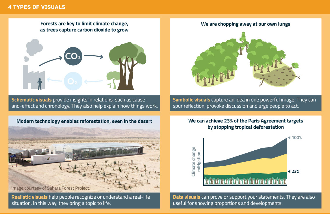
- Forests are important for mitigating climate change because trees capture carbon when they grow.
- We are chopping down our own source of oxygen.
- Modern technology helps forests grow back, even in the desert.
- If we stop tropical deforestation, we can achieve 23% of the targets in the Paris Agreement.
Did you sharpen your message? Then you are ready to choose a fitting image.
Type 1: schematic visuals
A schematic visual offers a simplified and abstract image of how something works.
With this type of visual, you can get your mental image across to your audience. For instance, how you picture an invisible process:
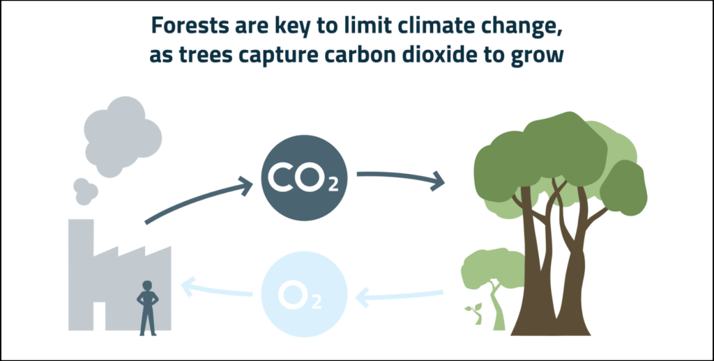
A schematic visual can also take the shape of a causal relationship, a chronology, or a step-by-step plan of action.
In addition, a schematic visual lends itself well for illuminating complex connections between components. Think of the parts of a machine, of the body, or of an organization.
Familiar examples are an IKEA manual, an underground map, flow charts, Venn diagrams and an explanation of electrical circuits in a physics book.
Schematic visuals have an important advantage over photos. You can decide precisely which details you depict. And therefore, guide the viewer’s attention to what’s important. For instance, a person in your image needn’t be male or female, if it doesn’t matter for your story.
Type 2: symbolic visuals
Do you want to make a powerful statement?
Consider using a symbolic visualization.
In symbolic images you visualize your message with a metaphor or analogy. For this reason, this type is sometimes called a ‘visual metaphor’.
An example:
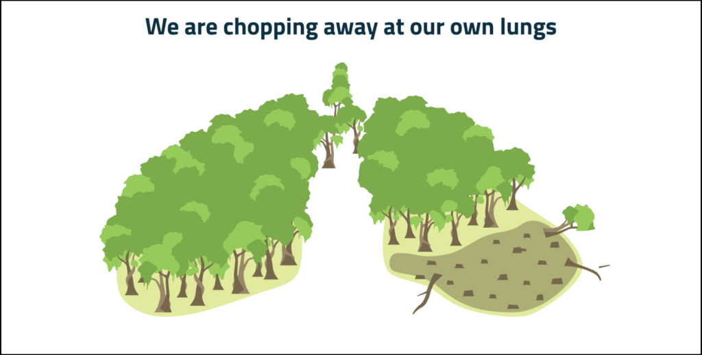
A symbolic visualization makes your message stick. It is also more effective for encouraging discussion, reflection and action.
Because of their rhetorical power, symbolic visualizations are often used in advertising, in campaigns by NGOs, and in politics.
For instance, BMW made a poster with a huge dog looking at a minuscule feeder bowl. ‘More power, less consumption’ was the accompanying message.
There are also many examples of symbolic visuals in business communication. Think of a hike to the top of a mountain (the goal), software as a multi-purpose knife, or people in a team pulling a wagon (or obstructing it).
These examples are familiar, but also somewhat cliche. Still, metaphors are effective. Even more so if you can come up with an original and striking metaphor.
Type 3: realistic visuals
Does your audience have a hard time picturing what you are telling them?
For instance, about a new technique, a clinical presentation of a disease, or an unfamiliar animal species?
In that case, a realistic visual is a good option.
In a realistic visual you show the audience what something looks like, usually with a photo.
An example:
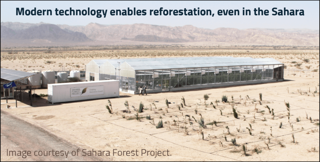
Your audience probably doesn’t have a clear image of how forests could grow in the desert.
This photo changes that: it shows the location, the buildings and objects that play a role, as well as their respective sizes.
With a realistic visual you convey a lot of information in one go. The result is that your audience will better understand your story, and that people ask better questions or give better feedback.
A realistic visual also communicates hat something actually exists, and isn’t just a plan.
Type 4: data visualizations
Is your message about data? Or can you support it with data?
In these cases, a data visualization is often just the most logical option.
For example:
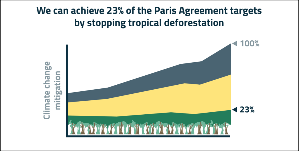
A data visualization is useful for, among other things, showing how components compare to each other. Like various measures to mitigate climate change.
Data visualizations also lend themselves well for depicting developments over time. For instance, how mitigating climate change becomes more and more urgent over the years.
Data visualizations are usually more technical and detailed than other types of visuals. For that reason, data visualizations can often best be used later in your story.
It’s usually good to start your story with the bigger picture: the ‘why’. Usually, other types of visuals are more effective for doing this.
Want to get better at making data visuals? I would recommend Storytelling with data.
Once you have chosen a type of visual
I hope these 4 types have given you new ideas for visualizing your message.
Picked one?
The next step is to decide what it should look like, exactly.
I recommend first making a sketch with pen and paper. This allows you to design your image from scratch. Without the limitations of someone else’s choices of composition, color and details.
Do you know what you want the image to look like? Then it’s time to design it with graphic design software, or to start looking for an existing photo.
Good luck!

Arnaud is trainer, advisor and text writer at Analytic Storytelling. He helps customers to send out a clear and convincing message in both words and images