Storytelling: een methode in 4 stappen

Wil je storytelling gebruiken om beter te communiceren?

Dat kan met de Analytic Storytellingmethode.

Met deze methode maak je in 4 stappen een goed verhaal. Bijvoorbeeld voor een presentatie, een beleidsplan of een subsidieaanvraag.

We hebben de Analytic Storytellingmethode speciaal ontwikkeld voor mensen die over complexe onderwerpen communiceren.

Neem bijvoorbeeld Laura.

Laura werkt voor een ngo. Haar organisatie helpt kleine Indiase boeren.

Laura heeft een sensor ontwikkeld die de vochtigheid van gewassen meet. Daardoor kunnen de boeren het schaarse water efficiënter gebruiken.

Laura gebruikt storytelling om te communiceren met de boeren, lokale beleidsmakers, de ingenieurs die de sensor maken en potentiële donateurs.

Stap 1: Pas je aan aan je publiek

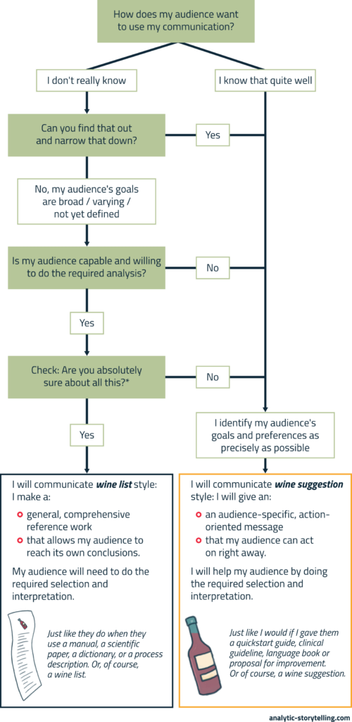
Aan wie vertel je je verhaal?

Voor succesvolle communicatie is het cruciaal om je publiek te kennen.

Je publiek bepaalt hoe je begint, welke vragen je beantwoordt, of en welk jargon je gebruikt en welk perspectief je kiest.

Bijvoorbeeld: leg je in een verhaal over de zorg de nadruk op de onzekerheid voor een patiënt, de werkdruk van een dokter of de kosten voor een verzekeraar?

Je aanpassen aan je publiek is niet het moeilijkste onderdeel van storytelling. Maar het is wel fundamenteel. En in de praktijk gebeurt het vaak niet of niet (expliciet) genoeg.  

De Analytic Storytellingmethode bevat allerlei hulpmiddelen om grip te krijgen op je publiek. Maar het belangrijkste is dat je nadenkt over je publiek. En dat je dat doet voordat je aan je verhaal begint.

Laura communiceert deze keer met een Rotary Club in Amstelveen. De leden zijn potentiële donateurs.

Ze maakt een kort publieksprofiel.

De Rotarians zijn goed opgeleid. De meeste hebben een zakelijke achtergrond, sommige een technische. De gemiddelde leeftijd is vrij hoog.

Over India weten ze niet veel. Maar ze zijn breed geïnteresseerd en leren graag nieuwe dingen.

De leden doneren regelmatig aan mensen die dat nodig hebben. Daarbij vinden ze het belangrijk dat hun geld effectief wordt ingezet. Als dat kan zetten ze ook graag hun eigen kennis en netwerk in.

Rotary heeft als uitgangspunt vijf zogeheten Avenues of Service. Twee daarvan bieden Laura een aanknopingspunt: International Service (betrokkenheid bij andere culturen en volkeren) en Community Service (betrokkenheid bij de plaatselijke gemeenschap).

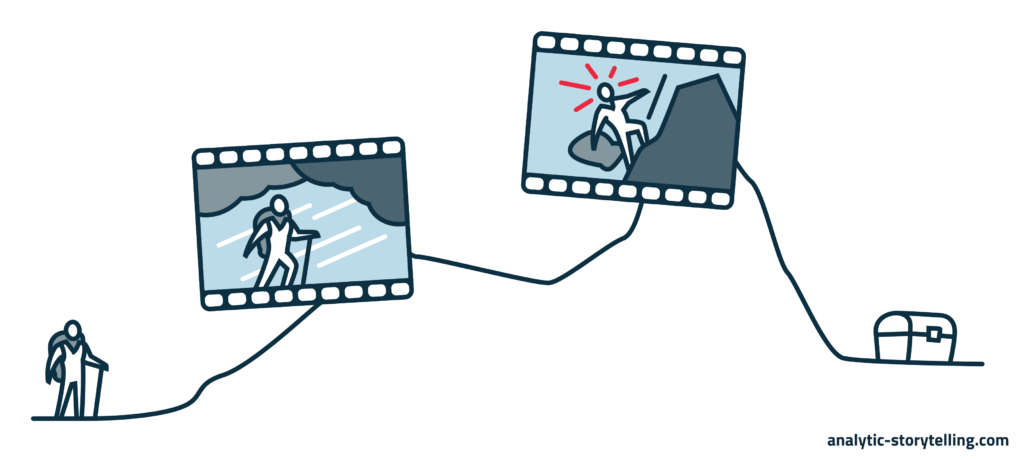
Stap 2: Maak een structuur

Elk verhaal is anders.

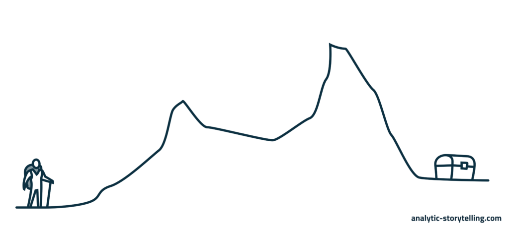
Maar goede verhalen hebben ook een gemene deler: een duidelijke structuur met een spanningsboog.

Die zorgt dat je publiek geïnteresseerd raakt en je kan volgen.

In de Analytic Storytellingmethode gebruiken we daarvoor het SCQA-model.

Situation – Complication – Question – Answer.

In de situatie schets je het onderwerp, zodat het publiek erbij betrokken raakt.

Waar gaat het over? Waar bevinden we ons?

Daarna volgt de complicatie met een urgent probleem of een doel. En met hordes die daarbij genomen moeten worden.

Dat leidt tot de vragen: lukt dat? En zo ja: hoe?

Tot slot leg je in je antwoord uit wat jij doet (of wat je publiek moet doen) om de vragen te beantwoorden en de hordes te nemen.

Een SCQA-structuur geeft je verhaal context en urgentie.

Laura maakt een SCQA-structuur voor haar verhaal.

Eerst kiest ze een herkenbaar vertrekpunt voor haar publiek: de Rotary Avenues van International Service en Community Service.

Dan legt ze uit dat de club de afgelopen jaren projecten heeft gedaan in Afrika, Zuid-Amerika, Rusland en China.

Maar niet in India.

Terwijl India na China de meeste inwoners van de wereld heeft.  

Ze schetst het beeld dat de meeste buitenstaanders van India hebben: dat van grote, chaotische steden.

Daarna legt ze uit dat het grootste deel van India platteland is. Vol kleinschalige boerderijen.

Dan de complicatie…

Kleinschalige Indiase boeren hebben het moeilijk en zijn vaak wanhopig. De meesten kunnen nauwelijks rondkomen omdat de oogsten mager zijn.

Dat komt onder meer doordat er weinig water is en ze vaak met verouderde irrigatietechnieken werken.

Kan dat anders?

Laura’s sensor zorgt dat boeren gewassen alleen water geven als dat nodig is.

Dat is een heel effectieve manier om de oogst te verbeteren. Effectiever dan alternatieven.

Om het werkende prototype op te schalen zijn donaties nodig. En daar kan de Rotary club bij helpen.

Bijvoorbeeld door een benefietevenement te organiseren samen met de Indiase gemeenschap in Amstelveen. Die is aanzienlijk: in de stad leven bijna 5.000 Indiase Nederlanders.

Er is al een restaurant dat graag wil meewerken.

Willen de Rotary-leden hierover nadenken en Laura mailen als ze interesse hebben?

Stap 3: Wees concreet

Een sterke verhaalstructuur is als een sterk skelet.

Het is nodig om je verhaal overeind te houden. Maar je hebt vlees en bloed nodig om het tot leven te brengen.

Dat doe je door je verhaal concreet te maken.

Dit is juist ook belangrijk bij complexe onderwerpen. Want die bevatten vaak veel abstracties.

Als je concretiseert, maak je je verhaal zintuigelijk, herkenbaar en specifiek. Je schetst als het ware een (mini)scène die je publiek voor zich gaat zien. Daardoor wordt je verhaal aantrekkelijk, begrijpelijk en invoelbaar.

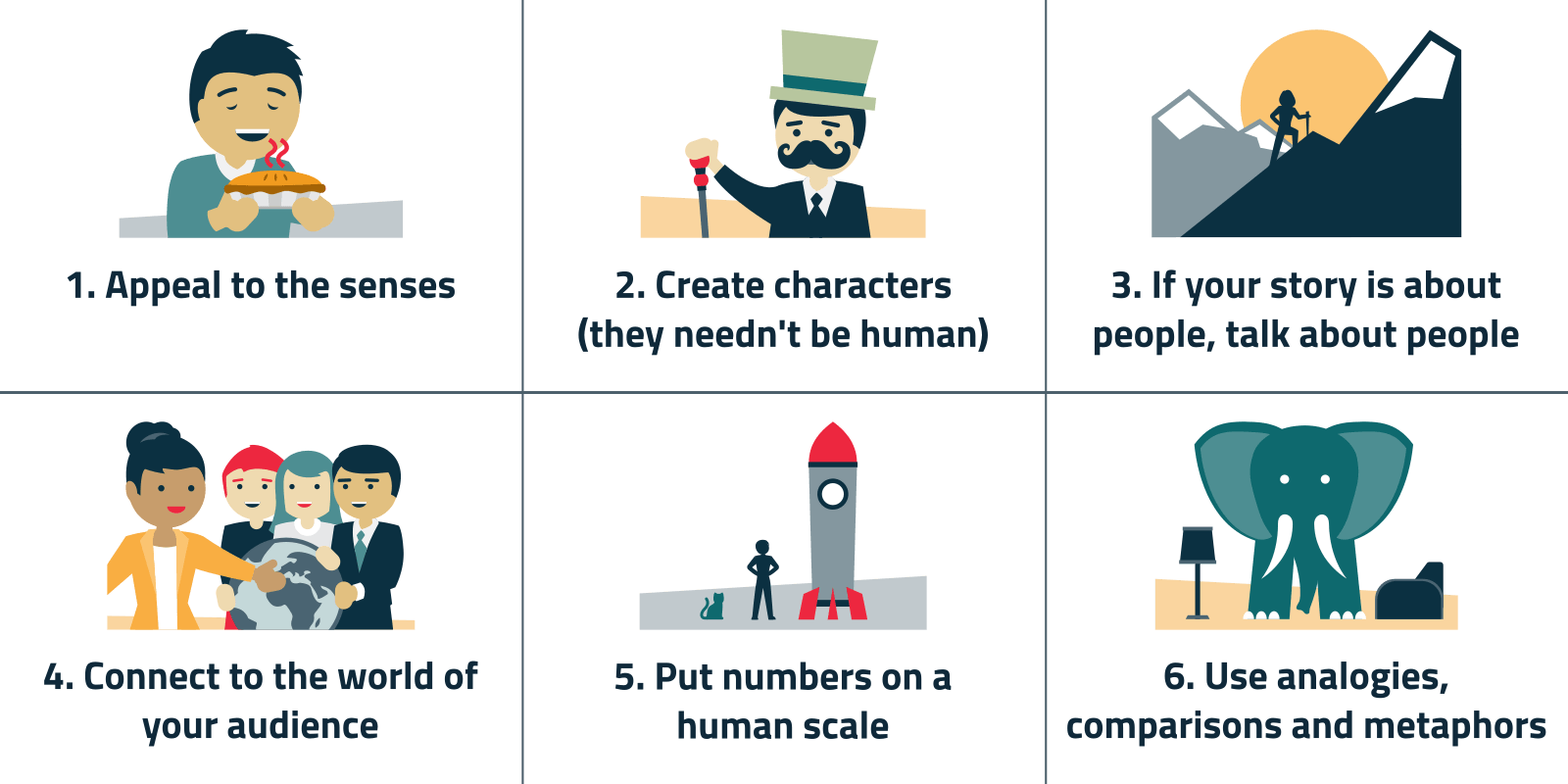
Concretiseren kan bijvoorbeeld door een voorbeeld, metafoor of anekdote te gebruiken.

  • Laura maakt haar boodschap concreet door te vertellen over wat de kleinschalige boeren produceren. Dat zijn bijvoorbeeld witte kool, aubergines en rozen. Dat doen ze ook voor Nederlandse supermarkten.
  • Dat boeren het moeilijk hebben en wanhopig zijn, is een abstractie die niet duidelijk maakt hoe hard hun werkelijkheid is. Daarom toont ze heftige cijfers over de zelfmoorden als gevolg van hun uitzichtloosheid. In 2019 waren dat er gemiddeld 28 per dag.
  • Ze introduceert één boer – Vyaan – die ze recent heeft ontmoet. In het droge seizoen houdt hij met andere boeren een ceremoniële ‘kikkerbruiloft’ om de regengod gunstig te stemmen.
  • Een verouderde irrigatietechniek is bijvoorbeeld met een gieter elke kool water geven.
  • De sensor gaat eruitzien als een soort thermometer die boeren in de grond steken. Boeren krijgen signalen van de sensor via wifi.

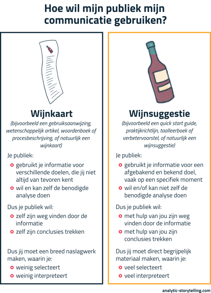
Stap 4: Maak tekst of beeld

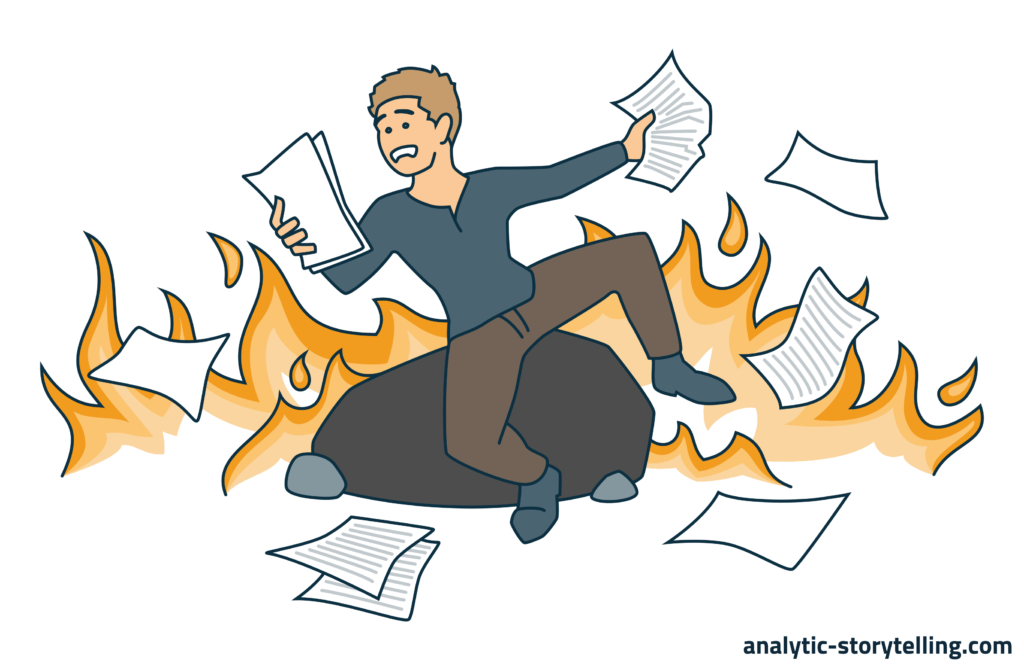
Uitstel heeft een negatieve bijklank.

Maar het is een belangrijk onderdeel van de Analytic Storytelling-methode.

Door de eerste 3 stappen, stel je het moment uit dat je ‘echt’ iets maakt.

Je zorgt eerst dat je een blauwdruk hebt van je verhaal. Bijvoorbeeld in een lijst met bulletpoints. En pas dan ga je aan de slag met je tekst of met beelden.

Door storytelling in deze 4 stappen ‘op te knippen’ versoepel je het maakproces. En tegelijk maak je je eindproduct beter.

Ook in de laatste stap zijn er natuurlijk nog aandachtspunten: zowel voor tekst als beeld.

Het is bijvoorbeeld goed om te zorgen voor een duidelijke hoofdboodschap voor elke alinea of slide. En om te zorgen dat elk woord of elk beeld die boodschap ondersteunt.

Uiteraard zijn er nog veel meer aandachtspunten. Onnodige passieve zinnen vermijden, alinea’s niet te lang maken, met kleurgebruik en compositie laten zien wat belangrijk is… Over goed schrijven en goed visualiseren zijn bibliotheken vol geschreven.

Maar als je verhaal aangepast is aan je publiek (stap 1), een goede structuur heeft (stap 2) en goede concretiseringen bevat (stap 3), heb je de belangrijkste stappen al gezet.

Laura maakt een presentatie.

Eerst formuleert ze de boodschap van elke slide. Een van haar boodschappen is bijvoorbeeld: Een sensor maakt duidelijk wanneer een gewas water moet krijgen.

Laura zoekt foto’s van een drukke straat in Mumbai, een supermarktschap met kool en aubergines en van het Indiase restaurant dat mee wil werken.

De heftige zelfmoordcijfers zet ze in een simpele, kale grafiek zonder onnodige waarden en rasterlijnen.

Ze heeft al een kort filmpje van boer Vyaan op zijn land met een gieter.

En ze gebruikt icoontjes van een thermometer, een batterij (daar werkt de sensor op) en wifi.

In een schema toont ze hoe de sensors kunnen worden verbonden aan een klein irrigatiesysteem met leidingen en kleppen. Sensors, leidingen en kleppen geeft ze een eigen kleur.

Stap voor stap naar een verhaal

De Analytic Storytellingmethode helpt je in 4 stappen van een eerste idee naar een eindproduct. Net zoals Laura in het voorbeeld.

Wil je de methode verder onder de knie krijgen? Dat kan in onze trainingen. Daar werk je aan een verhaal over je eigen onderwerp en leer je tegelijk storytellingtechnieken.

Heb je hulp nodig bij een storytellingproject in je organisatie? Mail of bel ons! We bespreken graag de mogelijkheden met je.


Arnaud is trainer, adviseur en tekstschrijver bij Analytic Storytelling. Hij helpt klanten om een heldere en overtuigende boodschap op papier te krijgen in woord en beeld.

Storytelling: a 4-step method

Want to use storytelling  to improve your communication?

You can do that with the Analytic Storytelling method.

This method helps you make an effective story in 4 steps. For a presentation, for example, or a policy plan, or a funding application.

We developed the Analytic Storytelling method especially for people who communicate about complex topics.

For instance, for people like Laura.

Laura works for an NGO. This organization supports small Indian farmers.

Laura has developed a sensor that monitors the humidity of crops. It helps farmers make more efficient use of water, which is scarce.

Laura uses storytelling techniques to communicate with farmers, with local policy makers, with the engineers who produce this sensor and with potential sponsors.

Step 1: Adapt to your audience

Whom will you tell your story to?

If you want to communicate effectively, it is crucial to know your audience.

Your audience determines how you start your story; which questions you answer; whether you use jargon and if so, what kind of jargon; and whose perspective you choose.

For instance, in a story about healthcare, do you emphasize the patient’s uncertainty, the doctor’s workload, or the costs for the insurance company?

Adapting to your audience is not the hardest part of storytelling. But it is a fundamental part. And we often don’t do it explicitly – or at all.

The Analytic Storytelling method offers all kinds of tools to capture your audience. But the most important thing is to think about your audience in the first place.

And to do that before you start making your story.

This time, Laura will speak to a Rotary Club in Amstelveen, The Netherlands. The members are potential sponsors.

She makes a quick audience profile.

Rotarians are well-educated. Most have a business background, some a technical background. They tend to be a bit older than average.

They don’t know much about India. But they tend to have a broad interest and like to learn new things.

Members often donate to people in need. They want their money to be used effectively. They also like to offer their knowledge and networks to help.

The principles of the Rotary are laid down in its five so-called Avenues of Service. Two of these seem to link with Laura’s project: International Service (engagement with other cultures and peoples) and Community Service (engagement with local communities).

Step 2: Build a structure

Every story is different.

And yet, good stories have something in common: a clear structure and a narrative arc.

This makes the audience interested and helps them follow the story.

At Analytic Storytelling, we use the SCQA format for this.

Situation – Complication – Question – Answer.

In the situation, you help the audience picture the topic in a way that draws them into the story.

What is this story about? Where are we?

Next, the complication introduces an urgent problem or goal. And it points to the hurdles that should be taken in order to solve that problem or to achieve that goal.

Which leads to the questions: will the goal be achieved? And if so, how?

Finally, you explain in the answer what you (or your audience) need to do to answer these questions and take these hurdles.

An SCQA structure helps you provide context and urgency to your story.

Laura makes an SCQA outline for her story.

First, she chooses a starting point that her audience is familiar with: the Rotary Avenues of International Service and Community Service.

Then she mentions that in recent years, this club has sponsored projects in Africa, South-Amerika, Russia and China.

But not in India.

Even though India has het largest number of inhabitants of the world, after China. 

She sketches the picture that most outsiders think of when they think of India: huge, chaotic cities.

Then she explains that the largest part of India is actually rural. Full of small-scale farms.

Then, the complication…

Small-scale farmers in India are struggling, to the point of desperation. With meager harvests most of them hardly get by.

One of the reasons for this is the scarcity of water, and the use of outdated irrigation methods.

Could something be done about this?

Laura’s sensor helps farmers to only water their crops when it’s necessary.

This is a very effective way to improve the harvest. More effective than alternative approaches.

She needs funding to upscale the working prototype. And that’s where the Rotary club can help.

For instance, by organizing a fundraising event, in collaboration with the Indian community in Amstelveen. It is a sizable community: almost 5.000 Indian-Dutch people live in the city.

She has already found a restaurant that wants to contribute.

Perhaps the Rotary members want to consider this, and if they’re interested, send Laura an email?

Step 3: Be concrete

A strong story structure is like a strong skeleton.

You need it to prop up your story.  But to bring the story to life, you need to add some flesh and blood.

You do that by making your story concrete.

This is especially important with complex topics. Because these often contain a lot of abstractions.

When you make your story concrete, you make it specific, familiar and sensory. You create a (mini)scene, as it were, which your audience will picture in their mid. As a result, your story becomes attractive, comprehensible and engaging.

You can make your story concrete by using an example, metaphor or anecdote, for instance.

  • Laura makes her message concrete by telling the audience what the small-scale farmers grow. Cabbage, eggplant and roses, among other things. They produce these for Dutch supermarkets too.
  • That farmers are ‘struggling to the point of desperation’, is an abstraction that doesn’t speak to the harshness of their reality. Therefore, she quotes shocking numbers about suicides as a result of their circumstances. In 2019, on average, 28 farmers killed themselves each day.
  • And she talks about a farmer – Vyaan – whom she met recently. In the dry season, he and other farmers organize a ceremonial “frog marriage” to bring back the rains.
  • An example of an outdated irrigation method is watering each cabbage with a watering pot.
  • The sensor will look like a kind of thermometer, which the farmers will stick in the ground. They receive signals from the sensor via Wi-Fi.

Step 4: Write text or design visuals

Delay has a bad rap.

But it is an important part of the Analytic Storytelling method.

The first 3 steps postpone the moment of ‘really’ producing something.

By first going through these 3 steps, you make a blueprint for your story. For instance, by making a bullet list. And only after that you start your work on text or visuals.

By dividing the process of making a story into 4 steps, the process becomes easier. And at the same time, you improve the end result.

There are some things to keep in mind during that last step as well: both when writing text and when designing visuals.

For instance, it’s good to make sure each paragraph or slide has a clear main message. And to make sure that each word or image supports that message.

There are of course many more things to think about. Avoiding unnecessary passive sentences and never-ending paragraphs, using color and composition to highlight what’s important … You can fill libraries with books about text writing and visualizing.

But if your story is adapted to your audience (step 1), has a good structure (step 2) and contains good concretizations (step 3), you have already taken the most important steps.

Laura prepares a presentation.

She first formulates the message for each slide. For instance, one of these messages is: A sensor indicates when a crop should be watered.

Laura collects photos of a busy street in Mumbai, of a supermarket shelf with cabbages and eggplants, and of the Indian restaurant that has offered to collaborate.

She summarizes the shocking suicide statistics in a simple graph, leaving out unnecessary values and grid lines.

She has a short movie of farmer Vyaan on his land, with a water pot.

She uses icons of a thermometer, a battery (which powers the sensor) and Wi-Fi.

In a schematic visual, she illustrates how the sensors can be connected to a small irrigation system with tubes and valves. She gives sensors, tubes and valves each their own color.

Towards a story, step by step

The Analytic Storytelling method helps you from the first idea to the final product in 4 steps. Just like Laura in the example.

Want to learn more about using this method? Take a training course with us! In our courses, you work on a story about your own topic, learning storytelling methods as you go.

Need help with a storytelling project in your organization? Email or call us! We look forward to exploring the possibilities with you.


Arnaud is trainer, advisor and text writer at Analytic Storytelling. He helps customers to send out a clear and convincing message in both words and images.

Wat is storytelling?

‘De term “storytelling” maakt me nieuwsgierig. Maar wat het nou precies inhoudt…’

‘Ik wil storytelling gebruiken voor mijn communicatie. Hoe doe ik dat?

‘Kan ík dat ook, storytelling? Ik ben helemaal niet creatief.’

Dit is een greep uit de reacties op verjaardagen als ik over storytelling begin. En over de trainingen die ik erover geef.

Heb je ook dit soort vragen?

In dit artikel bespreek ik de drie basis-ingrediënten van een verhaal.

Zodat je beter begrijpt wat storytelling betekent. En zodat je voor je ziet hoe je het zelf kunt gebruiken.

Storytelling maakt je onderwerp interessant en urgent

Maar eerst even een stap terug.

Waarom zou je er eigenlijk aan beginnen: storytelling?

Storytelling zet je in omdat mensen een zwak hebben voor verhalen. Ook managers, financieel experts en beleidsadviseurs.

Een verhaal maakt je boodschap interessant, samenhangend en urgent.

Door een verhaal zien mensen iets voor zich. Ze begrijpen je boodschap beter, worden nieuwsgierig, emotioneel betrokken en geïnspireerd. En daardoor komen ze eerder in actie.

Storytelling: je doet het al

Wil je storytelling gebruiken voor de communicatie over je werk?

Dat voelt misschien als iets compleet nieuws.

Toch is het dat niet: je doet het al.

Iedereen vertelt verhalen. Ook op en over zijn werk.

Bijvoorbeeld over het idee voor een nieuw product dat ontstond tijdens een rondje hardlopen. Over die keer dat de stroom uitviel in het lab. Over de inside joke die een collega in een memo heeft verstopt.

Voor storytelling hoef je dus niet vanaf nul te beginnen.

Je begint met het vermogen dat je al hebt.

Vervolgens versterk je dit vermogen met verhalende technieken. Zodat je het bewuster en beter inzet.  

Daarvoor put je uit technieken die al eeuwen worden gebruikt in allerlei vormen. Van mythen en sprookjes tot Hollywoodfilms en games.

Een verhaal bevat 3 hoofdingrediënten

Een verhaal kent grofweg drie hoofdingrediënten: een hoofdpersoon, een spanningsboog en scènes.

Ingrediënt 1: Hoofdpersoon

Verhalen gaan (meestal) over mensen.

Over hun drijfveren, doelen, emoties en problemen.

Een verhaal vertellen, is daarom het makkelijkste met personages. Die kunnen echt zijn of fictief.

Een klassiek verhaal heeft één hoofdpersoon. Daarnaast zijn er andere personages die de hoofdpersoon tegenwerken of helpen.

Door een hoofdpersoon krijgt je verhaal perspectief, richting en samenhang. En je publiek gaat meeleven.

In een verhaal over jouw onderwerp kun je bijvoorbeeld één specifieke burger, klant of patiënt als hoofdpersoon kiezen.

Je hoofdpersoon is dan bijvoorbeeld Ingmar, een freelance grafisch ontwerper van 32 jaar.

Hij heeft een paar kleine opdrachtgevers en één grote: een webshop voor dierenvoeding.

Zijn vrije tijd besteed Ingmar graag aan racefietsen en mountainbiken. Daar geeft hij veel geld aan uit.

Ingrediënt 2: Spanningsboog

Het tweede hoofdingrediënt van storytelling is een structuur met een spanningsboog. Of in storytellingjargon: een narrative arc.

Een narrative arc volgt een min of meer vast stramien.

Aan het begin leert het publiek de hoofdpersoon (of het onderwerp) kennen en raakt het erbij betrokken.

In een film heeft dit vaak de vorm van 24 hours in the life of…

Maar alleen een hoofdpersoon of onderwerp leren kennen en erbij betrokken raken is niet genoeg.

Om het publiek geïnteresseerd te houden, moet ook iets gebeuren. Iets op het spel staan.

Alleen dan is het een verhaal.

De hoofdpersoon krijgt daarom gewoonlijk een doel. Of een probleem dat hij moet oplossen. Het doel in The Lord of the Rings is bijvoorbeeld om de ring te vernietigen in de Doemberg.

Het doel zet het verhaal in beweging en onder spanning. Het zorgt voor een kloof tussen waar we zijn en waar we naartoe willen. En er zijn allerlei obstakels om daar te komen.

Aan het eind van de narrative arc wordt de spanning ingelost.

Een klassiek einde is een ‘resolutie’, een oplossing: de ring wordt vernietigd, de geliefden vinden elkaar, de moordenaar wordt opgepakt.

Hoe ziet een narrative arc in je professionele communicatie eruit?

Als financieel adviesbureau zeg je dan bijvoorbeeld dat controle over je geld belangrijk is. Het zorgt dat je kunt doen wat voor jou waarde heeft, zoals in een fijn huis wonen of op fietsvakantie gaan.

Veel mensen hebben alleen geen realistisch beeld van hun financiën. Een voorbeeld is grafisch ontwerper Ingmar. Hij heeft een hoge studieschuld, is te optimistisch over de vooruitzichten van zijn grafisch ontwerpbureau en blijft fietsspullen kopen.

Dat is risicovol. Na een paar tegenslagen kan hij in de schulden komen, stress krijgen, schuld op schuld stapelen en uiteindelijk bijvoorbeeld zijn huis verliezen.

De oplossing is een website met een financiële-gezondheidstest. Iemand als Ingmar vult hierop vragen in over inkomsten, uitgaven, sparen en lenen. Hij krijgt dan een score en advies. Bijvoorbeeld om een buffer op te bouwen.  

Ingrediënt 3: Scènes

Het derde en laatste hoofdingrediënt van storytelling is de scène.

Een scène speelt zich af op een specifieke plek, op een specifieke tijd. Meestal bevat een scene personen, zintuigelijke details en actie.

Door een scène ziet het publiek iets voor zich en wordt het ondergedompeld in het verhaal.

Het tegenovergestelde van een scene is een samenvatting.

Een samenvatting is bijvoorbeeld: in de jaren die volgden kreeg het stel drie kinderen.

In een scène zoom je in op de twee oudste kinderen die bij hun pasgeboren zusje mogen komen kijken. Je beschrijft hoe hun ogen twinkelen en hoe ze haar voorzichtig over haar wang aaien. En hoe ze een paar minuten later met een schok het ziekenhuisbed hoger zetten omdat ze nieuwsgierig op een knopje drukken.

In een scène in je professionele communicatie beschrijf je bijvoorbeeld dat Ingmar een mail opent van zijn grootste opdrachtgever.

De webshop voor dierenvoeding is failliet. Ze kunnen zijn facturen niet betalen.

Ingmar heeft net een nieuwe gravel bike – een racefiets geschikt voor onverharde paden. Hij gaat een rondje fietsen om dit nieuws te verwerken.

Hij rijdt op hoge snelheid een heuveltje af. Onderaan moet hij over een wildrooster. Hij draait zijn stuur licht om de bocht te nemen. Dan voelt hij zijn wiel wegglijden.

Hij valt. Hij schreeuwt het uit van de pijn. In zijn rechterarm – zijn goede arm – voelt hij een stekende, brandende pijn. Waarschijnlijk gebroken.

Twee seconden later denkt hij: shit, mijn eigen risico. En hoe moet ik nu werken?

Meer of minder storytelling?

Personages, een spanningsboog, scènes…

Je kunt ze allemaal tegelijk inzetten om je communicatie te verbeteren. Dan heb je een volledig verhaal.

Maar ook als je één van de drie ingrediënten gebruikt, maakt dat veel verschil.

Bijvoorbeeld als je je beleidsplan structureert met een herkenbaar begin, een complicatie en een resolutie. Of als je je blogpost begint met een korte anekdote: een scène. 

Hoe je storytelling inzet hangt af van je publiek, je doel en het medium. En van waar je jezelf comfortabel bij voelt. Mijn advies: experimenteer vooral. Het leven is te kort voor saaie presentaties en teksten.

Meer weten?

Wil je meer weten over storytelling? Of wil je het gebruiken in je werk?


Priscilla is directeur, adviseur en trainer van Analytic Storytelling. We helpen mensen om inhoudsgedreven verhalen te maken.

State your main message in the heading

Which heading do you prefer?

(1) ‘Global beer supply’ or (2) ‘Global beer supply decreases due to extreme drought and heat’?

Most people prefer heading number 2. It conveys more information, it’s more specific and more interesting.

Heading number 1 merely indicates the topic. Heading number 2 makes a statement about that topic. That’s why we call it a ‘statement heading’.

Do you communicate about a complex topic? Then it is good to use as many statement headings as possible.

You can use them on slides. As subheadings in a text. And also as titles for entire documents or presentations.

This article explains how statement headings work. And how to make them yourself – in 6 simple steps.

Statement headings help your audience understand your message

Headings are the most important sentences in communication. People construct these crucial sentences in various ways.

In communication about complex topics you’ll often encounter 4 types of headingsFor the sake of simplicity, ‘no heading’ will also be treated as a type of heading.:

  • No heading
  • A label heading, such as ‘Summary’
  • A subject heading, such as ‘Global beer supply’
  • A statement heading, such as ‘Global beer supply decreases due to extreme drought and heat’

Every one of these heading types provides more information than the previous one. Statement headings are the most informative.

Compared to a subject heading, a statement heading tells you what is going on with this subject. It communicates an idea about this subject. It declares, makes a statement.

It is effective to offer your audience as much information as possible right at the start – that is, in the heading. This way, your audience will better understand the message that follows, and it will understand it more quickly. It is also more likely to remember it.

Therefore, my advice is to use as many statement headings as possible.

The less informative types of heading are more common. Maybe you use them too.

In many disciplines, it is a custom to use these heading types. We are used to it. This is how almost everyone does it, this is how you learn to do it.

But for the audience, a heading with little information is not very pleasant.

3 types of headings you shouldn’t use too often

To show you why a statement heading works well, I will first briefly discuss the disadvantages of the 3 less informative types of heading.

No heading
Disadvantage: You offer your audience no clues
Luckily, documents without titles are rare.

But within documents and within presentations people don’t always use enough headings to help their audiences. For instance, you often see slides without headings.

Such a slide may look like this:

Without a heading, the audience has to decide for themselves – without any clues – what this slide wants to tell them.

This costs time and energy. And there’s a chance that they reach the wrong conclusion.

Informative texts often lack subheadings too. Such texts may look like this:

To a reader who wants to quickly look up something, these pages do not look very inviting.

People probably have to work hard to understand the message – that is, if they read the text at all. Beforehand, the audience has no idea what this text is about. Or where it can find the information it is looking for.

That’s why it is a bad idea to use no or very few headings.

Label heading
Disadvantage: Your audience still has no idea what this is about

Introduction. Conclusion. Summary.

You often find this type of subheadings in reports and scientific publications. They are called ‘label headings’.

When we add a label heading to the example slide, it looks like this:

The label heading is not very inspiring, and doesn’t make the audience much wiser. The big disadvantage is that a heading like this doesn’t tell you anything about the content.

That also applies to the text example:

Almost every reader scans the headings before she reads a text. In this case, a reader who does that has no idea what the text is about.

Of course, compared to the text without headings, the reader does have some extra information. She knows where a new part of the text starts. And what the status of that part is.

But compared to statement headings, the amount of information that a label heading conveys is small.

So, don’t use these headings out of habit, but only when it is compulsory. This is sometimes the case in a scientific paper, a report or a funding application.

Are you not obliged to use label headings? Then choose a more informative type of heading.

Subject heading
Disadvantage: Your audience has to wait for the conclusion
Headings that tell you what the subject is are called ‘descriptive headings’.

These headings are popular among knowledge workers too.

You see them above slides. As subheadings in texts. And as titles for entire documents and presentations.

With a subject heading, our slide example looks like this:

Compared to the previous versions this heading is very informative. The audience now understands right away what the data are about.

Still, there is something your audience doesn’t know:

What you want to tell them with these data.

Do you want to make the point that employees communicate less in open workspaces? Or that they communicate differently?

The audience has to take an extra step to interpret these data by themselves.

We can also put subject headings in a text, which would make it look like this:

A reader who has scanned the headings has some idea of the content.

But here, again, she doesn’t know anything about the message. What about these scenarios for extreme drought and heat?

Formulating the subject heading as a question doesn’t change much. A question heading (or ‘interrogative heading’) is about as informativeThe difference between a statement heading and a question heading is simple. A statement heading answers the question. as a subject heading.

For instance: What is the effect of open workspaces on communication?

So should you never use a subject heading (or a question heading)?

It is not that simple.

There are a couple of exceptions.

Possible reasons to choose a subject heading are:

  • You have multiple messages. For this reason, titles of longer publications, such as books, often aren´t formulated as a statement.
  • You want to discuss the data, so the main message is not clear yet.
  • It is very important to make your readers curious (for instance, on social media). Sometimes a statement heading isn´t effective enough for that.
  • Author instructions do not permit statement headings. This is the case with some scientific journals.

The trick is to use subject headings only when there is a good reason to do so.

In any case, try to get to a statement heading first. This is more often possible than you think.

If you can’t, you have at least thought about your message – and not just about your topic. Often, that helps focus your communication.

The type of heading that you should use as often as possible – statement heading

Advantage: Your audience better understands and remembers your message

A statement heading (also ‘declarative heading’) tells the audience the main message beforehand.

It can be the main message of an entire document (title). Or the message of a part of that document, like a slide or a text section (slide heading, subheading).

With a statement heading, our slide example looks like this:

The subject heading for this slide was: ‘Communication in open workspaces’. The statement heading specifies what is going on with this communication.

It is surprising that people communicate less in open workspaces. Open workspaces were designed to encourage communication.

When we add statement headings to the text example, it looks like this:

A reader scanning the headings reads a logical, flowing story. Compared to the version with subject headings, she has much more information.

That is why people understand text with statement headings better and more quickly.

There’s something else.

The statement headings in the examples are not only more informative, they are also more interesting.

A decrease in beer supply is more interesting than just ‘global beer supply’.

So, don’t worry that people will lose interest when you give away your main message (often the conclusion). Often, the main message prompts new questions.


Test in 1 minute whether you can spot the statement headings

Write down the numbers of all headings that you think are a statement heading

  1. Mortality in Puerto Rico after Hurricane Maria
  2. The Great Pacific Garbage Patch is rapidly accumulating plastic
  3. Association of Frequency of Organic Food Consumption With Cancer Risk
  4. Radar evidence found of subglacial liquid water on Mars
  5. Global warming transforms coral reef assemblages
  6. No intrinsic gender differences in children’s earliest numerical abilities
  7. Scientist on Twitter: Preaching to the choir or singing from the rooftops?
  8. Effect of Aspirin on Disability-free Survival in the Healthy Elderly
  9. Survey of Adélie penguin mega-colonies reveals the Danger Islands as a seabird hotspot
  10. The earliest modern humans outside Africa
Check your answers

Headings 2, 4, 5, 6 and 9 are statement headings. They state the main message of the article they belong to. The others are subject headings.

All these titles come from the Altmetric Top 100 2018, a list of the 100 scientific articles that were mentioned most online. I have made some minor adjustments to make the text more accessible.


Towards a good statement heading in 6 steps

You now know what a statement heading is (and isn’t). And you know why it is good to use statement headings.

But how do you make one yourself?

The step-by-step explanation below helps you. It consists of 6 simple steps:

Step 1: Think about your audience
Step 2: Know what you want to say (roughly)
Step 3: Choose at most 3 key terms
Step 4: Connect the key terms to make a sentence with a verb
Step 5: Make the heading more specific
Step 6: Remove redundant words

In the first 4 you formulate a statement heading. In step 5 and 6 you make little adjustments to optimize that heading.

Step 1: Think about your audience
Communication always starts with the audience. That is the starting point. This also applies to the statement heading.

That is because you may have a different message for different audiences.

So first, ask yourself what question your audience has about your topic.

A behavioral scientist, for instance, may wonder how open workspaces influence communication behavior.

A CEO probably has a more practical question: should I continue with open workspaces? In that case, the main message would be an advice rather than a conclusion.

Example: We formulate a heading for a behavioral scientist. We assume that she wants to know how open workspaces influence the communication behavior of employees.

Step 2: Know what you want to say (roughly)
With your audience in mind, you decide what you want to say. Your message, in broad strokes.

It is often a good idea to start with the subject. Or with the question that you want to answer.

But then you need to add another step.

‘I will show the data about communication in open workspaces’ is not enough. You have only a subject, and no message.

So ask yourself the question: what about it? What do you want to tell your audience with this data?

For instance, is this about the fact that people communicate less in open workspaces? Or that they communicate less face to face?

Example: Our message is that employees communicate less face to face in open workspaces. That is the most surprising result.

Knowing what it is (roughly) that you want to say, is the most important step on the way towards a statement heading.

This step is also the most difficult one. That is why it often takes a bit more time to make a statement heading compared to other heading types.

Step 3: Choose at most 3 key terms
In the next step, you write down key terms for your message. Usually, these are nouns.

If you know (roughly) what you want to say, key terms are usually easy to find.

It is ok to first write down a great number of terms. For instance: open workspace, traditional workspace, communication, interaction, collaboration, employees, face to face, email, WhatsApp and digital.

For your heading, you ultimately choose the 2 or 3 most important ones.

Just 1 key term will not get you an interesting message about a subject very quickly. With more than 3 key terms you risk ‘cramming’ multiple messages into your heading.

If you’re sure that you will stick to one main message, you can sometimes use more than 3 key terms.

Example: We choose the key terms open workspace, communication and face to face.

Step 4: Connect the key terms to make a sentence with a verb
In step 4 you connect the key terms to make a sentence.

To convey a message in your heading, you usually need a real sentence that is grammatically correct.

This is an important difference with the subject heading.

A subject heading with the key terms could be: ‘Open workspaces and face to face communication.’

A statement heading with these terms could be: ‘Open workspaces reduce the amount of face to face communication.’

The verb is the difference. It’s what is often added in this step.

Without a verb you don’t get a grammatically correct sentence. And the verb creates a relation between the key terms.

Example: Open workspaces reduce the amount of face to face communication.

Step 5: Make the heading more specific
You now have a statement heading. Such a heading is more informative than other heading types.

Still, you can often make your statement title even more informative.

Usually by adding more specific information

You can say, for instance, with what percentage face to face communication decreases. Or, to what kinds of open workspaces this applies, or what kinds of organizations.

Example: Open workspaces reduce the amount of face to face communication with 70%.

Sometimes, you can make the heading more specific by replacing a word.

Suppose we made the heading: Open workspaces change face to face communication. In that case ‘reduce’ would have been a more specific alternative.

Step 6: Remove redundant words
The more specific you make the heading, the longer it becomes.

Avoid making the heading too long. You have to find a good balance between being specific and concise.

A good heading consists of 5 to 15 words. This is a rule of thumb, and no absolute law.

If the heading is too long, your message gets buried in it. And a long heading also looks less inviting.

Whether your heading is long or short: it is always good to see if you can make it more compact.

You do this by deleting redundant words. Or by replacing word combinations with shorter alternatives.

Example: Open workspaces reduce the amount of face to face communication with 70%.

Invest time in making your headings

With these step-by-step instructions, you now know how to make good statement headings yourself.

You can use these headings in many places.

For publication titles. For chapters. As subheadings in a text.

But also as a title for a presentation, an infographic or a poster. Or as a subject line for an email.

Headings are the most important sentences in your communication. Good headings make sure that your audience understands you. And that it better remembers your main message.

So take your headings seriously, and take time and attention to make them. Give your communication a head start!


Arnaud is trainer, advisor and text writer at Analytic Storytelling. He helps customers to send out a clear and convincing message in both words and images.

Zet je boodschap in de kop

Welke kop vind jij beter?

(1) ‘Bierproductie wereldwijd’ of (2) ‘Bierproductie neemt wereldwijd af door extreme droogte en hitte’?

De meeste mensen geven de voorkeur aan kop 2. Die kop is informatiever, specifieker en prikkelender.

Kop 1 vertelt alleen het onderwerp. Kop 2 vertelt de boodschap over dat onderwerp. Zo’n kop noem je daarom een ‘boodschapkop’.

Communiceer je over een complex onderwerp? Dan is het goed om zo veel mogelijk boodschapkoppen te gebruiken.

Je kunt ze bijvoorbeeld gebruiken boven slides. Als tussenkopjes in een tekst. Maar ook als titel voor een heel document of presentatie.

Dit artikel laat zien hoe boodschapkoppen werken. En hoe je ze zelf maakt – in 6 simpele stappen.

Door boodschapkoppen begrijpt je publiek je beter

Koppen zijn de belangrijkste zinnen in communicatie. Hoe mensen koppen maken verschilt sterk.

In communicatie over complexe onderwerpen kom je globaal 4 kopsoortenVoor de leesbaarheid noem ik ‘geen kop’ ook een kopsoort. tegen:

  • Geen kop
  • Een labelkop, bijvoorbeeld ‘Samenvatting’
  • Een onderwerpkop, bijvoorbeeld ‘Bierproductie wereldwijd’
  • Een boodschapkop, bijvoorbeeld ‘Bierproductie neemt wereldwijd af door extreme droogte en hitte’

Elke kopsoort geeft meer informatie dan die daarvoor. De boodschapkop geeft de meeste informatie.

Vergeleken met de onderwerpkop zegt de boodschapkop wat er met het onderwerp aan de hand is. Hij formuleert een idee over het onderwerp. Hij doet een uitspraak, maakt een statement.

Het is verstandig om je publiek vooraf – in de kop – zo veel mogelijk informatie te geven. Je publiek begrijpt daardoor de boodschap die volgt beter en sneller. En je publiek onthoudt de boodschap beter.

Mijn advies is daarom om zo veel mogelijk boodschapkoppen te gebruiken.

In de praktijk kom je vooral de minder informatieve kopsoorten tegen. Misschien gebruik je ze zelf ook wel.

In veel vakgebieden is het een conventie om deze kopsoorten te gebruiken. We zijn eraan gewend. Zo doet bijna iedereen het, zo leer je het.

Voor het publiek is een kop met weinig informatie echter niet prettig.

3 kopsoorten die je niet te vaak moet gebruiken

Om te laten zien waarom een boodschapkop goed werkt, bespreek ik eerst kort de nadelen van de 3 minder informatieve kopsoorten.

Geen kop
Nadeel: Je publiek krijgt geen enkel handvat

Een document zonder titel kom je gelukkig zelden tegen.

Maar binnen documenten en binnen presentaties gebruiken mensen niet altijd genoeg koppen om het publiek te helpen. Je ziet bijvoorbeeld regelmatig een slide zonder kop.

Zo’n slide ziet er bijvoorbeeld zo uit:

Omdat de kop ontbreekt, moet het publiek zelf – zonder enig handvat – bedenken wat deze slide wil vertellen.

Dat kost tijd en energie. En de kans bestaat dat ze de verkeerde conclusie trekken.

Ook in informatieve teksten ontbreken tussenkoppen regelmatig. Een tekst ziet er dan bijvoorbeeld als volgt uit:

Deze pagina’s ogen weinig uitnodigend voor een lezer die snel wil vinden wat zij zoekt.

Als mensen al aan de tekst beginnen, moeten ze waarschijnlijk hard werken om de boodschap te begrijpen. Vooraf heeft het publiek geen enkel idee waar de tekst over gaat. En waar de informatie staat die het zoekt.

Geen of weinig koppen gebruiken is daarom een slecht idee.

Labelkop
Nadeel: Je publiek heeft nog geen idee waar het over gaat
Inleiding. Conclusie. Samenvatting.

Dit type tussenkoppen zie je regelmatig in rapporten en wetenschappelijke publicaties. Ze worden ook wel ‘labelkoppen’ genoemd.

Onze voorbeeldslide ziet er met een labelkop als volgt uit:

De labelkop is weinig inspirerend, en maakt het publiek niet wijzer. Het grote nadeel is dat zo’n kop niets zegt over de inhoud.

Ook bij de tekst zien we dat nadeel terug:

Bijna elke lezer scant van tevoren de koppen. Een lezer die dat hier doet, heeft geen idee waar de tekst over gaat.

In vergelijking met de tekst zonder koppen heeft de lezer natuurlijk wel extra informatie. De lezer weet waar een nieuw tekstonderdeel begint. En wat de status van dat onderdeel is.

Maar vergeleken met boodschapkoppen is de informatiewaarde van labelkoppen klein.

Gebruik deze koppen dus niet uit gewoonte, maar alleen als dat verplicht is. Dat is soms zo in een wetenschappelijk paper, in een rapport of bij een subsidieaanvraag.

Ben je niet verplicht om labelkoppen te gebruiken? Kies dan voor een informatievere kopsoort.

Onderwerpkop
Nadeel: Je publiek moet wachten op de conclusie
Koppen die het onderwerp vertellen worden ook wel ‘descriptieve koppen’ genoemd.

Ook deze koppen zijn populair bij kenniswerkers.

Je ziet ze boven slides. Als tussenkoppen in een tekst. En ook als titels voor documenten en presentaties.

Met een onderwerpkop ziet onze voorbeeldslide er als volgt uit:

Vergeleken met de vorige versies is deze kop heel informatief. Het publiek weet nu direct waar de data over gaan.

Toch is er ook iets wat je publiek nog niet weet:

Wat je met deze data wil vertellen.

Gaat het er bijvoorbeeld om dat medewerkers op open werkplekken minder communiceren? Of gaat het erom dat ze anders communiceren?

Het publiek moet zelf dus nog een interpretatieslag maken.

Ook in de tekst kunnen we onderwerpkoppen plaatsen. De tekst ziet er dan zo uit:

Een lezer die de koppen scant heeft nu al een redelijk idee van de inhoud.

Maar ook hier weet zij nog niks over de boodschap. Wat is er bijvoorbeeld met de scenario’s voor extreme droogte en hitte aan de hand?

Als je de onderwerpkop als vraag formuleert, helpt dat weinig. Een vragende kop (ook wel ‘interrogatieve kop’) is ongeveer even informatief.Het verschil met een boodschapkop is simpel. Een boodschapkop beantwoordt de vraag.

Bijvoorbeeld: Wat is het effect van open werkplekken op communicatie?

Moet je dan nooit een onderwerpkop (of een vragende kop) gebruiken?

Zo zwart-wit is het ook weer niet.

Er zijn een paar uitzonderingssituaties.

Redenen om voor een onderwerpkop te kiezen, zijn bijvoorbeeld:

  • Je hebt meerdere hoofdboodschappen. Om deze reden zijn titels van grotere publicaties (zoals boeken) vaak niet als boodschap geformuleerd.
  • Je wil in gesprek over je gegevens. De hoofdboodschap staat dan dus nog niet vast.
  • Het is heel belangrijk om lezers nieuwsgierig te maken (bijvoorbeeld op sociale media). Soms doet een boodschapkop dat niet goed genoeg.
  • De auteursinstructies staan boodschapkoppen niet toe. Dit komt voor bij wetenschappelijke tijdschriften.

De kunst is onderwerpkoppen alleen te gebruiken als daar een goede reden voor is.

Probeer in ieder geval altijd eerst om tot een boodschapkop te komen. Dat kan vaker dan je denkt.

Als het niet kan, heb je in ieder geval nadacht over je boodschap – en niet alleen over je onderwerp. Dat geeft je communicatie vaak al meer focus.

De kopsoort die je zo vaak mogelijk moet gebruiken – Boodschapkop

Voordeel: Je publiek begrijpt en onthoudt je boodschap beter

Een boodschapkop (ook wel ‘declaratieve kop’) vertelt het publiek vooraf de hoofdboodschap.

Dat kan de hoofdboodschap zijn van een heel document (titel). Of van een onderdeel van dat document, zoals een slide of een paragraaf (slidekop, tussenkop).

Onze voorbeeldslide ziet er met een boodschapkop zo uit:

De onderwerpkop bij deze slide was: ‘Communicatie op open werkplekken’. De boodschapkop voegt hieraan toe wat er met die communicatie aan de hand is.

Dat mensen op open werkplekken minder met elkaar praten is verrassend. Open werkplekken zijn juist bedoeld om communicatie te bevorderen.

De voorbeeldtekst met boodschapkoppen ziet er als volgt uit:

Een lezer die de koppen scant, leest nu echt een logisch, doorlopend verhaal. Vergeleken met de versie met onderwerpkoppen heeft zij veel meer informatie.

Daarom begrijpen mensen teksten met boodschapkoppen het beste en het snelste.

Dan nog iets anders.

De boodschapkoppen in de voorbeelden zijn niet alleen informatiever. Ze zijn ook prikkelender dan de onderwerpkoppen.

Dat de bierproductie afneemt is prikkelender dan alleen ‘Bierproductie wereldwijd’.

Wees dus niet te bang dat mensen niet meer nieuwsgierig zijn als je de hoofdboodschap (vaak de conclusie) al weggeeft. Vaak roept de hoofdboodschap juist nieuwe vragen op.


Test in 1 minuut of je boodschapkoppen herkent

Noteer de nummers van de koppen die volgens jou boodschapkoppen zijn

  1. Sterfte in Puerto Rico na orkaan Maria
  2. De Plasticsoep in de Noordelijke Grote Oceaan verzamelt snel meer plastic
  3. De relatie tussen frequentie van consumptie van biologisch voedsel en risico op kanker
  4. Radarbewijs gevonden van vloeibaar water onder het ijs op Mars
  5. De opwarming van de aarde beïnvloedt de samenstelling van koraalriffen
  6. Geen intrisieke genderverschillen in de eerste numerieke vaardigheden van kinderen
  7. Wetenschapper op Twitter: preken voor eigen parochie of een bereik waar je u tegen zegt?
  8. Het effect van aspirine op handicap-vrije overleving van gezonde ouderen
  9. Studie van mega-kolonies van de Adeliepinguïn laat zien dat de Danger-eilanden een hotspot zijn voor zeevogels
  10. De eerste moderne mensen buiten Afrika
Check je antwoorden

Koppen 2, 4, 5, 6 en 9 zijn boodschapkoppen. Ze geven de hoofdboodschap van het artikel waar ze bij horen. De andere koppen zijn onderwerpkoppen.

Al deze titels komen uit de Altmetric Top 100 2018, een lijst van 100 wetenschappelijke artikelen die het meest genoemd zijn online. Ik heb ze vertaald en wat kleine aanpassingen gemaakt voor de toegankelijkheid.


Stappenplan: in 6 stappen naar een goede boodschapkop

Je weet nu wat een boodschapkop is (en wat niet). En je weet waarom het goed is om boodschapkoppen te gebruiken.

Maar hoe maak je zelf zo’n kop?

Het stappenplan hieronder helpt je. Het bestaat uit 6 simpele stappen:

Stap 1: Denk na over je publiek
Stap 2: Weet (ongeveer) wat je wil zeggen
Stap 3: Kies maximaal 3 kernwoorden
Stap 4: Verbind de kernwoorden tot een zin, inclusief werkwoord
Stap 5: Maak de kop specifieker
Stap 6: Verwijder overbodige woorden

In de eerste 4 stappen formuleer je een boodschapkop. In stappen 5 en 6 doe je kleine aanpassingen om die kop te optimaliseren.

Stap 1: Denk na over je publiek
Het publiek is altijd het startpunt voor je communicatie. Dat geldt ook bij een boodschapkop.

Je boodschap kan namelijk per publiek verschillen.

Bedenk daarom eerst welke vraag je publiek heeft.

Een gedragswetenschapper kan zich bijvoorbeeld afvragen hoe open werkplekken communicatiegedrag beïnvloeden.

De vraag van een directeur is waarschijnlijk praktischer: moet ik doorgaan met open werkplekken? Je hoofdboodschap wordt in dat geval dus een advies in plaats van een conclusie.

Voorbeeld: We formuleren onze kop voor een gedragswetenschapper. We nemen aan dat zij wil weten hoe open werkplekken het communicatiegedrag van medewerkers beïnvloeden.

Stap 2: Weet (ongeveer) wat je wil zeggen
Met je publiek in je achterhoofd bedenk je wat je wil zeggen. Wat (ongeveer) je boodschap is.

Het is vaak goed om te beginnen met het onderwerp. Of met de vraag die je wilt beantwoorden.

Maar daarna is er nog wel een slag nodig.

‘Ik ga de data laten zien over communicatie op open werkplekken’ is niet genoeg. Je hebt dan alleen een onderwerp en geen boodschap.

Stel jezelf dus de vraag wat er met het onderwerp aan de hand is. Wat wil je met de data vertellen?

Gaat het je er bijvoorbeeld om dat mensen überhaupt minder communiceren op open werkplekken? Of dat ze minder face-to-face communiceren?

Voorbeeld: Onze boodschap is dat medewerkers op open werkplekken minder face-to-face communiceren. Dat is het meest verrassende resultaat.

Weten wat je (ongeveer) wil zeggen is de belangrijkste stap op weg naar een boodschapkop.

Deze stap is ook het moeilijkste. Daardoor kost het vaak iets meer tijd om een boodschapkop te maken dan een andere kopsoort.

Stap 3: Kies maximaal 3 kernwoorden
Bij de volgende stap schrijf je kernwoorden voor je boodschap op. Dit zijn meestal zelfstandig naamwoorden.

Als je (ongeveer) weet wat je wil vertellen, zijn kernwoorden meestal makkelijk te vinden.

Het is prima om eerst een flink aantal kernwoorden te noteren. Bijvoorbeeld: open werkplek, traditionele werkplek, communicatie, interactie, samenwerking, medewerkers, face-to-face, e-mail, WhatsApp en digitaal.

Voor je kop kies je uiteindelijk de 2 of 3 belangrijkste.

Met maar 1 kernwoord krijg je niet snel een interessante boodschap over een onderwerp. Met meer dan 3 kernwoorden bestaat het gevaar dat je meerdere boodschappen in de kop ‘propt’.

Voorbeeld: Als kernwoorden kiezen we: open werkplek, communicatie en face-to-face. Als je zeker weet dat je één hoofdboodschap houdt, kun je soms ook meer dan 3 kernwoorden nemen.

Stap 4: Verbind de kernwoorden tot een zin, inclusief werkwoord
In stap 4 verbind je de kernwoorden tot een zin.

Om in je kop een boodschap te vertellen, heb je meestal een echte, grammaticaal kloppende, zin nodig.

Dat is een belangrijk verschil met een onderwerpkop.

Een onderwerpkop met de kernwoorden kan zijn: ‘Open werkplekken en face-to-face-communicatie.’

Een boodschapkop met de kernwoorden kan zijn: ‘Open werkplekken verminderen de hoeveelheid face-to-face-communicatie.´

Het verschil is het werkwoord. Dat voeg je in deze stap vaak toe.

Zonder werkwoord kom je niet tot een grammaticaal kloppende zin. En door het werkwoord ontstaat er ook een relatie tussen de kernwoorden.

Voorbeeld: Open werkplekken verminderen de hoeveelheid face-to-face-communicatie.

Stap 5: Maak de kop specifieker
Je hebt nu een boodschapkop. Zo’n kop is sowieso al informatiever dan andere koptypen.

Toch kun je boodschapkop vaak nog informatiever maken.

Meestal door specifieke informatie toe te voegen.

Je kunt bijvoorbeeld zeggen met hoeveel procent de face-to-face-communicatie vermindert. Of bij welk type open werkplekken of in welk type organisaties dit geldt.

Voorbeeld: Open werkplekken verminderen de hoeveelheid face-to-face-communicatie met 70%.

Soms kun je de kop ook specifieker maken door een woord te vervangen.

Stel dat onze kop was geworden: Open werkplekken veranderen face-to-face-communicatie. In dat geval was ‘verminderen’ een specifieker alternatief geweest.

Stap 6: Verwijder overbodige woorden
Hoe specifieker je je kop maakt, hoe langer hij wordt.

Pas daarbij wel op dat de kop niet té lang wordt. Je moet zoeken naar een goede balans tussen specifiek zijn en bondig zijn.

Een goede kop heeft tussen de 5 en 15 woorden. Dat is een vuistregel en geen absolute wet.

Als de kop te lang wordt, sneeuwt je boodschap onder. En een lange kop ziet er minder uitnodigend uit.

Of je kop nou kort of lang is: het is altijd goed om te kijken of je hem strakker kunt formuleren.

Dat doe je door overbodige woorden schrappen. Of door woordcombinaties te vervangen door een korter alternatief.

Voorbeeld: Open werkplekken verminderen de hoeveelheid face-to-face-communicatie met 70%.

Investeer tijd in je koppen

Door het stappenplan weet je nu hoe je zelf goede boodschapkoppen maakt.

Je kunt deze koppen op veel plekken gebruiken.

Voor titels van publicaties. Voor hoofdstukken. Als tussenkopjes in een tekst.

Maar ook als titel voor een presentatie, een infographic of een poster. Of als onderwerpregel voor een e-mail.

Koppen zijn de belangrijkste zinnen in je communicatie. Goede koppen zorgen dat je publiek je beter begrijpt. En je hoofdboodschap beter onthoudt.

Neem koppen dus serieus en besteed er tijd en aandacht aan. Dan worden je koppen vanzelf top.


Arnaud is trainer, adviseur en tekstschrijver bij Analytic Storytelling. Hij helpt klanten om een heldere en overtuigende boodschap op papier te krijgen in woord en beeld.

6 ways to tell your audience vivid and engaging stories

You have worked hard, and now you present your result to your audience.

Your audience shows no response.

Did they not understand? Were they bored? Or both?

It’s a common challenge for everyone who works on specialist topics: how do you prevent people from tuning out when you discuss complex information?

To what extent you get your audience involved depends on multiple factors. But one of those factors is often overlooked by communicators: how much abstract language you use. That makes a big difference.

Abstract language won’t get your audience engaged

We all do it. Programmers don’t build banking apps, they build mobile payment solutions. Scientists experiment on test subjects – not on Sean, Alexandro and Natasha. And urban planners work with data points in urban mobility studies, not with sweaty, crowded subway carriages.

Abstractions like these may be useful for expert communication. But for most readers and listeners, excessively abstract language can be pretty confusing and, frankly, quite boring too.

To tell vivid, engaging stories that are easy to understand, you need colorful, concrete details.

Since abstract language is very common in science and policy, you may be accustomed to using it. Which makes it difficult to recognize, let alone turn it into something more lively.

6 suggestions to make your abstract story more concrete and vivid


1. Appeal to the senses

The word ‘arthropod’ probably doesn’t trigger a strong reaction in you. Perhaps ‘spider’ is more effective. And what about ‘a hairy, pale brown tarantula as big as a dinner plate’?

When you describe things in sensory terms – hairy, pale brown, plate-sized – you help your audience create a mental image. These images turn your into a vivid experience. Which will get your audience more involved.

Let me give you an example. A famous book about the devastating effects of pesticides on the environment is titled Silent spring. It´s possible to formulate a more abstract title that better summarizes the main idea. The adverse environmental effects of indiscriminate pesticide use, for instance. But ´Silent spring´ invites you to imagine what spring would sound like if pesticides would have eliminated all birds. That is a much more effective way to deliver the message.

No matter how good we are at abstract thinking, we experience the world first and foremost through our senses. That is why sensory descriptions are much easier for us to process.

Sensory language is also useful to describe things we can´t experience through our senses. For instance, nanomaterials are sometimes described as ‘smooth’ or ‘rough’. We could never touch these surfaces, but we can imagine what they are like, because we know what roughness and smoothness feel like. Abstract descriptions of their ‘surface topographies’ are less effective.

A polished beach ball
In 1957, the first man-made satellite, Sputnik, was launched into orbit. Most people had no idea what this novel technology looked like. Therefore, a Time magazine journalist included some concrete details in his news article about the launch:

“…hundreds of miles from the earth, a polished metal sphere the size of a beach ball passed over the world’s continents and oceans.”

That the Sputnik was polished, spherical and beach-ball-sized was probably not the most important thing there was to say about it. (It was launched by the Soviets, for instance.) But these little details were essential to help Time readers picture this novel thing. A more abstract definition – something like a man-made device orbiting the earth – would have been less helpful.

A hairy pumpkin seed
Recently, scientists discovered a new and unusual looking species of microbes. One that seemed very different from known species – which most people are not very familiar with anyway. Therefore, a popular-science journalist described what they looked like as follows:

“…under the 3D magnification of scanning electron microscopy, the creatures somewhat resemble hairy pumpkin seeds.

What was striking about these microbes was that they appeared to belong to a previously unknown super-kingdom. This meant that the ‘tree of life’ had to be reorganized. The image of the hairy pumpkin seed is the cartwheel that carries this more abstract information about biological classification. And the odd mental image may help you remember this story too.

2. Create characters (they needn't be human)

Most fictional stories are built around characters. The hero, the ugly duckling, Don Quixote: they carry the plot. You follow them through the story.

It’s less common to use characters in information-driven stories – but not less effective. Using a character, you can make your complex story more accessible and easier to understand.

So, if your story is about people, don’t hide them behind abstractions. Describe them as real human beings.

In a story about Alzheimer patients, you could describe a specific patient. Perhaps seventy-eight-year old Joanna, who can’t remember her children’s names, but loves to walk with them in the park.

In a story about the super-rich, you can mention Shahid Khan, a man with a handlebar mustache whose net worth is 8.1 billion dollar, which includes a British football club and a 300-foot superyacht.

Is your story not about people? No problem. Anything that can carry the plot like a human character can, is suitable.

For instance, you could describe corruption from the perspective of a bribe that goes from hand to hand. Or explain photosynthesis by describing it from the ‘viewpoint’ of a carbon dioxide molecule. Or show how misinformation spreads online, by reconstructing the spread of a single conspiracy theory.

Complex processes become easier to understand when you describe them from such a single perspective. A character provides a red thread that helps your reader navigate the complexities of your topic.

So, ask yourself: who or what could serve as a protagonist in your story?

A potato’s journey
In 1997, Asian countries were on the verge of a financial crisis. This crisis threatened to spread to the American market. A financial journalist called Richard Read was tasked with explaining this to his American readers.

Read knew that they would not have the patience to plough through abstract economic analyses. So, he decided to focus on something very concrete instead: a batch of potatoes, grown in the US, and destined to be sold as French fries in a McDonald’s in Indonesia.

These potatoes became the main characters of the story. And their trip to Asia became the red thread. From the potato farm, via a fries factory, to the freighter ship that took them to Asia. This allowed Read to tell the stories of the people who handled them along the way: the potato farmers, truck drivers, sailors and potato distributors – all of whom might be affected by the crisis.

By focusing on a single batch of potatoes, Read could make a more abstract point: that the American and Asian economies were intertwined.

Tweets from Mars
NASA’s current Mars mission has an ambitious research agenda. What is the chemical and mineralogical composition of Mars´ surface? Are there traces of the ‘building blocks of life’? What are the weather and climate like? – and many more research questions. The mission has already produced a pile of scientific publications on a wide range of topics. But these are, of course, not very accessible to non-experts.

Enter Curiosity, the Rover that landed on Mars in 2012. She is the central character in a more accessible story about this mission.

NASA presents her like a creature indeed: she has a ‘body’, ‘eyes’, a robot arm with a ‘hand’, and a ‘neck and head’ (a mast with cameras).

What is more, NASA gave Curiosity a voice, or rather, a Twitter account. That’s how the rover keeps the world up to date about research and discoveries. She currently has about 4 million followers.

Through Curiosity, NASA created a single perspective that helps people follow the mission: that of a brave little robot on a faraway planet. Looking good on selfies like this one:

3. If your story is about people, talk about people

In research and policy, human experiences are usually discussed in abstract, distant language.

Take ‘gentrification’. What does that mean?

A dictionary definition may give you an idea: ‘the buying and renovation of houses and stores in deteriorated urban neighborhoods by upper- or middle-income families or individuals, raising property values but often displacing low-income families and small businesses.’

But that’s still quite abstract. What does ‘deterioration’ mean – crumbling houses, or crime and violence? And what exactly happens to you when you are ‘displaced’?

The abstract definition describes worldwide similarities. But gentrification looks and feels different in London, Shanghai and Cape Town. Ignoring such local differences makes comparative analysis possible. That is the value of abstraction.

But if you want to tell an engaging story to an audience that isn’t familiar with this, then the messy, colorful local realities are indispensable. Specific details about real people and their experiences help your audience picture your topic.

You could zoom in on, for instance, a poor resident of a previously segregated neighborhood in Cape Town. Describe how luxury hotels and apartments are being built. Explain how this pushes up his rent, and how his neighbors and friends have moved away. Describe the streets that are being swept and the expensive shops that have replaced his local grocery.

To get your audience engaged, to help them create a mental image, you need such specific details.

We all live on Dollar Street
Global wealth inequalities are often expressed in big numbers. You have probably read somewhere that forty-two million people, or 0.9 percent of the world population, possess more than 1 million dollars. Or that the top 26 richest people have the same net worth as the poorest half of the world’s population, which is about 3.8 billion people.

But what does that mean for the people involved? What is it like to own a million dollar? What is ten dollar worth in Madagascar, Ecuador or Moscow?

The online photo project Dollar street makes wealth inequality concrete. In this project, the whole world population lives on one imaginary street. Households are sorted according to monthly incomes, with the poorest people living on one end of this street, and the richest on the other.

You can browse photos of everyday objects of these households. Click on a family, say, the Paramanik family in Bangladesh, and see their kitchen, bedroom, toilet, toys, toothbrush. At the bottom of each photo is their monthly income.

You can also sort the photos of all families by category. Select ‘kitchens’, and you see how people cook across the world – from open fires to built-in kitchens.

A very telling category is ‘most loved item’. On the poor left end of Dollar street, people cherish a pair of scissors, a plough, and, strikingly often, passports and other official documents. On the right, people love their camper cars and Ipads.

As it turns out, comparing what shoes people wear across the world, where they pee, and what things they cherish most, gives you a much better idea of wealth inequality than numbers can.

4. Connect to the world of your audience

However specialist your topic is, you can nearly always connect it to the lives of your audience, in one way or another.

That is relatively easy when you work on topics in medicine or economics, for instance. After all, all people in your audience have bodies. And most are affected by economic developments.

Still, such connections often remain implicit. Many people use generalizing, abstract language, out of habit. When you do this, your story feels more distant to your audience than it actually is. Which means that you miss an opportunity to get them involved.

An example. In a presentation about diabetes, you may discuss high glucose levels in ‘the’ blood, and how these may damage ‘the body ‘. But you can also refer to your audience´s blood sugar levels, which may be spiked by the sandwich they just ate. Or estimate how many of them are at risk of developing diabetes, based on statistics.

This is also possible with topics that are more distant from your audience’s everyday experience. Compare a newly discovered microbe to the ones that live in their kitchens or on their skin. Or, when you discuss cosmic rays, mention the effects that this radiation can have on your audience’s computers. Even if the relevance is less obvious, you emphasize the fact that this is about your audience’s world.

These are your cells
These are the first few lines of an article about genetic mutations:

“As you read this article, the cells in your body are dividing and the DNA in them is being copied, letter by letter. So long is the human genome—more than 3 billion letters—that even an astonishingly low error rate of one in many million letters could amount to 10 new mutations every time a cell divides.”

People may not be happy to be reminded of what could go wrong in their bodies – which is probably why the author proceeds to discuss how most of these mutations are harmless. Nevertheless, this opening is an effective way of emphasizing the relevance of the topic to the readers. It makes it difficult for the reader to think this is not about them.

This is your city
Projections show that because of global warming, the sea level may rise up to one to two meters at the end of this century.

That sounds urgent. But it is also difficult to picture and connect to our everyday world. Any idea how one meter would affect your hometown? Or two?

In the app Surging seas you can check this out. It shows you a map of the world, which you can manipulate by tuning the sea level up or down. You can zoom in on your home in, say, The Netherlands or England, to see which areas flood when the sea level rises 1.5 meter, and which at 3, or 10. You see your own city flood before your eyes, street by street, as you turn up the sea level dial.

The app also tells you in what year this would happen, in different emission scenarios. With unchecked emissions, The Netherlands will see 1 meter sea level rise 70 years from now. That really brings it home:

Currently, the English and Dutch have dry feet
With 2 meter sea level rise this might change dramatically

5. Put numbers on a human scale

We humans are pretty good with big numbers. We can calculate the GDP of Iceland: 23 billion in 2017. And the number or base pairs on the human genome – about 3 billion.

But in another way, we suck at dealing with big numbers. We really struggle to comprehend them. How much is 23 billion dollar? Is Iceland’s economy doing well? Do humans have a large or a small genome?

It´s likely that your work involves big numbers too. Perhaps millions of years of evolution, hundreds of thousands of patients or billion-euro budgets. If you want a non-expert audience to get a feel for these numbers, you must translate these numbers to a more human, everyday scale. That is: to amounts, distances and time periods that we know from experience.

An example. A billion and a trillion are both incomprehensibly large numbers. That makes it easy to overlook how different they are. The BBC explains it like this:

A million seconds is 11 days, a billion seconds is about 32 years and a trillion seconds is 32,000 years.

Only when you translate these numbers to unities that we know from experience, you see that a billion and a trillion are very different indeed.

The cosmic calendar
The cosmic calendar is a one-year calendar, like the one on your wall or in your agenda. But this one comprises the whole history of the universe. The Big Bang takes place on January 1st. The present is always midnight, December 31st.

Our solar system formed on September 2nd. Multicellular life emerged on December 5th. The dinosaurs arrived at Christmas day and disappeared on December 30th – compare that to us, modern humans, who appeared on December 31st, only a couple of cosmic minutes ago.

Projecting ~13.8 billion years of history onto a single calendar makes it possible to compare such otherwise incomprehensibly long periods of time.

Free labor
You have probably heard of the gender pay gap: the difference in average salaries for men and for women who do the same job. Perhaps you have seen some percentages, or a bar graph. Those are quite clear ways of explaining it. But now consider this interpretation by The Washington Post:

The median salary for women working full-time is about 80 percent of men’s. That gap, put in other terms, means women are working for free 10 weeks a year.

Ten weeks of working for free is easier to imagine – and much more striking.

Expensive chicken
In Great Britain, it is quite hard for people under forty to buy a house. In the past 20 years, house prices have increased about seven times faster than their average incomes.

Got that? House prices didn’t increase sevenfold, they increased at a rate that was seven times higher than the average income. What does that mean in concrete terms?

Catrina Davies wrote a book about the British housing crisis, called Homesick. In it, she explains the increase as follows:

“If food prices had risen as fast as house prices in the years since I came of age, a chicken would cost £51 (or £100 for those living in London).”

People don’t go out buying houses every day. But they do buy food often. By translating real estate trends to chicken prices, the increase becomes much easier to comprehend.

6. Use analogies, comparisons and metaphors

You are an expert in your field, or becoming one. You spend your days analyzing, exploring and dissecting your topic, zooming in more and more as you go. You have crawled deep into the rabbit hole of your specialization.

The world that you have found down there looks radically different from the everyday world that you share with your audience. Most people don´t ever encounter or even think about quantum phenomena or algorithms or the earth´s core.

So how can you explain to them what you’ve seen down there?

Literal descriptions are not very useful to explain unfamiliar things that are hard to visualize or counterintuitive. And a quick introduction into quantum mechanics, or algorithmic trading, or geophysics usually is not feasible.

In such cases, you can bridge the gap between your specialist world and your audience’s frame of reference by using a comparison, analogy or metaphor.

For instance, physicist Carlo Rovelli argues that the linear flow of time as we experience it is an illusion. That is quite difficult to comprehend. So he uses a comparison:

“The events of the world do not form an orderly queue like the English, they crowd around chaotically like the Italians.”

Another example. China censors and regulates the internet in myriad ways. It would take time to list them all. The metaphor ‘The Great Firewall of China’ summarizes the main point in one neat concept.

This metaphor works because it makes effective use of two simple, very familiar concepts. First, the Great Wall of China. And second, the firewall, which most people have on their own computers.

In this way, you can communicate an idea without going into the complex and technical details.

Perverse incentives
Years after the financial crash of 2008, still very few people understood what had happened. The Dutch journalist Joris Luyendijk wanted to understand the root causes of the crisis. So he immersed himself in the complex financial world of the London City.

The main problem, he finds, is that the financial system is riddled with perverse incentives. These incentives make otherwise good people act immorally.

But how to explain this without going into technical details? According to Luyendijk, he found a useful analogy when he tried to explain it to a seven-year old. This is what he told the child:

“Ok, so suppose the kid who stole a cookie and the kid who didn’t are both punished. What do you call that? … Right, that is unfair. Now, you do your homework, and your friend Loes doesn’t do her homework, and you both get the same grade. What will you do next time? … Exactly.”

Punishment and grades, instead of financial law and market incentives. That is how Luyendijk makes the financial world comprehensible for everyone.

One third of humanity
Try to picture a group of 2.2 billion people. It’s impossible. The number is far beyond our imagination.

That’s how many Facebook users there are.

This is how a New Yorker journalist makes this number a little bit less abstract:

“If Facebook was a country, it would have the largest population on earth. More than 2.2 billion people, about a third of humanity, log in at least once a month.”

The huge number of Facebook users becomes a bit easier to grasp when you compare it with two big entities that we are familiar with: the nation state and humanity as a whole. It gives you a better sense of the scale.

Warning light
Many people suffer from chronic pain without a clear physical cause. No one quite knows how this works. One theory holds that sometimes it´s not the body, but the perception of the body that´s broken.

You can visualize this idea like this:

“When your car’s dashboard warning light keeps telling you that there is an engine failure, but the mechanics can’t find anything wrong, the sensor itself may be the problem. [..]
Doctors have persisted in treating [types of chronic pain] as nerve or tissue problems—engine failures, as it were. We get under the hood and remove this, replace that, snip some wires. Yet still the sensor keeps going off.

The metaphor clearly distinguishes the body (the motor) and the perception of the body (the warning light). It also makes pain, which is notoriously subjective and invisible, visible: as an annoying warning light that just won´t stop blinking.


Final advice: find a test audience

Often, we are blind to our own abstractions. We use these terms day in, day out, and so to us, it’s perfectly clear what they refer to. To us, they are concrete.

That’s why it’s smart to look for a willing, critical and honest test reader or listener, who can tell you where your story becomes too abstract. And when you try to explain to them what you mean, you may also find more creative explanations than you would if you would work alone.


Marieke is trainer, advisor and editor at Analytic Storytelling. As an experienced science journalist, she always looks for an engaging story behind complex subjects.

Break academic writing conventions (if you want your paper to be read)

A majority of bachelor students deliberately make their texts more complicated now and then.

They think that that makes them look smarter.

This was the conclusion of a study conducted among students at Stanford University.

It is a common idea: write in a complicated style, and people will take you more seriously. But is that actually true?

Spoiler: Nope.

In science, complicated writing is the norm

Most students try to swim with the stream when it comes to writing. They try to adhere to the norm. Which was probably also what the students at Stanford tried to do.

In science This article is about science, but the lessons also apply to other types of texts for which a complicated style is the norm, such as policy papers., a complicated style is the norm. An average paper contains long, complex sentences and loads of jargon.

For instance, it is not uncommon to find a phrasing like this one in physics journals:

The smallest of the URF’s (URFA6L), a 207-nucleotide (nt) reading frame overlapping out of phase the NH2-terminal portion of the adenosinetriphosphatase (ATPase) subunit 6 gene has been identified as the animal equivalent of the recently discovered yeast H+-ATPase subunit 8 gene.

Source This example is from the classical article ‘The Science of Scientific Writing’ (pdf) by Gopen and Swan.


And in the humanities, a sentence can look like this:

‘If, for a while, the ruse of desire is calculable for the uses of discipline soon the repetition of guilt, justification, pseudo-scientific theories, superstition, spurious authorities, and classifications can be seen as the desperate effort to “normalize” formally the disturbance of a discourse of splitting that violates the rational, enlightened claims of its enunciatory modality.’

SourceThis example was taken from this source.


Even if you understand these sentences, it takes effort to read them. And both examples are just one sentence long.

To be honest, that second sentence is not quite representative. It won second place in a Bad Writing Contest of 1998. This ‘contest’ turns the spotlights on the worst-written academic passages.

Nevertheless, that sentence gives you a (exaggerated) idea of a style that is common in academic writing.

Of course, not all scientific texts are this complicated. But, again: this style is the norm, the conventionIt appears that academic papers have become more complex over the years. Jargon, for instance, is used increasingly often..

A complicated writing style slows down the exchange of knowledge

This complicated style of scientific writing has many disadvantages. Both for the author and for the reader.

An important disadvantage for the author is that people tend to give up on reading a complicated text much more quickly. And even if they do finish it, chances are that they don’t fully understand the content.

This decreases the likelihood that the methods and results from such papers will actually be used. And the author misses out on opportunities for collaboration and constructive feedback.

As for the disadvantages for the reader: she loses time to trying to decipher the complicated style. And she will not always succeed in doing that.

Because of all this, these academic writing conventions slow down the exchange of knowledge.

Scientists learn less than they could have. And they miss out on insights that may be relevant for their own research.

In addition, many scientists find reading papers is unpleasant, frustrating and boring. Even when the research itself is interesting. (Want to know more?)

People tend to think that it is mainly outsiders who find academic texts difficult to read. Lay people, for instance; professionals (such as physicians); and scientists from a different field. But that is not the case: experts struggle too.

This is how the linguist and psychologist Steven Pinker describes it, in Why Academics Stink at Writing:

“I suffer the daily experience of being baffled by articles in my field, my subfield, even my sub-sub-subfield.”

Source (pdf)

Scientists think that a complicated style is a requirement

Then why do so many scientists write in such a complicated style?

When you ask around, you’ll get various answers.

That it is difficult to write clearly about a topic that you know so much about. That scientists are too busy. That there are few incentives to write clearly. That science is about complex, nuanced things which you can only describe in complex, nuanced language.

But there is one argument that I hear most often from the scientists I meet in my training courses: it is the norm. This is how you are supposed to write in science. You will not be taken seriously, or come across as professional, scientific and intelligent, unless you write like this.

People assume that a complicated style is a must for journal editors, funding agencies and supervisors: the ‘gatekeepers’ of the academy.

A different style would evoke criticism, for instance, that the text is too simple or too popular.

The Stanford students deliberately made their texts more complex. Later in their careers, scientists probably do this less consciously. By then, this style has become their second nature, an unquestioned habit.

The result is described poetically in an ironic paper:

“Hell – is sitting on a hot stone reading your own scientific publications.”

A complicated style doesn’t make you look smarter

When you write texts that are difficult to read, you come across as more intelligent. Sounds plausible.

But…

It isn’t true.

In the Stanford study mentioned at the start of this article, Daniel M. Oppenheimer even presented evidence to the contrary.

Oppenheimer asked students to read several texts, some of which were made more difficult to read.

Students estimated the authors of the least complex texts to be the most intelligent.

The tongue-in-cheek title of the article is Consequences of Erudite Vernacular Utilized Irrespective of Necessity: Problems with Using Long Words Needlessly.

So, deliberately writing in a more complicated style is not an effective strategy for making yourself look intelligent.

A complicated style is not a requirement for getting your paper published

Next: the assumption that a complicated style is necessary to pass the ‘gatekeepers’ of the academy.

Not true either.

Generally, in the style guides of scientific journals, a complex style is discouraged.

Nature‘s style guide asks its authors, among other things, to avoid jargon and acronyms. It also encourages them to use the active voice, to “unpack” concepts, and to communicate their conclusions in simply constructed sentences.

Helen Sword, author of the book Stylish Academic Writing, analyzed 100 style guides of various scientific journals. She investigated what these guides say about jargon.

21 of these guides advised authors to not use any jargon at all. 46 told them to be careful with jargon. In 33 style guides, jargon was not mentioned.

Sword:

“I have yet to discover a single academic-style guide that advocates a freewheeling embrace of jargon. Nevertheless, academic journals are awash in the stuff.”

Bron This quote is from the article ‘Inoculating Against Jargonitis‘.


Now, not all editors follow their own rules. Still, according to Sword, most of them prefer articles that are written in a clear style that is easy to read. When you do that, you shouldn’t have any trouble passing these gatekeepers.

Which is what happens in practice.

Helen Sword analyzed 500 published articles from different scientific disciplines. She concluded that in each discipline ‘a healthy minority’ of the articles is well-written.

When you write clear texts, you reach more readers

Of course, Sword’s analysis also reveals that you can publish when you write complicated texts. A complex style, after all, is the norm.

But getting your paper published doesn’t mean that people will read it.

As a persistent rumor has it, half of all scientific papers are never read by anyone other than their referees and journal editors. This rumor, it turns out, is impossible to prove. But the underlying idea – that many papers have a limited audience – is commonly accepted.

So, if you want people to do something with your research, don’t assume that publishing about it is enough. However important publications are for an academic career. And however difficult it is to get your result published in the first place.

Your methods and findings will only be used when people read, understand, and remember your paper. To make sure they do, you have to write clear texts.

Invest in your writing skills

The most common reasons for writing complicated texts do not hold up to scrutiny. And there are plenty of reasons to write clearly.

But how?

Do you sometimes deliberately make your texts more complicated? Then the quick win is to just stop doing that. That is relatively easy.

Actively improving your writing style is more difficult. To clearly describe your complex research, you need good writing skills.

Awareness is an important first step. When you realize that your writing style matters, you will prioritize (working on) it – however full your agenda is.

Then, you should consistently dedicate time and effort to your writing style. You can only improve by practicing, just like with sports.

You can, for instance, take a writing course, read a book or blog about writing, or discuss the writing style of papers with your colleagues.

Writing clear scientific texts requires some courage. After all, you are breaking with conventions. But breaking conventions it is a good thing to do when conventions are as counterproductive as these.

It’s the only way to make others as enthusiastic about your research as you are.

Online sources of inspiration

Ready to invest time in your writing skills? These tips may guide you:

General writing advice

Using narrative structures

Avoiding jargon and complicated language

Writing concrete and precise texts

Writing sentences and paragraphs with one core message

Using the active voice, avoiding nominalisations, and writing concisely


Arnaud is trainer, advisor and text writer at Analytic Storytelling. He helps customers to send out a clear and convincing message in both words and images.

Avoid information overload: instead of offering a long wine list, make a wine suggestion

Do you often find yourself confronted with loads of information, not knowing what to do with it? Or are you yourself guilty of routinely burying people in data? Let me tell you about information overload – and how to prevent it.

You have two guests in your restaurant who have just ordered the main course. They tell you they would like to have a glass of wine with that. What do you do?

Either: You bring them the wine list with all the wines that you have in stock, which specifies grape, age and a taste description for each wine.

Or: You suggest a wine that matches the dish they have just ordered.


  • You bring them the wine list with all the wines that you have in stock, which specifies grape, age and a taste description for each wine.
  • You suggest a wine that matches the dish they have just ordered.

Always ask yourself first: what does my audience want to do with this information?

Of course, there is no general rule for what to do in this situation. It depends on how you would answer this question:

How does my audience want to use my communication?

Are your guests opinionated wine connoisseurs, the kind of people who enjoy exploring wine lists and who like to choose their wines themselves? Or are they relaxed gourmands who just want a carefree evening and are happy to trust your expert opinion? Perhaps you can guess what type of guests they are, based on your interactions with them. If you can’t, you can always just ask them. When you tailor your answer to their particular wish, their satisfaction is guaranteed.

This is not just true for restaurant owners. Pretty much all communication requires making a similar choice. Each time, the question is:

Does my audience want a lot of raw data, to explore on their own? Or do they want my help, in the form of a more targeted message?

If you tailor your communication to their specific purpose, you help them achieve their goals. Which, in turn, will help you achieve your own purpose.

In this article I will discuss why it is important to adapt to your audience’s goals, and how you can do that. I will discuss some theory and some examples, and I will be using wine list and wine suggestion as metaphors for two different styles of communication. At the end of this article you will find a decision tool for determining the best strategy for your audience.

Wine list and wine suggestion: two styles of communication

If you present your audience with a lot of data which they have to navigate themselves, you communicate in ‘wine list style’. Obvious examples are dictionaries and law codes. Scientific papers also belong to this category. These are sources that your audience explores on its own.

If, instead, you take a big pile of data and select only those parts that are relevant to your audience, your communication resembles the wine suggestion. A legal advisor usually doesn’t present a customer with a list of all legal provisions that apply to his situation; rather, she gives him tailor-made advice on what to do (or what not to do).

What your audience wants determines which communication style you choose

How does my audience want to use my communication? Being aware of the importance of this question is half the work. The other half, of course, is to find a useful answer to this question.

Here’s an overview of the differences between communicating in a wine list and in a wine suggestion style:

It is easier to see the difference when you compare some examples:

Communicating in a wine list style: you provide loads of information, which your audience then has to make sense of

Giving your audience a lot of information that they should interpret by themselves means that your audience has to do a lot of work. It should also possess the required expertise to select and interpret this information. For example:

  • A wine list in a restaurant is only useful to guests who enjoy a minute-long exploration of pinot noirs and sauvignon blancs.
  • Manuals, for example, those that come with your new television, are also typical examples of wine list style communication. At the time of writing, the author of the manual has no idea who will use it to make sense of the error message on their tv, nor when this will happen. He writes for many different possible audiences and situations. He therefore leaves it to the readers to select information they need, navigating error codes and indexes. That means that the manual has to be exhaustive: it has to include all possible error messages in all languages of the European Union.
  • In a scientific article,the results of research should be easy to find, use and reproduce in new scientific research. That is why papers in scientific journals have a fixed format, and also why they are loaded with details about, for instance, research methods and measurements. This makes the articles useful as reference works, now and in the future.

Communicating in a wine suggestion style: you help your audience by selecting and interpreting

You help your audience as best as possible to reach a conclusion from a load of data, by guiding them through that information, and by using your expertise to help them interpret it. For example:

  • When you make a real wine suggestion, you select a couple of wines for your guests and you explain why these wines match the dish that they ordered. Your guests know too little about wine or about the dish to do this matching themselves.
  • When you buy a new tv, it nowadays often comes with a quickstart guide. This guide explains how you use the tv for the first time, and offers a selection of only those operations that you need to get the tv working. This guide is tailored to a specific audience with a specific goal on a specific moment, namely, someone who has just opened the box and wants to connect the tv as quickly as possible.
  • Family doctors work with clinical guidelines. These give them suggestions on, for instance, what medicine to prescribe for an illness. Such guidelines are based on scientific research, the results of which are selected and interpreted by a group of experts, and formulated in such a way that family doctors can directly apply them in 10-minute medical consultations.

Check these 2 real-life examples to see how the same message translates to wine list and wine suggestion style:

Example: memorizing a list of opening hours versus learning one single rule of thumb

Imagine you arrive at the bicycle parking at the train station of Amsterdam Amstel, and you see a sign with these opening hours:

It’s a neat list of days and hours. The sign gives you the complete schedule, wine list style. As a user of the bicycle parking, you conclude whether or not you should stall your bicycle here, taking your travel plan into consideration.

But wouldn’t you be better off with a tailor-made message – with a wine suggestion? I think you would. Look:

You, and 95% of users with you, probably don’t have the kind of broad question (when is this parking open in general?) that requires a wine list. Your question is: can I park my bicycle if I take the first train, and can I still collect it after I have returned with the last train? That’s a typical, specific, wine suggestion type of question. The extra sentence that was added to the sign answers this question by interpreting the opening hours and explaining how these relate to the train schedules.

Thanks to this ‘wine suggestion‘, 95% of the audience immediately sees whether they can and should park their bicycle here. That’s nice, especially when they have to hurry to catch their train.

Still, putting the timetable on the sign was a good idea, as it helps the 5% of the audience that has a different question. Such as: “I have a marathon run that starts at Amstel station this Sunday. Can I put my bicycle in the parking?”.

Example: an orderly policy proposal, part wine suggestion, part wine list

A while ago, we worked with several Dutch municipalities on a policy proposal for child protection. They sent us a 19-page, detailed analysis, drafted by child protection experts. In this document they described in chronological order just about everything that had happened in the preceding years. Plans for the future were interlaced with this detailed analysis of the past.

The analyses were fine. But the way they were presented was not sufficiently tailored to the intended use by their audience. They tried to satisfy two distinct ambitions of the audience at the same time:

  • On the one hand, the document had to serve a specific purpose that was clearly defined and tied to a specific moment – a purpose that required a wine suggestion:
    • The document had to enable all councillors to quickly decide whether they would vote for or against the proposal in the next council meeting.
    • For this decision, councillors would also take into account practical issues like management and finances.
    • Councillors didn’t have the time, nor the required background knowledge, for a profound analysis of the dossier. They trusted their child protection specialist to do this for them.
  • On the other hand, the document also had to fit various purposes, which could not be fully defined at the moment of writing – a broad goal which called for a wine list:
    • Child protection specialists and civil servants in charge of child protection, would be using this document to make various analyses, policy proposals and evaluations, for several years after it was written.
    • For this, they needed detailed information about things like current policy, bottlenecks, possibilities for improvement, finances, etc.

We re-ordered their draft so that these two distinct purposes were clearly separated. We started with a wine suggestion style summary that allowed all councillors to quickly get an overview of the plan. In three pages, we answered the following questions:

  • How should you read this policy paper?
  • Why was this policy proposal drafted?
  • What do we want your consent for?
  • What’s the main theme of this policy framework?
  • How will management and finances be organized?
  • Table of contents: Want to learn more?: In the rest of this policy proposal you’ll find the following…

The table of contents offers directions for the reader who is looking for the more detailed, wine list version of the policy proposal. He or she can find their way through the text, at any moment, and draw conclusions that are relevant to his or her specific purpose at that time.

Does it matter what you choose? Yes, certainly:

We often give people a long wine list when all they want is our expert suggestion

Let me emphasize that the choice between a wine list and a wine suggestion type of communication is not a choice between good or bad, or right or wrong. Everything depends on your audience and the situation, which is seldom purely black or white. Oftentimes combining the two communication types is the best solution, as the example of the policy proposal shows.

But I do notice in my work that knowledge workers often reflexively offer a wine list when the situation requires a wine suggestion. We often overdose our audience with information which they have no way of navigating or making sense of. Of course, we almost always do this with the best intentions. But it is not effective. For when the audience doesn’t have the knowledge or resources to make sense of it, chances are they get lost in details, and you subsequently lose them altogether. Which means they will not get your message. If you have ever witnessed lethally boring or incomprehensible presentations, with slides packed with tables and lists, you know how this works.

In the rest of this article I will show you how to make a better, more conscious choice of communication style. I will use 3 examples for this and I will end with a practical decision tool that you can use for your situation.

Curious to know why we tend to automatically offer our audiences a wine list? Check out:

Four mechanisms that push us towards offering a wine list when actually a wine suggestion would be more useful

We have all kinds of reasons, often subconscious ones, to reflexively opt for wine lists. See if you recognize any of these four:

1. We forget to take the question behind the question into account

Imagine your CEO asks you this question: “Could you give me an update about the construction of our new hospital?” It may seem appropriate to give her an hour-long update with a detailed chronological account of the proceeding. But the question behind her question is probably much more practical. This question may be: “When will construction be complete? And will the project stay within the budget?”. In addition, she may have no more than 10 minutes to spare for this update. Therefore, a selection and interpretation of the available information, wine suggestion style, may be a much more fitting response. So don’t be shy to ask follow-up questions when you are not sure whether you understand the task you are given by some decision-maker.

2. We all suffer from the ‘curse of knowledge’

Many knowledge workers spend years studying one specific topic. Whether it’s the laws that govern business takeovers or technical standards for electric cars, you have learned so much about your subject that it is easy to forget that your audience is much less knowledgeable and less experienced. You assume that your audience, like you, can draw its own conclusions from a big pile of information. But how to do this is much less obvious to them than it is to you.

This is what Dan and Chip Heath call the ‘curse of knowledge’ in their book ‘Made to Stick’. As an expert you can’t forget what you know. You are familiar with each detail, every exception, which is why you tend to communicate in a very elaborate and abstract way – in other words, in a wine list style. In their book, the Heaths give an example of designers who invent complicated machines in the computer chip industry. These designers used to draw an elaborate technical drawing for every machine. When the technicians didn’t understand these drawings, the designers made an even more detailed and comprehensive version. What the designers didn’t see was that this made it even more difficult for the technicians to understand the drawings. The designers (and the technicians) were victims of the curse of knowledge.

3. We are not very good at killing our darlings

If you’ve invested a lot of time in something, it automatically feels important to you. Therefore, you want to discuss it. Even if it is actually a side issue or a dead end in your project. These darlings are hard to kill, which means that you are at risk of adding unnecessary details to your story, making it disordered. Your audience will wonder what this has to do with the main message of your story. (Why is grape juice included in the wine list?)

Sometimes it is someone else’s ‘darling’ that’s hard to kill. Organizations often communicate in a way that seems to be designed to keep everyone involved happy: for instance, if a project by department A is discussed, the good work done by department B and C should also be mentioned. The story, bulging with all this extra information, may be comprehensible and familiar to people from this organization, but people from outside will get lost in it.

4. We want our stories to be neutral, objective and comprehensive – and we overdo it

There is nothing wrong with aiming to communicate in a neutral, objective and/or comprehensive way. That is, as long as that aligns with the purpose of your story. But often, these ambitions clash. For instance:

  • In an attempt to give an exhaustive overview, you use unfamiliar and vague terms. For instance, you may say ‘in public spaces’ when you mean to say ‘on the streets’, or ‘autonomous vehicles’ instead of ‘self-driving cars’. For you, the first definition may be slightly more accurate, but can your audience still picture it?
  • In an attempt to make your text legally correct, you may also make it very abstract. Suppose the Dutch postal service PostNL would use legal definitions in their consumer leaflet about mail delivery. They might end up with something like “‘95% of all mail items in The Netherlands, excluding overseas territories, are delivered from Tuesday through Saturday, with the exception of official public holidays, unless this cannot reasonably be expected of PostNL”. It would probably be more fitting to describe these details in the terms and conditions. Luckily, the leaflet merely states that ‘all domestic mail should be delivered within 1 day’.

The balance between the wine list and wine suggestion styles is best shown through examples. Here’s 3:

Example: how to explain what a pomelo is?

This of course depends on the reason why your audience wants to know. What will they do with the information you give them?

You could give an encyclopedia-style description:

The pomelo, (Citrus maxima or Citrus grandis), is a citrus fruit native to South East Asia. It is usually pale green to yellow when ripe, with sweet white (or, more rarely, pink or red) flesh and very thick spongy rind. It is the largest citrus fruit, 15-25 cm in diameter, and usually weighing 1-2 kg.

Obviously, this is a wine list approach. You are not anticipating any specific ambition that your audience may have with this information. So you present a collection of facts, without selecting or interpreting much. It is up to your audience to draw conclusions from it. The information is correct and precise, but doesn’t really help your audience do something with it.

You could also use an analogy:

A pomelo is basically a supersized grapefruit with a very thick and soft rind.

This wine suggestion approach makes use of the fact that your audience is familiar with grapefruits. This description of a pomelo gives a quick answer to a practical question, such as: ‘this recipe tells me to use a pomelo, but I don’t have one, what can I replace it with?’ As a bonus, the description is shorter and more familiar.

This elegant example is from the book Made to Stick by Chip en Dan Heath. Their message is that, as a knowledge worker, you will often opt for the encyclopedia-style definition. You answer the question in abstracto, but you probably don’t address the practical question-behind-the-question that your audience wants you to answer. The grapefruit analogy is more likely to answer that hidden question. Of course, an even better approach would be to find out why your audience is asking, and to adapt your answer to that purpose.

Example: what does this graph want to tell you about gas use?

In images and data visualization, there’s also a difference between wine list and wine suggestion communication styles. You probably recognize slides like this one, and perhaps you make such slides yourself: lots of data, but no handles for the audience to use that data. This is rarely effective:

The question is, of course: what did the author expect the audience to do with this information? It is unlikely that this was actually meant to be used as a reference work, wine list style. Presentations aren't really suitablePresentations are meant to verbally transfer information, for example in a meeting or a sales pitch. If you use slides, they should support that verbal transfer. In practice, you are often asked to send around the slides before or after the presentation moment. Usually, that’s not so effective: good presentation slides are not meant to stand on their own, without the story you tell live. Consider making a special reference version. For example by typing out your verbal story in the notes of your slides.for such communication. So they probably tried to convey a more specific message with this. But which?

  • That the increase in energy tax has had little influence on gas use?
  • That the delivery price in Amsterdam consists of different elements than the price in other cities?
  • That single-family homes have fluctuating gas use?
  • That more than a quarter of the gas price goes to taxes?

A wine suggestion-approach that effectively communicates that last point could look something like this:

This slide gives a clear interpretation of the data, and presents a selection of that data that supports it. The audience will immediately understand the message, and can focus on your presentation.

Example: what should I do with my new insurance policy?

Imagine you receive a letter from your insurer, which in a typical wine list style does not help you in any way to take action:

Dear Mrs. Sauers,

Please find enclosed the insurance policy document, as requested by you. In this policy you will find the terms and conditions of your insurance. You can keep the policy document with the rest of your documents.

In case your personal situation changes in a way that might affect the insurance, please inform us.

Please do not hesitate to contact us if you have any further queries.

Kind regards,
L. Jansen

The insurer tells you all kinds of details about this new insurance policy document. But how does the letter help you as a reader? Is there still some action required from you, or is all settled now?

Actually, the insurer does want you to do something: they want you to check the document for errors and then neatly file it in your administration. Therefore, it would be better if they write a letter that explicitly tells you what to do, wine suggestion style:

Dear Mrs. Sauers,

Here is your new policy document for your car insurance. Your car will be insured with us for another year. In this letter, I’ll explain what we would like you to do.

What should you do with this document?
Please check your personal information on the document for errors. You can still correct these. If your information is incorrect, it is possible that damage may not be compensated by us. If you find any errors, please inform us. You can find our phone number below. Please file the document carefully; it serves as proof that you have insured your car with us.

Questions?
Should you have any questions, please contact our customer service at 012-3456789. We are happy to answer your questions from Monday to Friday between 8 AM and 8 PM.

Kind regards,
Luc Jansen
The Insurer

This example – which is from this great book, available only in Dutch – shows that the author thought about how the reader would use it: the language is direct and action-oriented, the practical information that you need is easy to find, the headings give you an overview. Note how you can make a difference in your communication on all these levels: word choice, content and lay-out.


Decision tool: how do I decide whether to communicate wine list or wine suggestion style?

Obviously, it all depends on what your audience wants and needs. Use this tool to decide:

*All too often, we reflexively opt for a wine list when the situation requires a wine suggestion. Check whether you are at risk of doing that. And: talk to your audience to find out about their goals!

Final remarks

Good luck with telling audience-oriented stories – and have fun! If you succeed in making a story that is tailored to the way the audience wants to use it, you help them reach their goals. That’s how you achieve the goals that you set for your communication. Therefore, do make sure you discuss your audience’s wishes as early in the process as possible.


Stijn is director, trainer and advisor at Analytic Storytelling. We help people to make content-driven stories. That is: clear and compelling communication on complex content.

Voorkom informatie-overload: geef eens een wijnsuggestie in plaats van de complete wijnkaart

Word je vaak overladen met informatie waarvan je niet snapt wat je er mee moet? Of doe je dat anderen wel eens aan? Ik vertel je alles wat je moet weten over informatie-overload en hoe je die voorkomt.

Twee gasten in je restaurant hebben net hun hoofdgerecht uitgekozen. Nu vragen ze je: ‘Kunnen we daar ook een wijntje bij krijgen?’ Wat doe je?

Of: Je brengt ze jullie wijnkaart met daarop alle wijnen die jullie hebben, met jaartallen, druivensoorten en smaakomschrijvingen.

Of: Je geeft ze een wijnsuggestie op basis van het hoofdgerecht dat ze besteld hebben.

Stel jezelf altijd de vraag: hoe wil mijn publiek mijn communicatie gebruiken?

Er is geen algemeen goede of foute reactie op de vraag van je gasten. Alles hangt af van hoe je deze vraag beantwoordt:

Hoe wil mijn publiek mijn communicatie gebruiken?

Zijn je gasten eigengereide wijnkenners die met veel plezier in de wijnkaart gaan snuffelen om hun keuze te maken? Of zijn het relaxte bourgondiërs die een onbezorgde avond willen en graag leunen op jouw expertise? Misschien weet je dat al uit de gesprekken die je met ze hebt gehad. En anders vraag je het gewoon. Willen ze de menukaart, dan krijgen ze die, willen ze jouw advies, dan heb je dat ook klaar. Zeker weten dat ze tevreden zijn met deze op hen afgestemde aanpak.

Dit geldt niet alleen voor restauranthouders. Bij alle communicatie is de vraag:

Wil je publiek een bak ruwe informatie, waar ze zelf hun weg in kunnen vinden? Of willen ze op weg geholpen worden met een afgemeten, pasklare boodschap?

Als het je lukt om een verhaal te maken dat precies past bij hoe je publiek jouw informatie wil gebruiken, help je hen om hun doelen te halen. Waarmee jij weer bereikt wat je wil met jouw communicatie.

In dit artikel bespreek ik waarom het belangrijk is om je aan te passen aan het gebruiksdoel van je publiek, en hoe je dat kan doen. Dat doe ik aan de hand van theorie en een paar voorbeelden, met wijnkaart en wijnsuggestie als handige metaforen voor verschillende communicatiestrategieën. Aan het eind van dit stuk vind je een stap-voor-stap keuzehulp om te bepalen welke vorm het beste bij het gebruiksdoel van jouw publiek past.

De wijnkaart en de wijnsuggestie: twee communicatiestijlen

Als je je publiek veel data verschaft, waar ze zelf hun weg in moeten vinden, communiceer je in ‘wijnkaart-stijl’. Voor de hand liggende voorbeelden hiervan zijn woordenboeken en wetboeken, maar ook wetenschappelijke artikelen passen in deze categorie. Dat zijn bronnen die je publiek op eigen houtje verkent.

Als je uit een grote berg data alleen die informatie selecteert die voor je publiek relevant is, heeft je communicatie meer weg van de wijnsuggestie. Een juridisch adviseur geeft haar klant bijvoorbeeld niet alle wetboeken met de wetsartikelen die op zijn situatie van toepassing zijn; ze geeft hem op maat gemaakt advies over wat te doen (of te laten).

Wat je publiek wil, bepaalt welke communicatiestijl je kiest

Hoe wil mijn publiek mijn communicatie gebruiken? Je bewust zijn van die vraag is al de helft van de winst. De andere helft zit hem natuurlijk in een goed antwoord op die vraag.

Zo ziet het verschil tussen communicatie in wijnkaart– en wijnsuggestie-stijl er samengevat uit:

Je ziet het verschil het best in voorbeelden. Ik bespreek er hieronder een heel aantal:

Communicatie als wijnkaart: je geeft veel informatie, maar je publiek moet er zelf wijs uit worden

Als je veel informatie geeft waar het publiek zelf een conclusie uit moet trekken, moet je publiek veel werk verzetten. Het moet ook over de benodigde expertise beschikken om informatie te kunnen selecteren en interpreteren. Bijvoorbeeld:

  • Een wijnkaart in een restaurant is vooral nuttig als je gast het fijn vindt om zelf 5 minuten te speuren tussen pinot noirs en sauvignon blancs.
  • Een gebruiksaanwijzing, bijvoorbeeld van een televisie, is een typisch voorbeeld van wijnkaart-stijl communicatie. De schrijver weet niet wie wanneer welke foutmelding op zijn TV zal zien. Hij schrijft voor allerlei verschillende publieken en situaties. Dus laat hij het selecteren van de juiste informatie over aan het publiek, dat zijn weg moet vinden aan de hand van foutcodes en inhoudsopgaves. Gevolg is dat de gebruiksaanwijzing compleet moet zijn: alle mogelijke foutmeldingen moeten in alle talen van de Europese Unie beschreven zijn.
  • Een wetenschappelijk artikel: de resultaten van wetenschappelijk onderzoek moeten goed te vinden, te gebruiken en te reproduceren zijn voor nieuw wetenschappelijk onderzoek. Daarom hebben artikelen in vakbladen een vaste opbouw en bevatten ze veel details over bijvoorbeeld de gevolgde onderzoeksmethode en de meetresultaten. Hierdoor zijn ze zo geschikt mogelijk als naslagwerk, nu en in de toekomst.

Communicatie als wijnsuggestie: je helpt je publiek kiezen door te selecteren en interpreteren

Je helpt je publiek om zo goed mogelijk een conclusie te trekken uit een bak informatie, door het door die informatie te leiden. En je zet jouw expertise in om hen te helpen die informatie te interpreteren. Bijvoorbeeld:

  • Als je een echte wijnsuggestie geeft, selecteer je een paar wijnen en leg je uit waarom die goed bij het gekozen gerecht passen. De gasten weten te weinig van wijn, of van het gerecht, om die keuze zelf te kunnen maken.
  • Een quick start guide: die krijg je tegenwoordig ook bij je nieuwe televisie. De quick start guide legt uit hoe je de TV voor het eerst kunt gebruiken en selecteert enkel de bedieningsmogelijkheden die je daarvoor nodig hebt. Deze guide is dus aangepast op een specifiek publiek met een specifiek doel op een specifiek moment: iemand die de doos net open doet en de TV zo snel mogelijk wil aansluiten.
  • Een praktijkrichtlijn: een huisarts werkt veel met praktijkrichtlijnen. Hierin staat bijvoorbeeld een advies over welke medicijnen voor te schrijven bij een bepaalde ziekte. Dit advies bestaat uit resultaten van wetenschappelijk onderzoek die geselecteerd en geïnterpreteerd zijn door een commissie van experts, zodat de huisarts ze in een consult van 10 minuten direct kan toepassen.

Bekijk deze 2 uit het dagelijks leven gegrepen voorbeelden om te zien hoe dezelfde boodschap er in wijnkaart-stijl en wijnsuggestie-stijl uit ziet:

Voorbeeld: alle openingstijden uit je hoofd leren versus één enkele vuistregel onthouden

Je komt aan bij de fietsenstalling op station Amsterdam Amstel en ziet deze openingstijden:

Netjes alle tijden op alle dagen op een rijtje. Dit bordje geeft je de complete openingstijden, in wijnkaart-stijl. Je kunt als gebruiker zelf concluderen of je, gezien jouw reistijden, je fiets hier kan stallen.

Maar zou je niet meer gebaat zijn bij een op maat gemaakte boodschap – een wijnsuggestie? Ik denk van wel, kijk maar:

Jij hebt namelijk waarschijnlijk, net als 95% van de gebruikers van dit bord, niet het soort brede vraag – wanneer is deze stalling open? – die om een wijnkaart vraagt. Jouw vraag is eerder: kan ik mijn fiets hier wel stallen en ophalen als ik de (eerste of laatste) trein neem? Dat is een typisch specifieke wijnsuggestie-vraag. De extra zin beantwoordt precies die vraag, door de openingstijden te interpreteren: hoe verhouden die zich tot de treintijden?

Met deze wijnsuggestie snapt dus 95% van de gebruikers direct of ze hier kunnen stallen. Dat is fijn, zeker als je moet haasten om je trein te kunnen halen. Het is trouwens een prima keus van de bordjesmaker om de tijdentabel ook te laten staan. De 5% van het publiek die een andere vraag heeft (“Ik heb aanstaande zondagochtend een hardloopwedstrijd bij Amstel, kan ik dan ook hier mijn fiets stallen?”) is zo ook geholpen.

Voorbeeld: een overzichtelijk beleidsplan, deels wijnsuggestie, deels wijnkaart

Voor een groep gemeenten in Brabant werkten wij aan een beleidsplan Jeugdzorg. We ontvingen van hen een 19 pagina’s lange, gedetailleerde analyse, die de Jeugdzorg-specialisten van de gemeenten samen hadden gemaakt. Daarin beschreven ze chronologisch wat er allemaal gebeurd was de afgelopen jaren. De plannen voor de toekomst zaten verweven in die gedetailleerde analyse.

Inhoudelijk waren het prima analyses, alleen was de presentatie onvoldoende aangepast op het beoogde publieksgebruik. Dat kwam omdat er twee publiekswensen door elkaar liepen:

  • Enerzijds moest de tekst een specifiek, afgebakend en bekend doel dienen, op één moment – een doel dus dat meer om een wijnsuggestie vroeg:
    • Álle gemeenteraadsleden moesten snel kunnen vaststellen of ze voor of tegen het plan wilden stemmen in de volgende raadsvergadering.
    • Voor een diepgaande eigen analyse van de inhoud hadden ze onvoldoende tijd en achtergrondkennis. Ze vertrouwden daarvoor op hun fractiespecialist Jeugdzorg.
  • Maar de tekst moest ook andere, wisselende, brede en vooraf onbekende doelen kunnen dienen, waarvoor een wijnkaart dus passender was:
    • Fractiespecialisten en ambtenaren Jeugdzorg moesten in de komende jaren met dit beleidsplan kunnen werken, om uiteenlopende analyses, beleidsvoorstellen en evaluaties op poten te zetten.
    • Daarvoor hadden zij gedetailleerde informatie nodig over dingen als: huidig beleid, knelpunten, verbetermogelijkheden, financieringsmodellen, etc.

We herschikten het materiaal zodat die twee gebruiksdoelen overzichtelijk gescheiden werden. We begonnen met een introductie in wijnsuggestie-stijl, waarmee alle raadsleden zo snel mogelijk het plan konden overzien. In die drie pagina’s beantwoordden we de volgende vragen:

  • Leeswijzer: hoe kunt u dit beleidsplan lezen?
  • Waarom is dit beleidsplan opgesteld?
  • Waarvoor willen we graag goedkeuring van u?
  • Wat is de inhoudelijke hoofdlijn van dit beleidsplan?
  • Hoe zijn de financiën rond het beleidsplan geregeld?
  • Hoeveel ruimte laat dit beleidsplan aan de uitvoerders?
  • Inhoudsopgave: wilt u meer weten? De rest van dit beleidsplan beschrijft het volgende:…

Die inhoudsopgave helpt de gebruiker die meer op zoek is naar een wijnkaart-versie vanhet beleidsplan om de details in te duiken. Hij/zij kan op elk moment voor elk doel zijn eigen weg vinden en conclusies trekken uit de beschikbare gegevens.

Maakt het uit wat je kiest? Ja, zeker:

We geven ons publiek te vaak een wijnkaart als ze eigenlijk een wijnsuggestie willen

Ik wil benadrukken dat de keuze tussen een wijnkaart of wijnsuggestie geen keuze is tussen goed of fout. Alles hangt van het publiek en de situatie af, en die is zelden enkel zwart of wit. Vaak is een bewuste combinatie van beide stijlen de beste oplossing, zoals je zag bij het beleidsplanvoorbeeld hiervoor.

Toch merk ik in mijn werkpraktijk dat kenniswerkers vaak (onbewust) een wijnkaart geven, terwijl de situatie meer vraagt om een wijnsuggestie. We walsen ons publiek vaak plat met een overdosis informatie waar ze helemaal geen wijs uit kunnen. Vrijwel altijd goed bedoeld, maar niet effectief. Want als het publiek niet voldoende uitgerust is om chocola van die informatie te maken, is de kans groot dat het verdwaalt in de details en vervolgens afhaakt, waardoor het de hoofdboodschap mist. Als je wel eens een dodelijk saaie of onnavolgbare presentatie hebt bijgewoond waarin slides vol tabellen en lijsten werden getoond, dan weet je hoe dat werkt.

In de rest van dit artikel laat ik je zien hoe je een betere, bewustere keus kunt maken voor een geschikte communicatiestijl. Ik doe dat aan de hand van 3 voorbeelden. Ik sluit af met een praktische keuzehulp die je kunt gebruiken voor jouw situatie.

Als je het leuk vindt om ook te weten waarom we ons publiek vaak automatisch een wijnkaart presenteren, bekijk dan ook:

Vier mechanismen waardoor we vaak een wijnkaart presenteren, terwijl een wijnsuggestie beter past

Er zijn allerlei, vaak onbewuste redenen waarom we snel kiezen voor een wijnkaart. Kijk eens of je deze vier herkent:

1. We vergeten na te denken over de vraag achter de vraag

Stel, je directeur vraagt: “Kun je me een update geven over de bouw van onze nieuwe ziekenhuislocatie?” Een gedetailleerde update van een uur over de chronologische voortgang lijkt dan misschien passend. Maar waarschijnlijk is de vraag achter haar vraag veel praktischer, bijvoorbeeld: “Wanneer is de bouw klaar, en blijft het project binnen het budget?”. En heeft ze maar 10 minuten om hierover bijgepraat te worden. Selecteren en interpreteren – een wijnsuggestie geven dus – is dan een veel betere oplossing. Wees niet bang om door te vragen als je een opdracht van een beslisser niet begrijpt.

2. We lijden aan de ‘curse of knowledge’

Veel kenniswerkers werken al jaren aan één specifiek onderwerp. Of dat nou wetten rondom bedrijfsovernames of technische standaarden voor elektrische auto’s zijn: je weet inmiddels zo veel over dat ene onderwerp, dat je vergeet dat je publiek veel minder kennis en ervaring heeft. Je gaat er vanuit dat je publiek, net als jij, zelf zijn conclusies kan trekken uit een berg informatie. Maar dat is voor hen veel minder vanzelfsprekend.

In hun boek ‘Made to Stick’ noemen Dan en Chip Heath dat de ‘curse of knowledge’: je kan als expert je kennis niet uitzetten. Je kent elk detail en elke uitzondering en bent daardoor geneigd heel uitgebreid en abstract te communiceren, in wijnkaart-stijl. In het boek beschrijven ze een voorbeeld van ontwerpers van ingewikkelde machines uit de computerchipindustrie. Zij maakten voor elke machine een zeer uitgebreide technische tekening. Als de productiemedewerkers die tekeningen niet begrepen, maakten ze de tekening nóg uitgebreider en gedetailleerder. De ontwerpers zagen niet dat dit het juist onduidelijker maakte voor de productiemedewerkers: de ontwerpers leden aan de ‘curse of knowledge’.

3. ‘Kill your darlings’ is niet ons sterkste punt

Dingen waar je veel tijd in hebt gestoken, voelen voor jou automatisch belangrijk. Dus daar wil je ook over vertellen. Ook als het eigenlijk een zijpad is in je project, of op niets is uitgelopen. Die darlings zijn moeilijk te killen. Maar als je die niet schrapt, kan je verhaal onnodig gedetailleerd en onoverzichtelijk worden. En je publiek vraagt zich af: wat heeft dit met de kern van het verhaal te maken? (Waarom staat deze wijn überhaupt op de wijnkaart?)

Ook darlings van anderen zijn moeilijk te killen. Organisaties communiceren vaak op een manier die doet vermoeden dat intern iedereen tevreden gehouden moest worden: je kunt niet een voorbeeldproject noemen van afdeling A, terwijl B en C ook mooie dingen doen. Resultaat is een uitpuilend verhaal dat intern misschien herkenbaar en behapbaar is, maar waar een extern publiek in verdwaalt.

4. We willen (overmatig) neutraal, objectief en volledig zijn

Er niks mis met neutraal, objectief en/of volledig zijn. Zolang dat maar verenigbaar is met het doel van je communicatie. En dat wringt nog wel eens. Bijvoorbeeld:

  • Je gaat onherkenbare, brede termen gebruiken in een poging om alles af te dekken. Zoals ‘op de openbare weg’, als je eigenlijk ‘op straat’ bedoelt, of ‘autonome voertuigen’ in plaats van ‘zelfrijdende auto’s’. Voor jou klopt het misschien net iets beter, maar kan je publiek zich er nog iets bij voorstellen?
  • Je probeert je tekst juridisch dekkend te krijgen, waardoor hij erg abstract wordt. Als PostNL de informatie over postbezorging in zijn consumentenfolders op een technisch-juridisch correcte manier zou formuleren, dan krijg je iets in de trant van ‘95% van de post in Nederland, met uitzondering van de overzeese gebieden, wordt binnen 1 dag bezorgd, van dinsdag tot en met zaterdag, met uitzondering van algemeen erkende feestdagen, tenzij dit redelijkerwijs niet van Koninklijke PostNL gevraagd kan worden’. Maar zulke ‘afdek-uitleg’ past vaak beter in aparte voorwaarden dan in een folder. Gelukkig houden ze het dan ook gewoon bij ‘post wordt binnen Nederland in 1 dag bezorgd.’

Je kunt het beste zien hoe de balans tussen wijnkaart-stijl en wijnsuggestie-stijl werkt aan de hand van voorbeelden. Hier zijn er 3:

Voorbeeld: hoe leg je uit wat een pomelo is?

Dat hangt er uiteraard vanaf waarom je publiek het wil weten. Hoe gaan ze jouw omschrijving gebruiken?

Je zou het bijvoorbeeld in encyclopedie-stijl kunnen doen:

De pomelo (Citrus maxima of Citrus grandis), is een citrusvrucht die oorspronkelijk uit Zuidoost-Azië komt. Hij is meestal lichtgroen of -geel wanneer hij rijp is, met zoet wit (of soms roze of rood) vruchtvlees en een zeer dikke, sponsachtige schil. Het is de grootste citrusvrucht die er is, met een diameter van 15 – 25 cm, en een gewicht tussen 1 en 2 kg.

Dit is duidelijk een wijnkaart-benadering: je anticipeert niet op het gebruiksdoel van je publiek. Daarom geef je een rij feiten en selecteer of interpreteer je daarbij weinig. Je publiek moet daar zelf maar conclusies uittrekken. De informatie klopt en is heel precies, maar je kan er niet echt iets mee.

Een alternatief is om het in een analogie-stijl te doen:

Een pomelo is eigenlijk een supersized grapefruit met een erg dikke en zachte schil.

Deze uitleg in wijnsuggestie-stijl maakt handig gebruik van het feit dat je publiek een grapefruit wel kent. Deze omschrijving van een pomelo beantwoordt daarmee heel snel een praktische vraag van je publiek als: volgens dit recept heb ik een pomelo nodig, maar die heb ik niet, waar kan ik die mee vervangen? En als bonus is het korter en herkenbaarder.

Dit elegante voorbeeld komt uit het boek Made to Stick van Chip en Dan Heath. Hun punt daarbij: als kenniswerker kies je te vaak voor de encyclopedie-definitie. Je beantwoordt daarmee in abstracto wel de vraag, maar waarschijnlijk niet de praktische vraag-achter-de-vraag die je publiek heeft. Met een grapefruit-analogie is de kans groter dat je die onderliggende vraag ook beantwoordt. En nog beter is natuurlijk: achterhalen waarom je publiek het wil weten en daar je antwoord precies op aanpassen.

Voorbeeld: wat wil deze grafiek laten zien over gasverbruik?

Ook bij beeld en datavisualisatie is er een verschil tussen een wijnkaart en een wijnsuggestie. Waarschijnlijk zie je tijdens een presentatie wel eens een slide als deze voorbijkomen of maak je ze zelf wel eens: veel data, maar geen handvatten voor het publiek om die data te kunnen gebruiken. Bijna altijd gaat dat mis:

De vraag is natuurlijk: hoe word het publiek geacht de informatie op deze slide te gebruiken? De kans dat je dit echt bedoelt als een wijnkaart-achtignaslagwerk is klein. Presentaties zijn daar ook niet echt geschikt voor.Presentaties zijn in principe bedoeld om mondeling informatie over te dragen. Bijvoorbeeld tijdens een vergadering of verkooppitch. Eventuele slides ondersteunen die mondelinge overdracht. In praktijk wordt vaak gevraagd om de slides vooraf of achteraf op te sturen. Maar eigenlijk werkt dat niet goed, want je presentatie-slides zijn als het goed is niet bedoeld om zonder jouw mondelinge toelichting te kunnen. Overweeg om een speciale naslagwerk-versie te maken. Bijvoorbeeld door je mondelinge verhaal uit te typen in de notities van de slides. Waarschijnlijk wil je er iets mee zeggen, maar wat?

  • Dat de verhoogde energiebelasting weinig invloed heeft op het gasverbruik?
  • Dat de leveringsprijs voor gas in Amsterdam anders is opgebouwd dan in andere steden?
  • Dat eensgezinswoningen een schommelend gasverbruik hebben?
  • Dat meer dan een kwart van wat je voor je gas betaalt belasting is?

Een wijnsuggestie-aanpak die die laatste boodschap illustreert, zou er zo uit kunnen zien:

Deze slide geeft een duidelijke interpretatie van de data. En vervolgens zijn enkel de gegevens geselecteerd die die interpretatie onderbouwen. Je publiek begrijpt je punt direct en houdt zijn aandacht bij je presentatie, in plaats van afgeleid te worden door een overdaad aan informatie.

Voorbeeld: wat moet ik doen met mijn nieuwe polis?

Een heel fijn boek over taalgebruik is De taal van mr. Jip van Harten en dr. Janneke Bavelinck. Met veel voorbeelden tonen de auteurs hoe je publieksgericht kunt schrijven. Daardoor staan er ook heel goede voorbeelden in van het verschil tussen wijnkaarten en wijnsuggesties.

Zoals deze. Een typische wijnkaart-brief van je verzekeraar krijgt waarin je niet geholpen wordt om in actie te komen:

Geachte mevrouw Sauers,

Bijgaand ontvangt u de polisbescheiden, naar aanleiding van de door u ingediende aanvraag. In deze polis vindt u een overzicht van alle voorwaarden. U kunt de polis bij de rest van uw bescheiden bewaren.

Indien zich wijzigingen in uw persoonlijke omstandigheden voordoen, die van invloed kunnen zijn op de door u afgesloten verzekering, dan horen wij dat graag.

Voor vragen kunt u altijd contact opnemen met ondergetekende. Wij vertrouwen erop u hiermee voldoende te hebben geïnformeerd.

Met vriendelijke groet,

L. Jansen

De verzekeraar geeft allerlei informatie over de nieuwe polis. Maar wat kun je hier als lezer mee? Is alles in orde of moet je nog iets doen?

Nu is het zo dat de verzekeraar wel degelijk wil dat je als lezer iets doet: je moet je polis controleren en goed bewaren. De verzekeraar zou dus beter een wijnsuggestie-brief kunnen schrijven waarin hij je expliciet helpt om een conclusie te trekken wat je moet doen:

Geachte mevrouw Sauers,

Alstublieft, de nieuwe polis voor uw autoverzekering. U bent weer een jaar bij ons verzekerd. In deze brief leest u wat we nog van u verwachten.

Wat moet u doen met de polis?
Controleer de gegevens op de polis. U kunt ze nog veranderen. Als uw gegevens niet kloppen, loopt u het risico dat wij uw schade niet betalen. Dus klopt er iets niet? Geef dat dan aan ons door. Het telefoonnummer staat hieronder. Bewaar de polis goed, want daarmee bewijst u dat u bij ons verzekerd bent.

Heeft u nog vragen?
Als u nog vragen heeft, bel dan met onze klantenservice. Het telefoonnummer is 012-3456789. U kunt ons van maandag tot en met vrijdag bellen. Wij zitten van 8.00 tot 20.00 uur voor u klaar.

Met vriendelijke groet,

Luc Jansen
De Verzekeraar

Heel deze tekst laat zien dat er over gebruik door de lezer is nagedacht: het taalgebruik is direct en actiegericht, de praktische informatie die je misschien nodig hebt, vind je meteen, en de tussenkopjes bieden je overzicht. Op al deze niveaus kun je dus een verschil maken.


Keuzehulp: hoe weet ik een wijnkaart of een wijnsuggestie moet maken?

Dat hangt natuurlijk volledig af van wat je publiek nodig heeft. Doorloop dit schema om te weten wat je moet doen:

*We kiezen te vaak (onbewust) voor een wijnkaart, terwijl het beter bij de situatie past om (ook) een wijnsuggestie te geven. Check hier of dat risico bij jou ook op de loer ligt. En vooral: overleg met je publiek over hun gebruiksdoel!

Tot slot

Ik wens je veel succes en vooral ook plezier met het maken van je publieksgerichte communicatie. Als het je lukt om een verhaal te maken dat precies past bij hoe je publiek het gaat gebruiken, zorg je dat zij hun doelen kunnen halen. En zo bereik jij wat je wil met jouw communicatie. Overleg dus zo vroeg mogelijk met je publiek over hun wensen.


Stijn is directeur, adviseur en trainer van Analytic Storytelling. We helpen mensen om inhoudsgedreven verhalen te maken. Dat betekent: heldere en overtuigende communicatie over complexe inhoud.

A protagonist outside the cinema (part 1 of 2): Advantages and examples

Harry Potter, Oliver Twist, Anna Karenina: we know from movies and novels that characters with a clear identity can captivate us and draw us into the story. A protagonist is one of the most basic storytelling ingredients. However, communication about business, policy or science hardly ever features any characters. Is it possible to use protagonists in policy papers, innovation plans and texts about change management? And if so, how?

I will address these questions in two articles. In this first article I discuss why your message can benefit from a main character. I also share some examples of protagonists in content-driven communication.

Why using a main character is effective

A nice first example of content-driven communication with a main character is the animation Joined-up care, Sam’s story. In the 3.5-minute video, the audience gets an idea of what integrated care means, through the story of one patient. This video nicely illustrates the three ways in which a story can benefit from a main character.

First advantage: Your audience can picture your topic
The video’s main character is Sam, an 87-year-old man who suffers from emphysema, Type 2 diabetes and arthritis. Thanks to Sam, the audience can right away picture the patients concerned, which is much less the case with commonly used policy terms like ‘vulnerable elderly’ or ‘multimorbidity’. That kind of abstract jargon is used in every sector. Because such terms are not visually evocative, they are much more difficult to process for our brains.

Via the main character, other people enter the story, like district nurse Cathy and a volunteer who takes Sam to the shop every week. Again, this is a more effective way of communicating than by using abstract concepts like ‘primary care’ and ‘informal care’. In addition, the main character brings in all kinds of other tangible details. Think of the chair in Sam’s shower, the oxygen cylinder and the medication dispenser. All these images make it easier for your audience to understand and remember your message, and make that message more appealing to them.

A main character also automatically locates your story in a specific time and place, and adds mini-scenes. These too help your audience process the information.

Second advantage: the audience empathises
Because a story with a main character has one perspective, the audience experiences the story from this perspective. This happens at the beginning of the story, for instance, when Sam is struggling with the death of his wife and feels lonely and depressed. He finds it difficult to discuss all his symptoms in brief consultations with his GP and sometimes panics and calls for an ambulance. Six months and many hospital visits later he moves to a nursing home. Next, the audience is drawn into an alternative, integral care scenario, in which Sam is provided with a coordinator. Sam can continue to live at home, because district nurse Cathy is there to answer all his questions.


While Sam’s story is no Titanic, it still gives the viewer a sense of relief to see that Sam is doing better. Terms like ‘increasing quality of life’, ‘living independently’ and ‘patient-centred care’, although commonly used, are less likely to evoke such feelings. When the audience gets emotionally involved in the story, it will process the information much more easily.

Complex topics are often about large numbers of people, so it may feel a little odd to focus on one single character. But it is really important to do so if you want your audience to empathise. Our capacity to empathise decreases rapidly when applied to large numbers. We feel relatively little emotion when confronted with the fact that there are 65,3 million refugees worldwide, but we are very moved by a story about one Syrian child who is forced to leave his home. Even when a story is about two people rather than one, our relative empathy decreases.

Third advantage: your audience is motivated by your ‘why’
The introduction of a main character also puts more emphasis on the goal of your story. In the end, your policy, complex product or research has to have value for people. In the case of Sam’s Story, an integrated care policy makes it possible for people to live an agreeable life at home, even when they’re ill.

In communication lingo this goal is called the ‘why’. Simon Sinek, who introduced this concept, argues that it is the why of a story that determines whether people will be inspired and motivated by it. When they are, and they believe in the same goal as you do, they will be willing to change their behaviour. They will vote for your policy plan, invest in your product or work hard for your change management plan.

A lot of content-driven communication places a heavy emphasis on the hows and the whats. Obviously, you have to mention these too. For instance, in the video, what allows Sam to live a pleasant life at home is the fact that budgets are joined and his dossier is accessible online. But the story becomes much more compelling when you put these hows and whats in the context of a central why. When you use a lead character, this happens almost automatically.

Five examples

A video about healthcare is relatively well-suited for a main character. Animations more often feature characters than texts do. And healthcare policies have a direct impact on the lives of people. Still, in many other types of communication, and in many other sectors, stories can improve when you add a character. Much more often than you might think. Here are a few examples, for inspiration:


Leaflet: Anna brings apple pie (link leads to content in Dutch)
In this Dutch leaflet Anna tells us about how her life in 2035 is affected by changes in housing, healthcare and technology. The story is interlaced with first-person story fragments by Wouter, an independent care coordinator. To eleven pages of narrative, another five are added that explain the trends that were already illustrated by the story. So in this publication, the narrative element is even more prominent than in Sam’s story.

Comic: On a plate: A short story about privilege
Like animation videos, other types of visual communication are also suitable for using main characters. Actually, it can be quite hard to make a good visual story without them. This comic explains the meaning of the abstract concept ‘privilege’, by telling a story about two characters, Richard and Paula. Richard’s parents are rich, Paula’s are poor. We see how little initial differences lead to Richard and Paula ending up in very different societal positions. So in this case, there are two main characters.

Exhibition: Wealth of waste (link leads to content in Dutch)
This exhibition introduces the audience to 18th century recycling methods, through the story of a factory owner and inventor, Watse Gerritsma. His story illustrates how, during the Industrial Revolution, experiments in chemistry were connected to entrepreneurship, resource policies and waste management issues. Museums and books often feature protagonists, to bring history to life.

Watse Gerritsma, de main character of the exhibition Rijk van Rotzooi of the Fries Museum. (Image: Studio BrandendZant / Jona Kuijs)

Presentation: Feats of memory anyone can do
In his TED-talk about ‘feats of memory’, Joshua Foer is his own main character. He describes how he got interested in memory championships and decided to participate in one himself. He uses his own experiences in this strange world to explain how our memory works.

Commercial: Google Search: Reunion
You can explain how Google’s search functions work, one by one, but you can also show them in passing, while telling a story. That’s what this commercial for Google India does. It’s about a reunion between an old man in India and his childhood friend in Pakistan. The video strongly appeals to the emotions, which resulted in millions of views. Commercials often feature main characters, and often subordinate technical details to storytelling. As a knowledge worker, you will usually opt for a more informative approach, but this video nicely illustrates how far you can take character-oriented storytelling. 


There are, of course, many more ways to use main characters in content-driven stories. Charitable organisations use characters so you will empathise with children in development countries, and news media and newspapers use them to bring abstract facts to life.

Next time: 10 tips for using characters in your story
If you think using a main character in your communication about your topic might be a good option, then of course the next question is: how do you do this? In a follow-up article I share ten practical pieces of advice on how to tell stories with a main character.


Arnaud is trainer, advisor and text writer at Analytic Storytelling. He helps customers to send out a clear and convincing message in both words and images.