

They are indispensable in data visualization.
Graph and chart legends.
Without a legend, the audience doesn’t know what they are looking at.
Which is why a standard graph in Excel, for instance, looks like this:
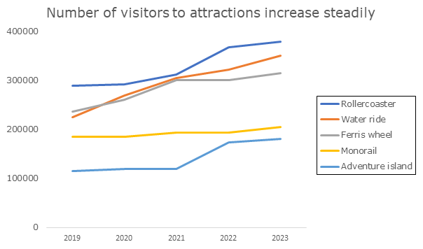
However, there is a problem with this way of labeling information.
Namely, your audience has to travel with their eyes back and forth between the lines and the legend. This takes energy. Energy that the audience cannot spend on the content.
Is there an alternative?
Certainly.
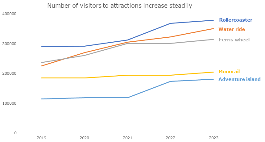
The alternative for legends is called ‘direct labeling’. It looks like this:
Convinced?
Then the next question is: how do you do this?
If you have been reading my emails for a while, you know that I usually don’t discuss technical how-tos. I prefer to share conceptual tools and fun examples.
But today is an exception.
Because there is a simple and useful trick.
Step 1: Remove the legend.
Step 2: Add text boxes. Then drag them to the right spot.
Done.
It is a little quick and dirty, but it always works.
For a more thorough way to do this in Excel, I want to refer you to a blog article by Elizabeth Ricks (Storytelling with data).
Regards,
Arnaud