

In primary school, I ate pie every day for a week.
It was like this.
We learned fractions. My teacher had asked a few parents to bake a pie with their child. The idea was that we could cut them into pieces, so that we got a feel for ‘a twelfth’ or ‘an eighth’. And also had fun learning about fractions.
So my association with pies and numbers is downright positive. 😉
Yet there is one area in which you have to be careful with pies and numbers: data visualizations. Just google ‘pie charts are evil’.
What’s the problem?
In a pie chart, you can’t see exactly how the pie slices relate to one another. Especially if values are close to each other. Take, for example, this chart about freight transport:
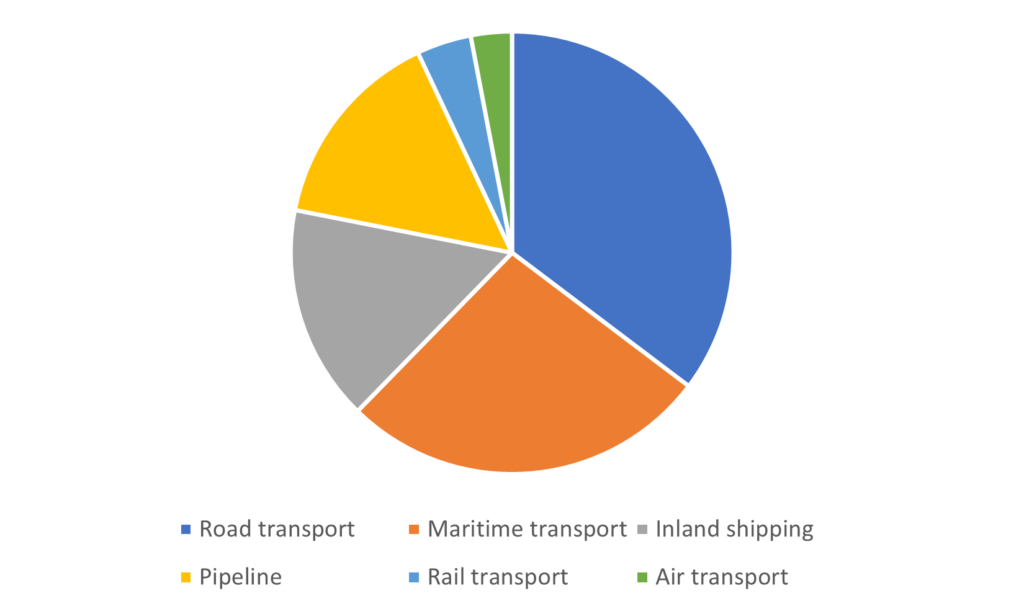
Which one is larger, the yellow or the gray segment? That’s not easy to see.
Even more dangerous are 3D pie charts. With those, you enter the realm of propaganda and tabloids. For example:
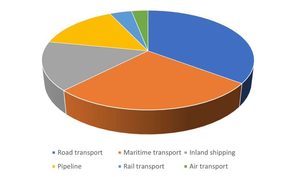
The orange segment here now appears to be the same size as the dark blue one, while there’s in fact a big difference.
Then what should you do?
Make a bar chart. In bar charts, your audience immediately sees the proportions.
Look at this:
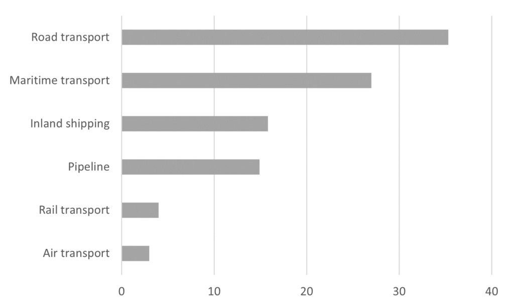
It also helps you get rid of the Excel colors.
Regards,
Arnaud
PS The only advantage of a pie chart is that it’s a way to show segments as part of a total. If that’s important, consider a pie chart.