Yuma is datawetenschapper. Een numbers girl.
Als ze programmeert, bereikt ze vaak een flow en vergeet ze de wereld. Soms vergeet ze zelfs te lunchen.
In presentaties laat Yuma meestal datavisualisaties zien. Tabellen, lijngrafieken, staafdiagrammen… Haar werk gaat immers over data.
Toch is ze niet altijd tevreden met de vragen en de reacties die ze krijgt na afloop van haar presentaties.
Waarom zijn mensen minder enthousiast dan zijzelf? Soms lijkt het wel of ze haar niet begrijpen. Terwijl ze haar visualisaties heel zorgvuldig maakt.
Moet ze iets anders doen?
Gebruik je net als Yuma vaak datavisualisaties?
Dan is goed om je af te vragen of je met alleen datavisualisaties je doel wel bereikt.
Datavisualisaties zijn vooral geschikt om detailinformatie over te brengen. Om het achterliggende, grotere geheel te schetsen, moet je ze vaak combineren met andere typen beeld.
Er zijn grofweg vier typen beeld – waarvan de datavisualisatie er één is.
Dit artikel helpt je om bewust tussen deze verschillende typen beeld te kiezen. Zodat je verhaal goed landt bij je publiek.
Begin met je boodschap
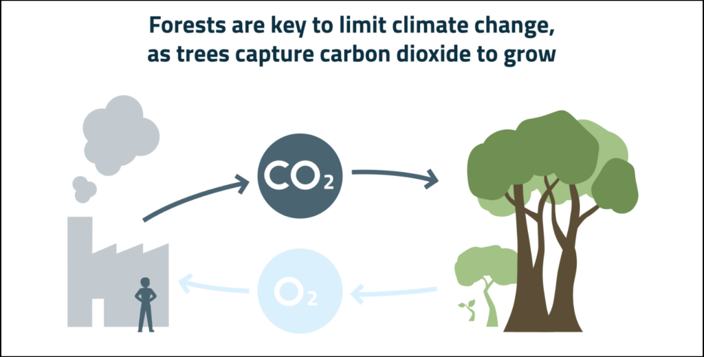
Welk type beeld je kiest, hangt af van je boodschap. Zorg dus dat je eerst weet welke je boodschap je aan je publiek wilt overbrengen. Mijn advies is om je boodschap vooraf echt op te schrijven. In een hele zin, inclusief een werkwoord. Dat dwingt je om een boodschap te formuleren en niet alleen een onderwerp. Het verschil? Een onderwerp is een woord. Of een paar woorden. Bijvoorbeeld: Tropische ontbossing. Of: Moderne technologie. Een boodschap is een hele zin waarin je een uitspraak over zo’n onderwerp doet. Bijvoorbeeld:- Bossen zijn belangrijk voor het beperken van klimaatverandering omdat bomen CO2 opslaan als ze groeien.
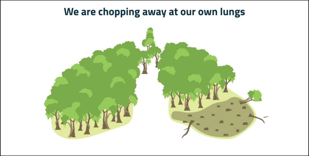
- We hakken onze eigen bron van zuurstof om.
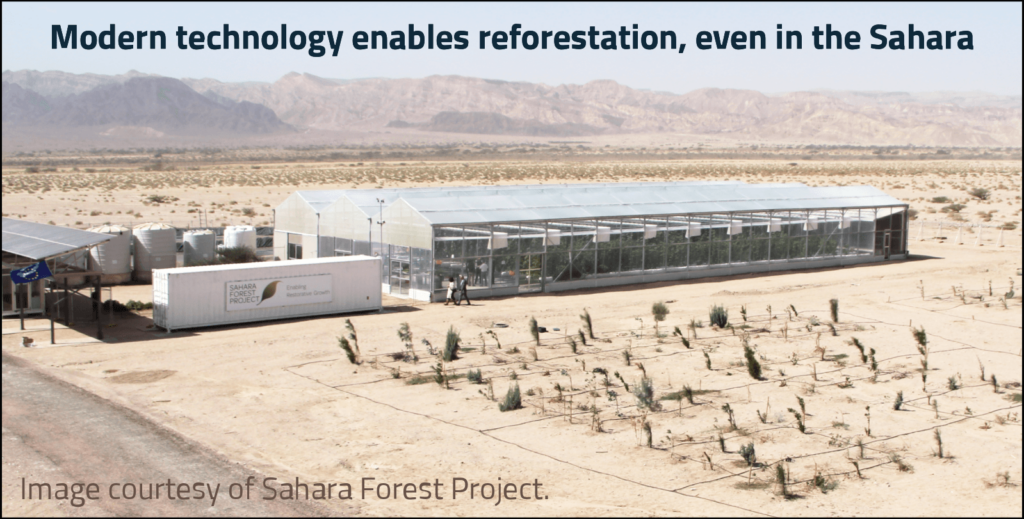
- Moderne technologie helpt bossen terug te groeien, zelfs in de woestijn.
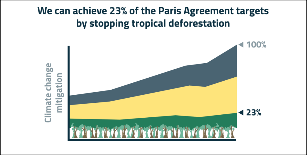
- Als tropische ontbossing stoppen kunnen we 23% van de doelstellingen uit het Parijsakkoord halen.
Beeldtype 1: schematische visualisatie
Een schematische visualisatie geeft versimpeld en abstract weer hoe iets werkt. Met zo’n visualisatie kun je goed jouw mentale beeld overbrengen op je publiek. Bijvoorbeeld jouw beeld van een onzichtbaar proces: Een schematische visualisatie kan ook de vorm hebben van een oorzaak-gevolgrelatie, een chronologie of een stappenplan.
Daarnaast kun je met een schematische visualisatie goed de complexe samenhang tussen onderdelen verduidelijken. Denk bijvoorbeeld aan de onderdelen van een apparaat, het lichaam of een organisatie.
Bekende voorbeelden van schematische visualisaties zijn een gebruiksaanwijzing van IKEA, een metrokaart, stroomschema’s, Venndiagrammen en een uitleg van elektrische circuits in een natuurkundeboek.
Ten opzichte van foto’s hebben schematische visualisaties een belangrijk voordeel. Je kunt in een schematische visualisatie namelijk precies bepalen welke details je laat zien. En zo de aandacht van de kijker richten op dat wat belangrijk is. Een afgebeeld mens hoeft bijvoorbeeld geen vrouw of man te zijn, als dat voor je verhaal niet uitmaakt.
Een schematische visualisatie kan ook de vorm hebben van een oorzaak-gevolgrelatie, een chronologie of een stappenplan.
Daarnaast kun je met een schematische visualisatie goed de complexe samenhang tussen onderdelen verduidelijken. Denk bijvoorbeeld aan de onderdelen van een apparaat, het lichaam of een organisatie.
Bekende voorbeelden van schematische visualisaties zijn een gebruiksaanwijzing van IKEA, een metrokaart, stroomschema’s, Venndiagrammen en een uitleg van elektrische circuits in een natuurkundeboek.
Ten opzichte van foto’s hebben schematische visualisaties een belangrijk voordeel. Je kunt in een schematische visualisatie namelijk precies bepalen welke details je laat zien. En zo de aandacht van de kijker richten op dat wat belangrijk is. Een afgebeeld mens hoeft bijvoorbeeld geen vrouw of man te zijn, als dat voor je verhaal niet uitmaakt.
Beeldtype 2: symbolische visualisatie
Wil je je boodschap krachtig overbrengen? Overweeg dan een symbolische visualisatie. In een symbolische visualisatie verbeeld je je boodschap met een metafoor of analogie. Daarom wordt dit type beeld ook wel ‘visual metaphor’ genoemd. Een voorbeeld: Een symbolische visualisatie zorgt dat je boodschap goed blijft hangen. Ook leidt hij eerder tot discussie, reflectie en actie.
Vanwege hun zeggingskracht worden symbolische visualisaties veel gebruikt in reclames, campagnes van ngo’s en in de politiek.
BMW maakte bijvoorbeeld een poster met een enorme hond met een minivoerbakje. ‘More power, less consumption’ was de boodschap.
Ook in de zakelijke communicatie bestaan legio voorbeelden van symbolische visualisaties. Denk aan een bergtocht naar de top (het doel), software als Zwitsers zakmes of mensen in een team die een kar trekken (of tegenhouden).
Deze voorbeelden zijn bekend, maar ook enigszins cliché. Alsnog zijn ze effectief. En dat geldt helemaal als je een originele en treffende metafoor weet de bedenken.
Een symbolische visualisatie zorgt dat je boodschap goed blijft hangen. Ook leidt hij eerder tot discussie, reflectie en actie.
Vanwege hun zeggingskracht worden symbolische visualisaties veel gebruikt in reclames, campagnes van ngo’s en in de politiek.
BMW maakte bijvoorbeeld een poster met een enorme hond met een minivoerbakje. ‘More power, less consumption’ was de boodschap.
Ook in de zakelijke communicatie bestaan legio voorbeelden van symbolische visualisaties. Denk aan een bergtocht naar de top (het doel), software als Zwitsers zakmes of mensen in een team die een kar trekken (of tegenhouden).
Deze voorbeelden zijn bekend, maar ook enigszins cliché. Alsnog zijn ze effectief. En dat geldt helemaal als je een originele en treffende metafoor weet de bedenken.
Beeldtype 3: realistische visualisatie
Kan je publiek zich weinig voorstellen bij wat je vertelt? Bijvoorbeeld over een nieuwe techniek, een ziektebeeld of een onbekende diersoort? Dan is een realistische visualisatie een goede optie. In een realistische visualisatie laat je zien hoe iets eruitziet, meestal met een foto. Een voorbeeld: Je publiek heeft waarschijnlijk geen duidelijk beeld van hoe bossen in de woestijn kunnen groeien.
Door de foto verandert dat: deze toont de locatie, de bouwwerken en objecten die een rol spelen en hoe groot die zijn.
Met een realistische visualisatie breng je dus in één oogopslag veel informatie over. Daardoor begrijpt je publiek je beter en stellen mensen bijvoorbeeld betere vragen of geven ze betere feedback.
Een realistische visualisatie maakt bovendien direct duidelijk dat iets echt bestaat en niet zomaar een plan is.
Je publiek heeft waarschijnlijk geen duidelijk beeld van hoe bossen in de woestijn kunnen groeien.
Door de foto verandert dat: deze toont de locatie, de bouwwerken en objecten die een rol spelen en hoe groot die zijn.
Met een realistische visualisatie breng je dus in één oogopslag veel informatie over. Daardoor begrijpt je publiek je beter en stellen mensen bijvoorbeeld betere vragen of geven ze betere feedback.
Een realistische visualisatie maakt bovendien direct duidelijk dat iets echt bestaat en niet zomaar een plan is.
Beeldtype 4: datavisualisatie
Gaat je boodschap over data? Of kun je die met data onderbouwen? Dan is een datavisualisatie vaak gewoon de meest logische optie. Bijvoorbeeld: Met een datavisualisatie kun je onder meer goed de verhouding tussen onderdelen tonen. Zoals die tussen de verschillende maatregelen om klimaatverandering te beperken.
Ook ontwikkelingen in de tijd kun je goed laten zien met een datavisualisatie. Bijvoorbeeld hoe de noodzaak van klimaatmaatregelen in de loop van de jaren toeneemt.
Datavisualisaties zijn meestal technischer en gedetailleerder dan andere typen visualisaties. Vaak passen datavisualisaties daarom het beste later in je verhaal.
In het begin van je verhaal is het meestal goed om in te gaan op het grotere plaatje: de ‘why’. Dat kun je meestal beter overbrengen met een ander type visualisatie.
Wil je beter worden in datavisualisaties? Het boek Storytelling with data is een aanrader.
Met een datavisualisatie kun je onder meer goed de verhouding tussen onderdelen tonen. Zoals die tussen de verschillende maatregelen om klimaatverandering te beperken.
Ook ontwikkelingen in de tijd kun je goed laten zien met een datavisualisatie. Bijvoorbeeld hoe de noodzaak van klimaatmaatregelen in de loop van de jaren toeneemt.
Datavisualisaties zijn meestal technischer en gedetailleerder dan andere typen visualisaties. Vaak passen datavisualisaties daarom het beste later in je verhaal.
In het begin van je verhaal is het meestal goed om in te gaan op het grotere plaatje: de ‘why’. Dat kun je meestal beter overbrengen met een ander type visualisatie.
Wil je beter worden in datavisualisaties? Het boek Storytelling with data is een aanrader.
Checkvraag: heeft je publiek echt behoefte aan data?
Wil je een datavisualisatie gaan maken? Stel dan voor de zekerheid de checkvraag: heeft mijn publiek echt behoefte aan data? Het is goed om deze vraag te stellen, omdat een datavisualisatie soms ‘de makkelijke keuze’ is. Als kenniswerker heb je immers vaak al data. En je bent vaak al gewend om met datavisualisaties te communiceren. Denk maar aan datawetenschapper Yuma aan het begin van dit artikel. Vanuit communicatie-oogpunt zijn de data niet het vertrekpunt, maar je publiek. En je publiek heeft meestal vooral behoefte aan het grotere plaatje. Aan de context en de why van je verhaal. De why laat zich doorgaans beter verbeelden met een ander type visualisatie dan een datavisualisatie. Vaak passen datavisualisaties het beste later in je verhaal. Als je na de why ingaat op meer specifieke punten. Je combineert je datavisualisatie dan dus met andere typen visualisaties.Als je een type beeld hebt gekozen
Hopelijk heb je door de vier typen beeld nieuwe ideeën om je boodschap te visualiseren.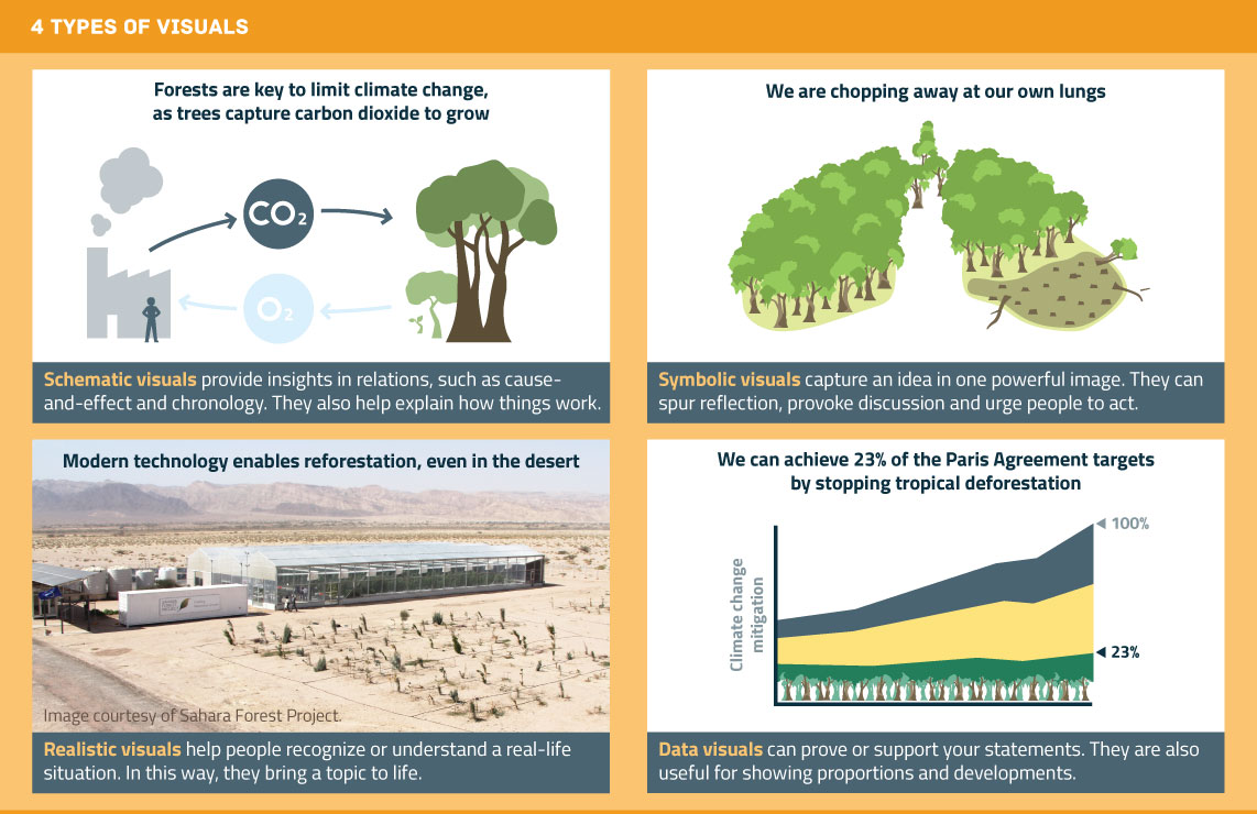 Heb je een type beeld gekozen?
Dan is de volgende stap om te bedenken hoe dat beeld er precies uit moet zien.
Ik raad je aan om daarbij eerst met pen en papier een schets te maken. Dan kun je from scratch nadenken over je beeld. En ben je niet gebonden aan iemand anders’ keuzes qua compositie, kleur en details.
Weet je hoe je beeld eruit moet zien? Dan is het tijd om het uit te werken in een softwareprogramma of op zoek te gaan naar een bestaande foto.
Succes!
Heb je een type beeld gekozen?
Dan is de volgende stap om te bedenken hoe dat beeld er precies uit moet zien.
Ik raad je aan om daarbij eerst met pen en papier een schets te maken. Dan kun je from scratch nadenken over je beeld. En ben je niet gebonden aan iemand anders’ keuzes qua compositie, kleur en details.
Weet je hoe je beeld eruit moet zien? Dan is het tijd om het uit te werken in een softwareprogramma of op zoek te gaan naar een bestaande foto.
Succes!

Arnaud is trainer, adviseur en tekstschrijver bij Analytic Storytelling. Hij helpt klanten om een heldere en overtuigende boodschap op papier te krijgen in woord en beeld.