Mike hears himself talk. His patient looks at him blankly.
Mike tries again. No jargon. Simple language.
The patient nods politely. But Mike can tell from the look in his eyes that he still doesn’t understand.
Argh…
How can he explain this?
Anyone who communicates about a complicated topic can sometimes get stuck. Doctors, like Mike, but also scientists, engineers, policy makers and financial experts.
Usually, we look for different words to improve our explanation.
Have you ever considered trying a wholly different approach? You can also use sketches to explain something.
Sketches are effective
Yes, drawing figures. And trees, cars and apples.
A simple, handmade sketch is often enormously effective. Because a sketch can help your audience understand your topic better, and much faster.
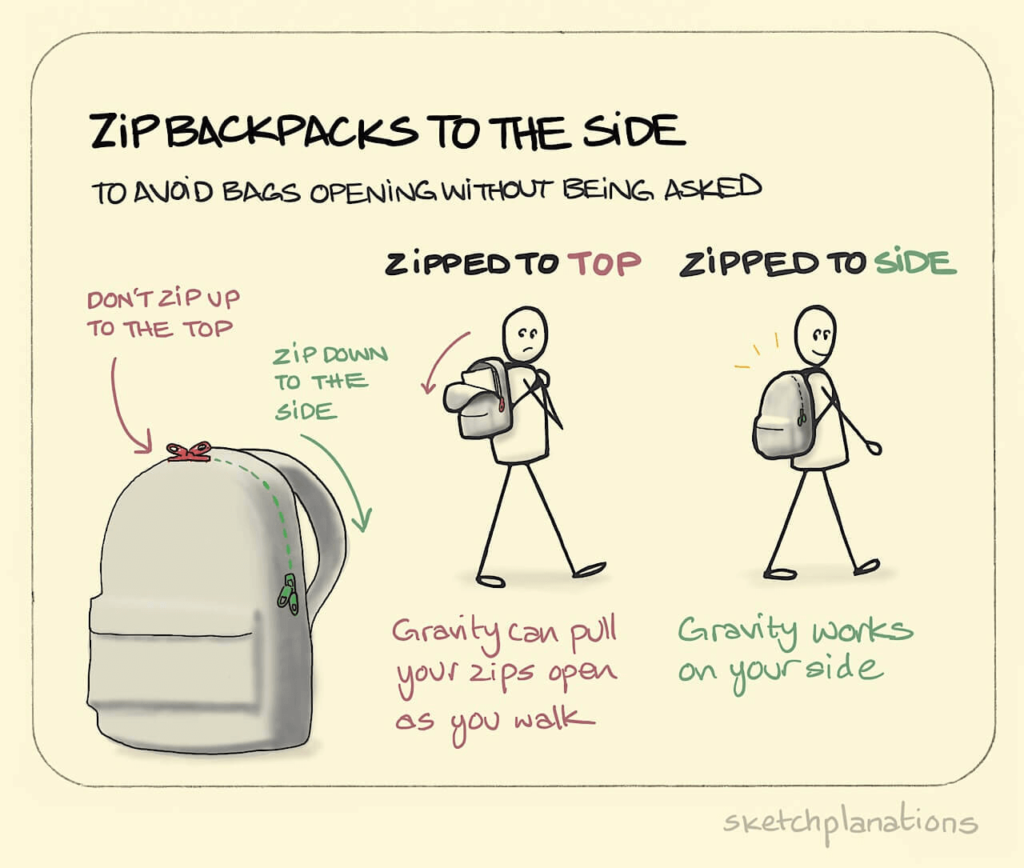
An explanatory sketch can look like this:
Most knowledge workers hardly ever draw.
Because it just doesn’t enter their minds. Because they don’t know how. Or because they think a sketch doesn’t look professional.
Drawing is generally outside of their comfort zone.
Below, I will discuss some examples of explanatory sketches. To give you an idea of how you could use such sketches yourself. And what to keep in mind when you do.
But first, a reassurance: you don’t have to be good at drawing!
Sketchplanations as example
The backpack example is from sketchplanations.com. That’s where designer Jono Hey publishes a new sketch every week, about a topic that he’s interested in.
They’re nice, visual nuggets of knowledge, easy to consume in just 30 seconds.
Often, they teach you something useful or interesting. For instance, I consistently apply the backpack trick.
As a knowledge worker, you generally communicate about topics that are more complex than backpacks. Such topics may seem more difficult to draw because they are more abstract.
Luckily, sketchplanations are often about complex, abstract topics too. I selected five of them.
#1: The 3 tallest mountains
The Mount Everest is the tallest mountain on earth. Everybody knows this. Yet there are two other mountains that also have a claim to the title.
Hey explains this as follows:
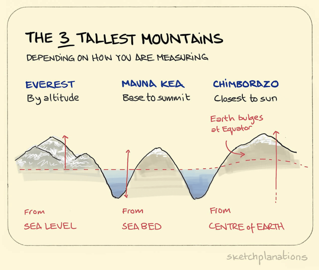
Of course, you could explain this idea using words. But an image does so more quickly.
For instance, the image helps you instantly understand the effect of the bulge at the equator.
When you sketch, you generally won’t need to draw as nicely as Jono Hey does. Hey’s mountains are pretty detailed. It takes extra time to draw like that.
A geography teacher who wants to explain this idea, would only need a few simple lines on the blackboard.
A line, a triangle, a circle, a square. With these basic shapes you can, in fact, sketch anything.
Drawing skills are therefore not that important. It is much more important that you can decide what your sketch should look like.
#2: Two-factor authentication
This sketchplanation is about two-factor authentication: a familiar concept in the world of security.
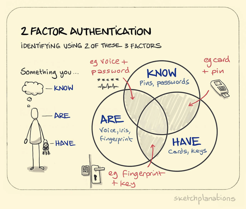
To explain the concept on an abstract level, Hey uses a Venn diagram. But he adds something.
He draws a person. And with keys and fingerprints he shows what two-factor authentication looks like in our everyday world. If he hadn’t done that, the sketch would have still been clear, but it would have remained quite abstract.
You can do the same when you sketch.
Think how people play a role in your topic. Maybe your patient, end user or customer. If you draw them, your explanation will be clearer, more urgent and more relatable.
When you sketch people, a simple stick figure often will do.
It is also good to describe people when you write or talk. But you won’t do this automatically, because when you use language, it is easy to keep it abstract. Language allows you to discuss ‘valorization’, ‘agile working’ or ‘the circular economy’ without explicitly mentioning people. When you sketch, that is less likely to happen.
#3: Accuracy and precision
The topic of this next sketchplanation – accuracy and precision – is more abstract and complex than the previous ones.
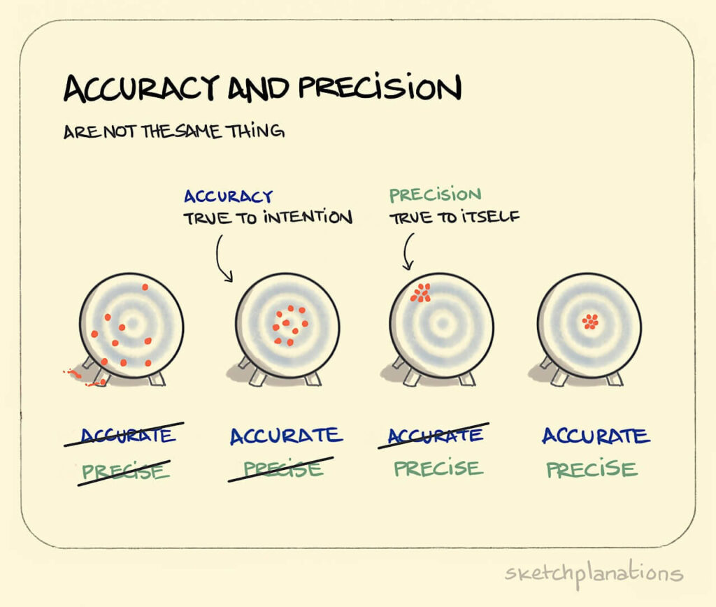
A metaphor can help to clearly explain such an abstract idea. Without the shooting target metaphor that’s not as easy.
In language, metaphors are effective too. But because metaphors often use visual language, they are usually easy to sketch, which will help your audience understand it even faster.
With a little imagination you can think of spot-on metaphors yourself. Which is often fun to do.
This sketchplanation has another important element.
Color.
Jono Hey always uses black as the base color. In addition, he uses color for the parts that are important for the explanation. Each part gets its own color.
This use of color helps your audience instantly recognize what is ‘the same’. This makes the sketch quick to understand. In addition, color makes the image more appealing. The image attracts attention.
You can use too much color. That makes the image messy and chaotic. Therefore, choose consciously what colors you use in your sketch, and use them only for things that are important for the explanation.
#4: Fruit vs vegetable
Tomatoes are fruits.
Maybe someone has told you this at some point.
As it turns out, the fruit-and-vegetable spectrum is even more complicated than that. If tomatoes are fruits, then avocado’s, cucumbers and eggplants are too.
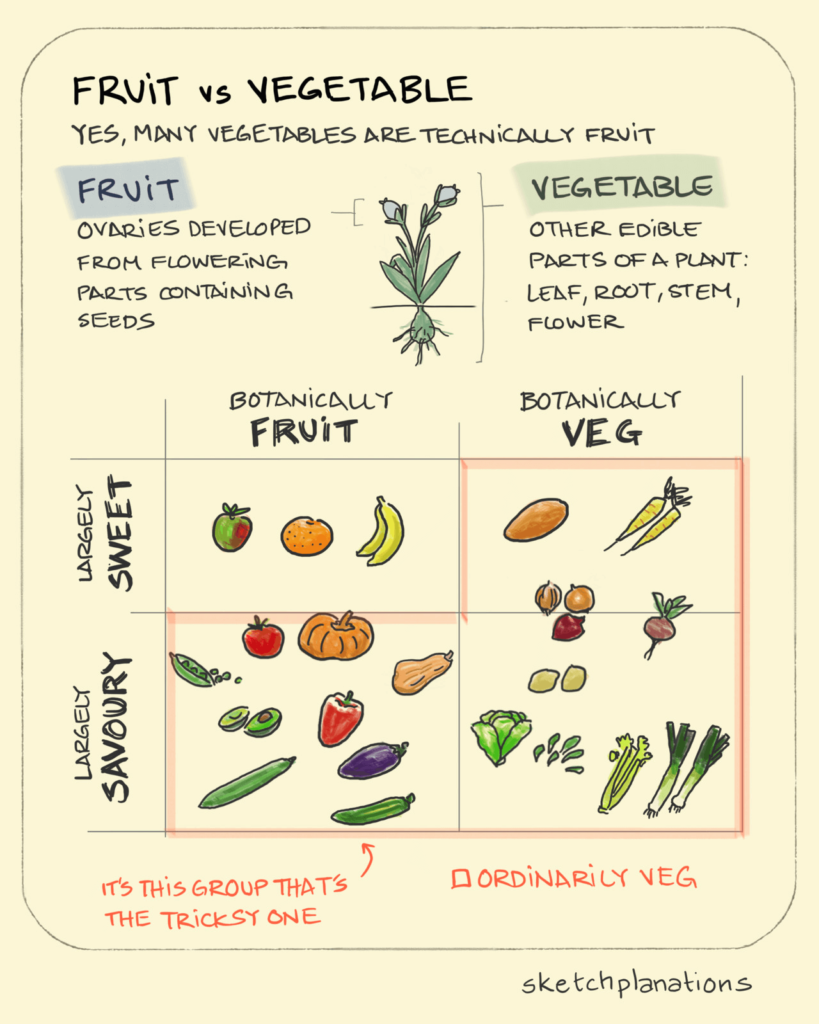
Images are useful for explaining simple contrasts. The top part of the sketchplanation is a good example of this.
Here, it’s fruit versus vegetable. The previous example contrasts precise with accurate. Similarly, contrasts like before/after, now/future and good/bad lend themselves well to sketching.
When you visually separate things (usually left/right), your audience can instantly recognize what belongs to what.
The lower part of the sketchplanation reveals another benefit of using images: you can see all the different parts at the same time.
This is a great advantage over text. With text, your audience can only experience the separate parts one after the other.
Visuals convey the connections between parts more quickly. And you don’t need to repeatedly refer to categories like ‘botanically fruit’ or ‘largely sweet’, which you would have to do when you use text.
With a sketch you can also quickly explain what parts a cell, organ, machine, organization or network is made of. And how these parts interact.
#5: The square-cube law
The square-cube law is a mathematical law. And as is often the case with mathematical concepts, it is not that easy to explain.
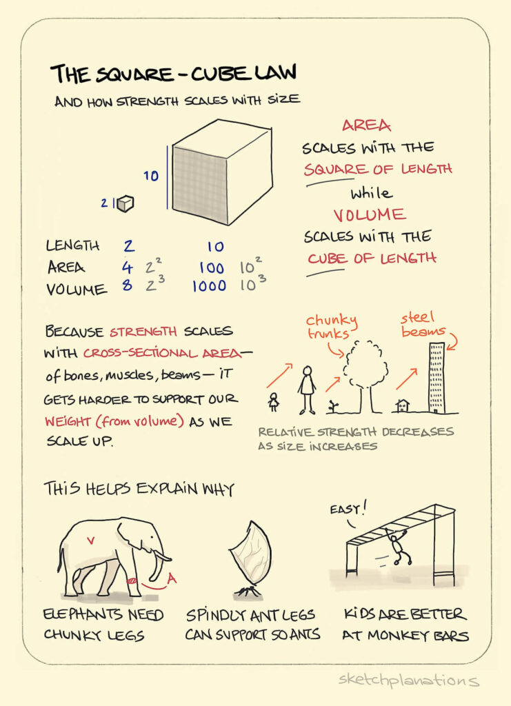
In this sketchplanation, Jono Hey combines two things.
On the one hand, his sketch explains the technical, mathematical part. You can compare this with the Venn diagram in the two-factor authentication image.
On the other hand, he draws familiar examples from biology and civil engineering. The elephant, the ant, the child, the tree, the building.
Examples and concrete, everyday objects are enormously helpful when you want to explain a topic in an accessible way, and bring it to life. In previous examples we saw a keyhole, an ATM, a banana and all the other fruits and vegetables.
There’s something else that’s remarkable about this sketch.
It contains quite a large amount of text.
Of course, sketches don’t always need to be self-explanatory. After all, you can usually add a verbal or written explanation.
It is important to realize that a sketch with a lot of text is often less effective and less appealing. But there certainly is no law against using text in your sketch.
To work: there are more opportunities to sketch than you think
I hope that these sketchplanations will inspire you to more often reach for a pencil yourself.
There are more opportunities to do so than you think.
I will not easily forget how my real estate agent made a drawing for me to explain that some houses in Haarlem, my hometown, are built on poles that are driven deep into the ground. And how to check whether the foundation of such a house has sunken.
The radiologist who drew the ‘diverticulum’ (a pouching in the intestinal wall) in my son’s belly scored points too. The drawing really helped me understand what was going on.
In many of our training courses, scientists and other knowledge workers make sketches about their topic. It turns out that everyone can draw. Including people who spend eight hours a day behind a computer or in a lab.
What’s more, it also turns out that every topic can be sketched.
More examples?
Do you want more inspiration? At sketchplanations.com you’ll find more explanatory sketches about various topics. You can also subscribe to the newsletter. I myself enjoy receiving a new sketchplanation in my inbox every Sunday.

Arnaud is trainer, advisor and text writer at Analytic Storytelling. He helps customers to send out a clear and convincing message in both words and images.


