

Chart and graph software is awesome.
With one click, you can generate a treemap, waterfall chart or word cloud based on your data.
Still, there lurks a danger in the ease with which you can create these visuals. I might sound a little conservative here 😉
Let’s look at an example first.
I found a dataset online about the novel Les Misérables. It’s about how often characters appear, how often they appear together, and to which group they belong.
When I enter this dataset in the program Gephi, it gives me this visual:
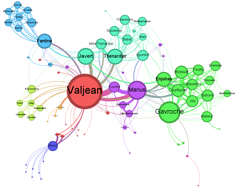
Two minutes of work. And I have something substantial for my presentation or article.
Still, it’s good to realize that the program has made an extremely large number of choices.
First, it has decided to make a network visual. Even though a bar chart with the groups might be better for my message.
It also decided what colour each group should have, where to place them, how many characters are included, et cetera.
My advice when you create an image like this?
First decide what your message is. What do you want to say?
Then, get a blank piece of paper and a pencil. Sketch until you’re more or less happy with the result.
Only then is it time to open your software program.
Old-fashioned – but if you do it this way, you hold the reins.
Regards,
Arnaud